
A brand that feels like you – on your best day, no apologies. Something that stops people mid-scroll, mid-street, mid-conversation. That’s what you’re after.
 Joy through design since 2008

Getting things ready
A brand that feels like you – on your best day, no apologies. Something that stops people mid-scroll, mid-street, mid-conversation. That’s what you’re after.
Joy through design since 2008
Getting things ready
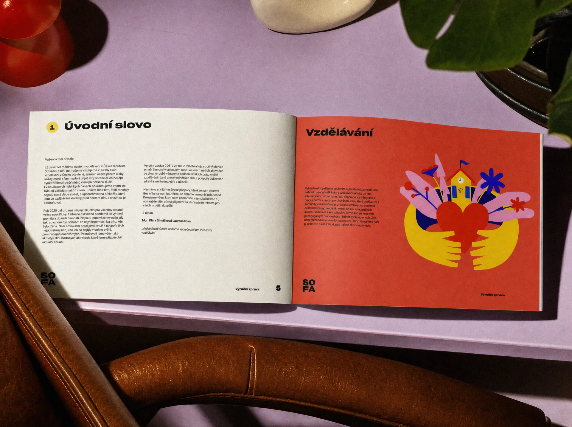
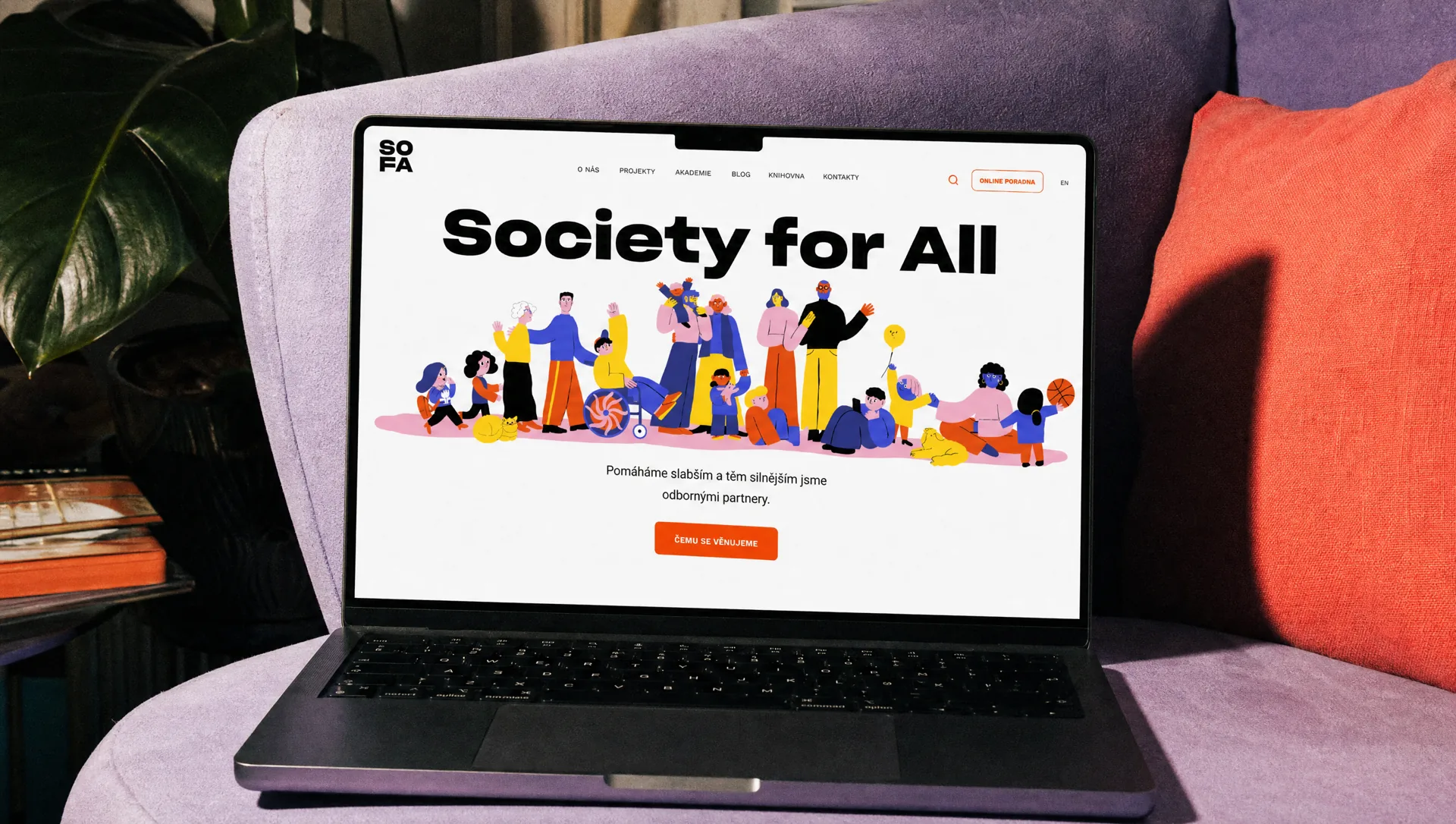
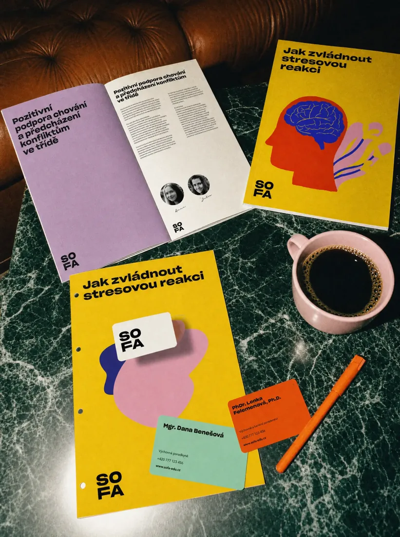
SOFA works on some of the most complex issues in Czech education: inclusion, mental wellbeing and systemic change. After more than a decade of work as ČOSIV, the organisation had grown beyond its original identity. It needed a brand that could better reflect its role, speak to a wider audience and make its expertise easier to approach. The transformation started with a new name: SOFA, Society for All.
SOFA needed to feel credible enough for institutions and experts, but human enough for teachers, parents and everyone affected by the education system. The new name gave us the starting point. A sofa is familiar, welcoming and open. A place where people come together, talk and feel safe. That idea became the foundation for an identity that feels confident without becoming institutional.
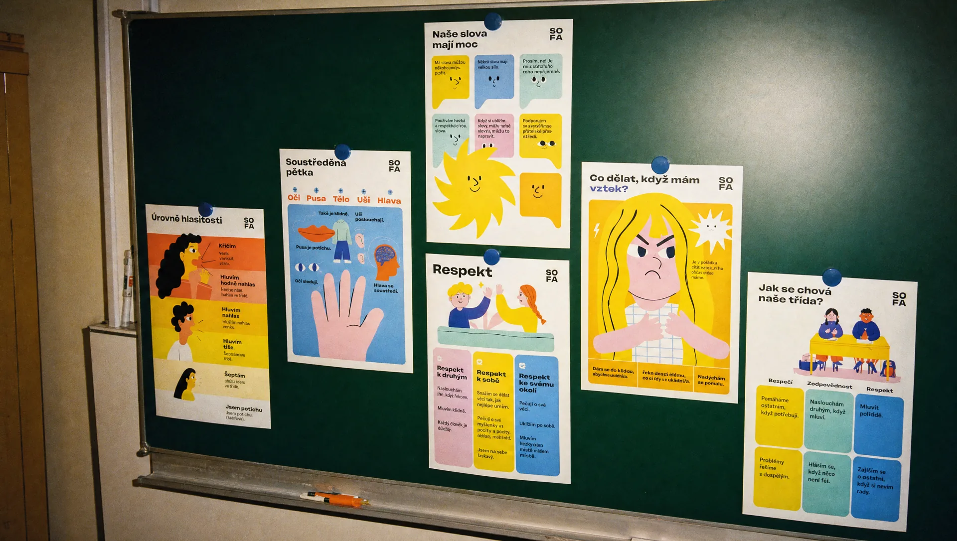
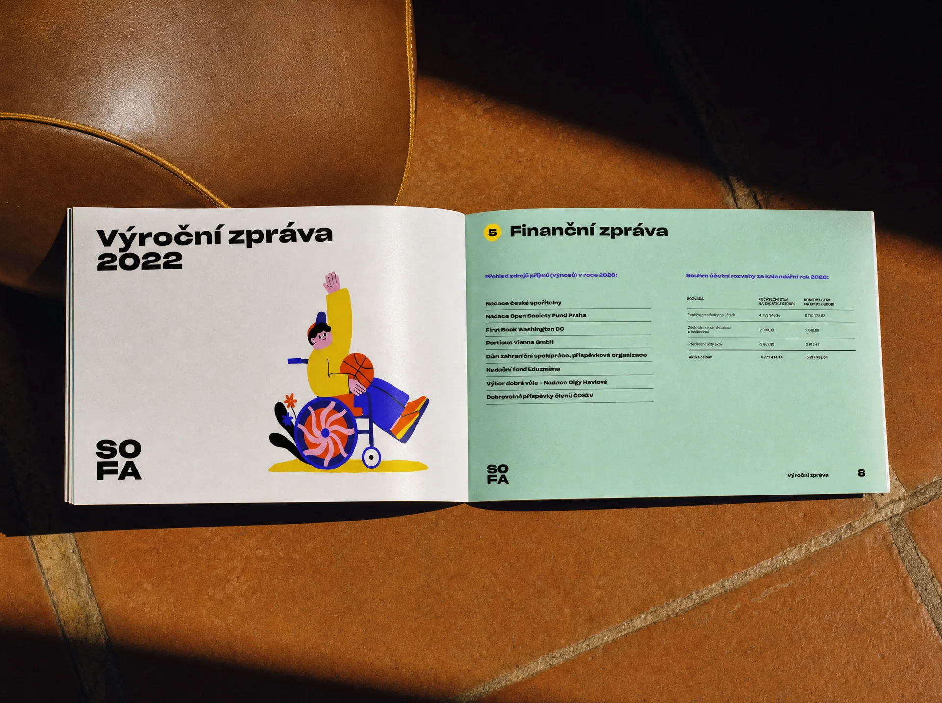
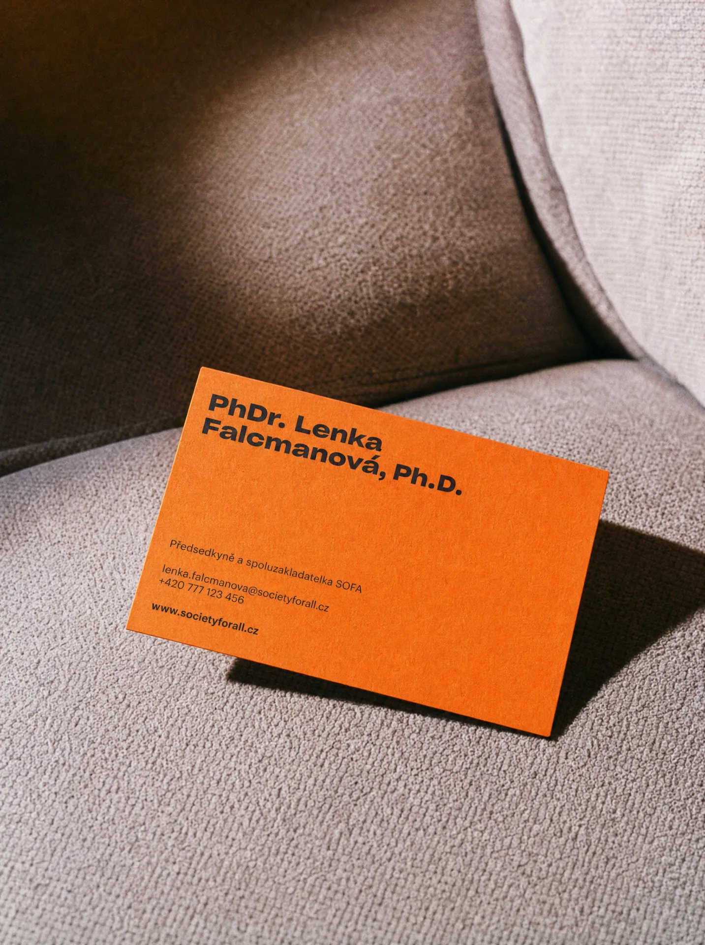
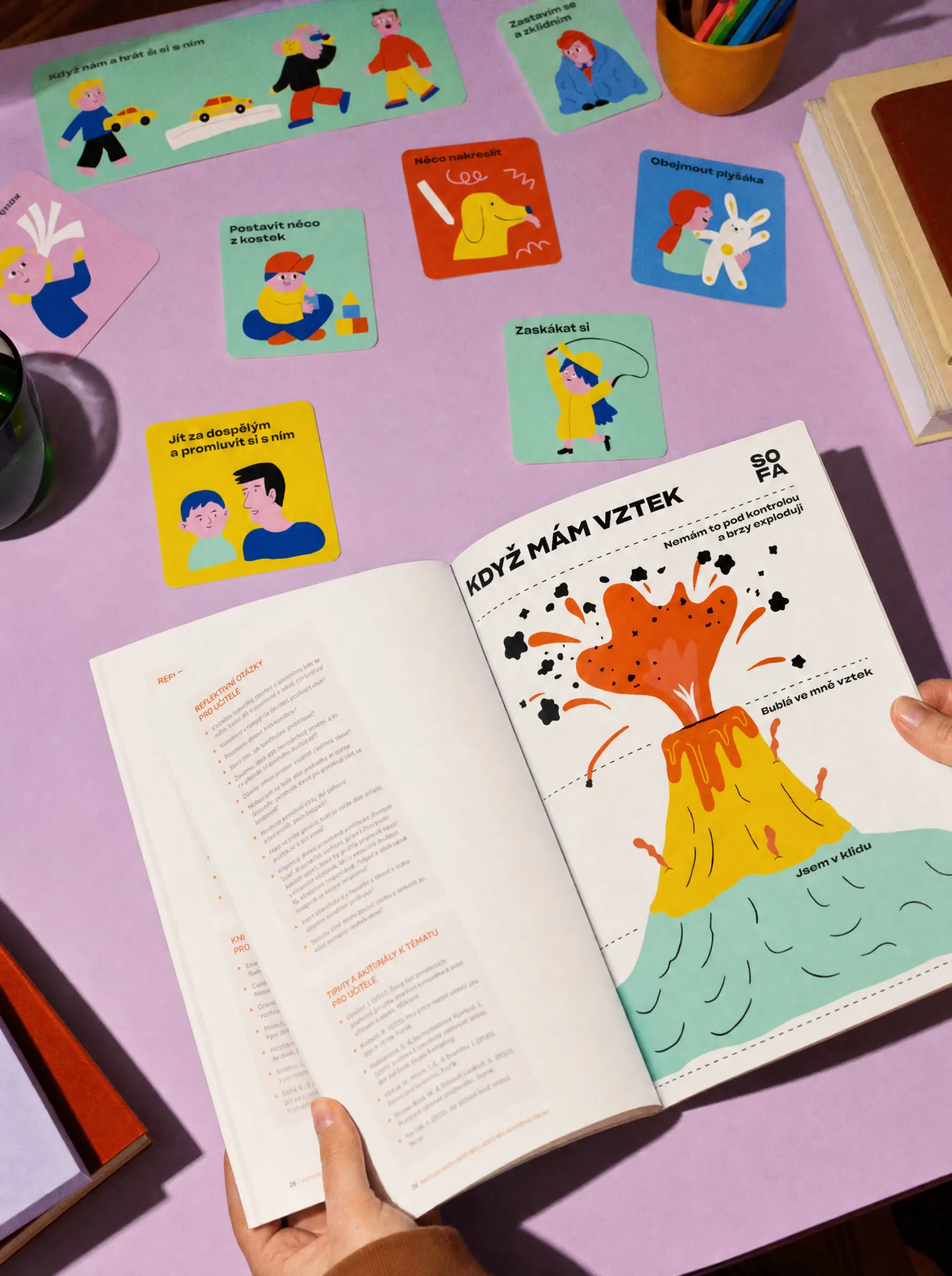
The SOFA brand identity combines strong typography, bold colours and playful details to make complex topics easier to enter. Instead of creating another restrained nonprofit identity, we built a visual world with energy and optimism. The system can be loud when it needs attention, quieter when dealing with sensitive topics, and structured when communicating research or expert content. It gives SOFA enough flexibility to speak to very different audiences without losing its character.
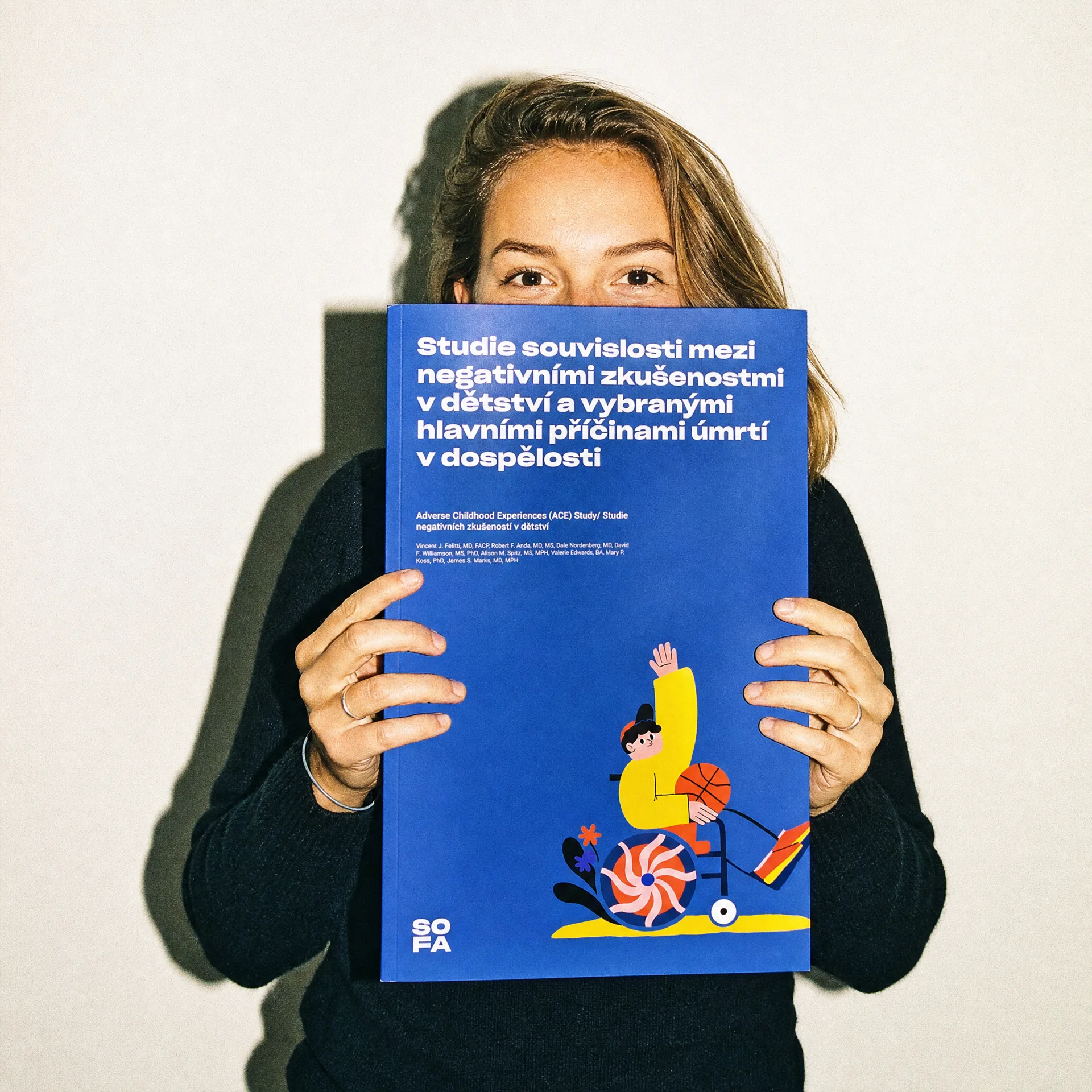
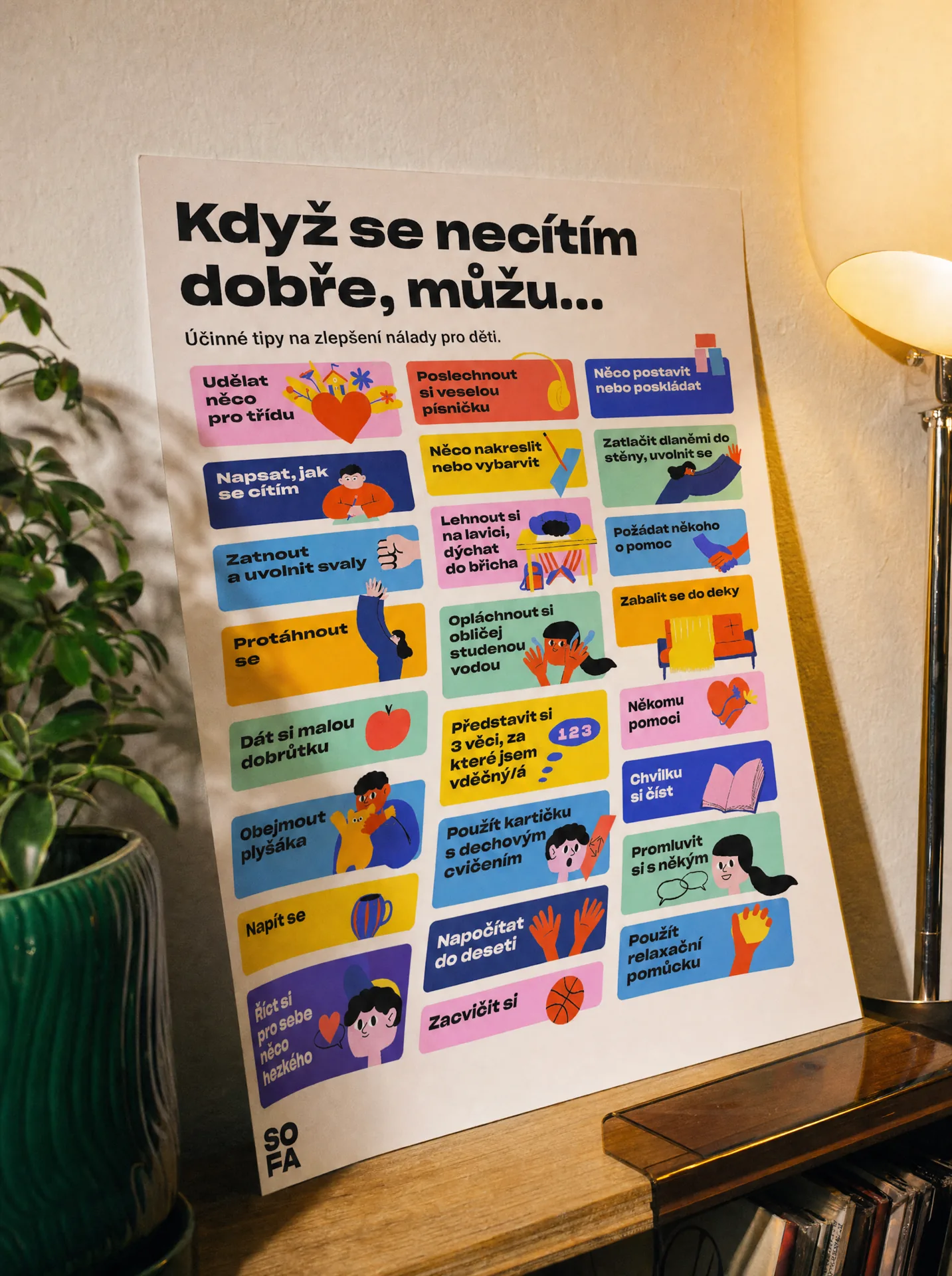
Illustration became an important part of making the organisation feel approachable. Together with illustrator Barbora Idesová, we created a visual language full of personality, small imperfections and human moments. It brings warmth into subjects that could otherwise feel technical, institutional or difficult. Combined with typography and colour, the illustrations make SOFA immediately recognisable while keeping the communication open and accessible.
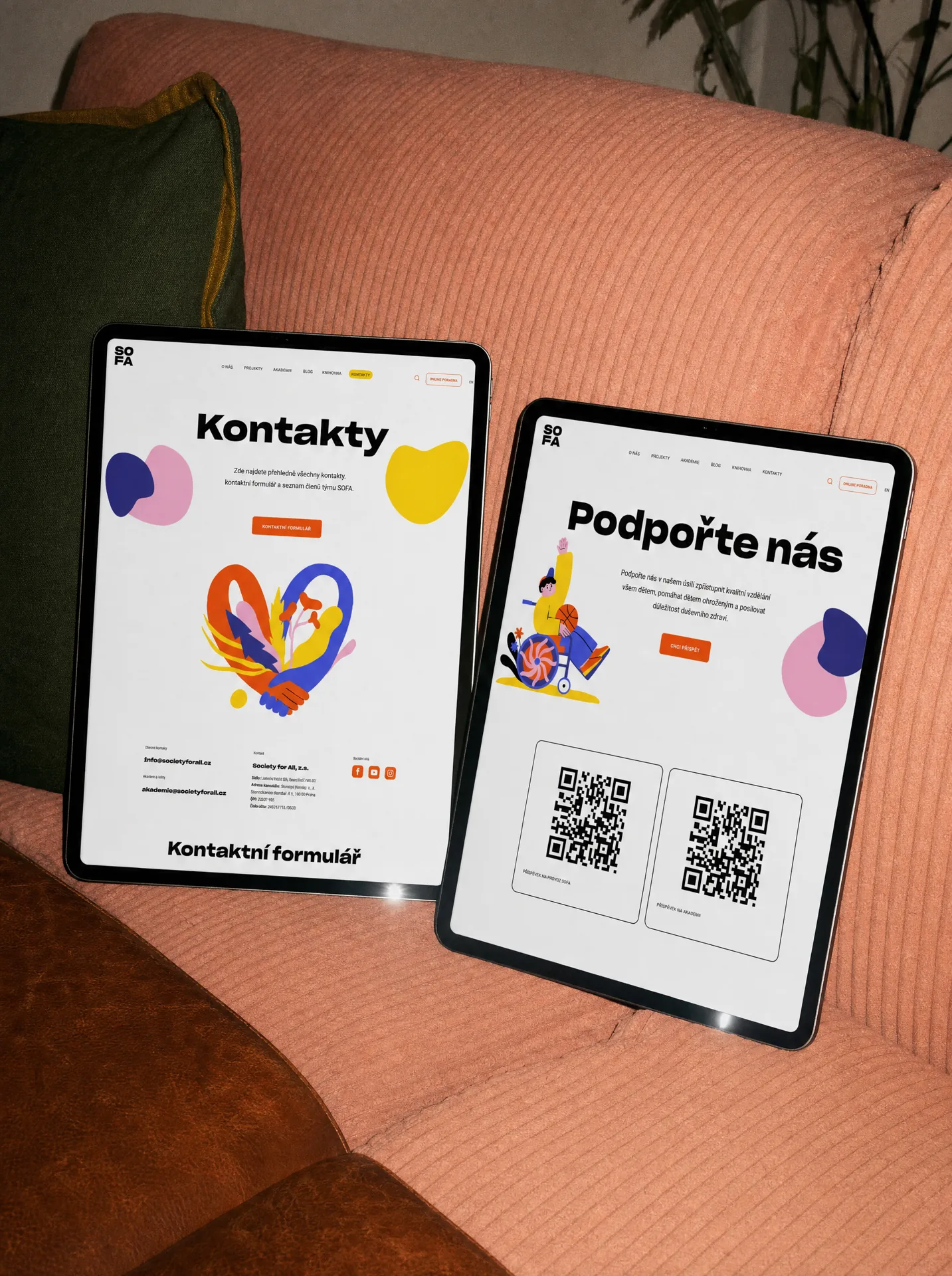
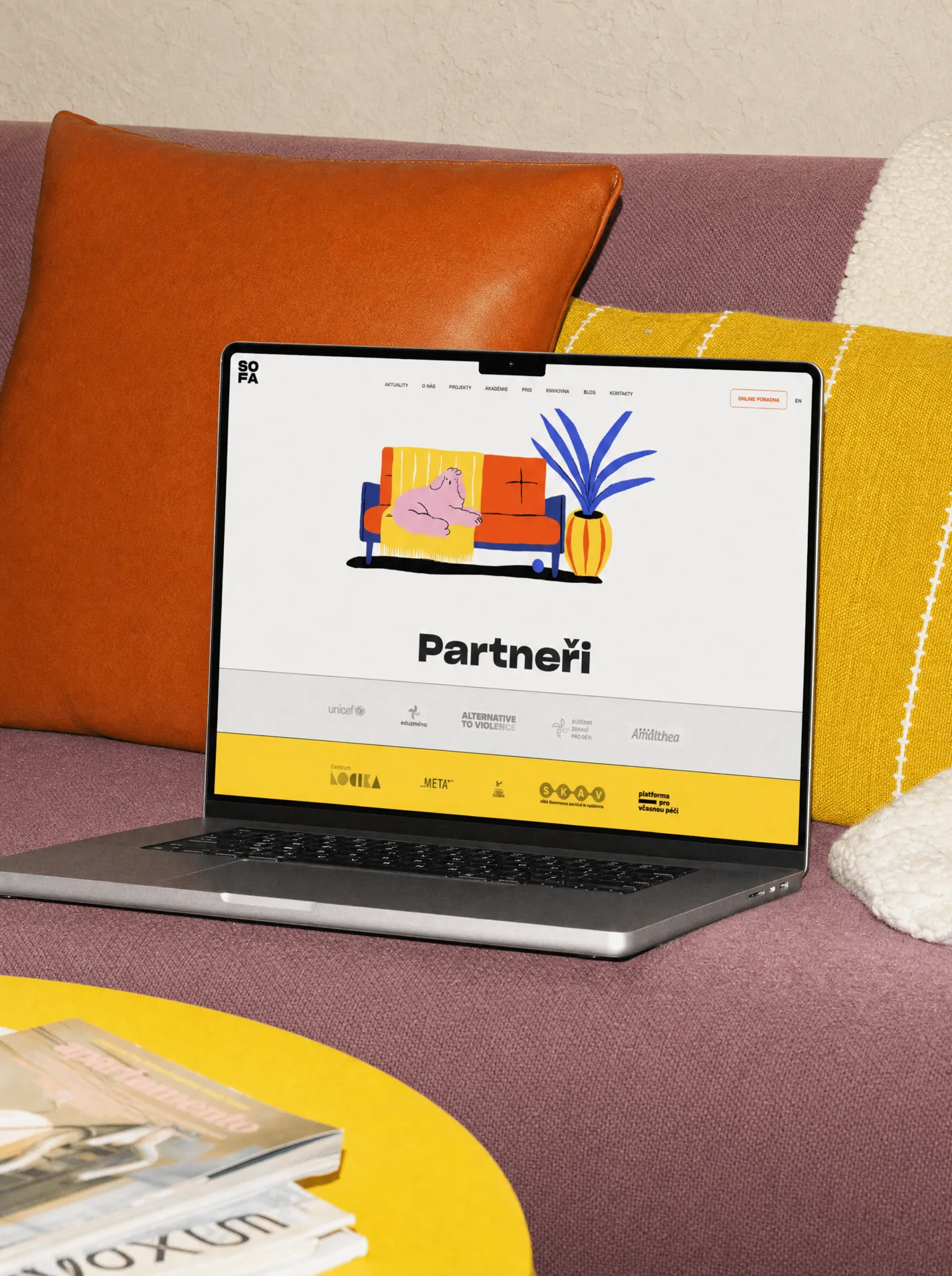
The brand was designed to work beyond communication. It expanded into the SOFA website and a growing digital ecosystem of educational content, services and tools. The same visual principles help keep very different types of information connected while making complex content easier to navigate. The identity gives SOFA a consistent foundation as the organisation and its services continue to grow.
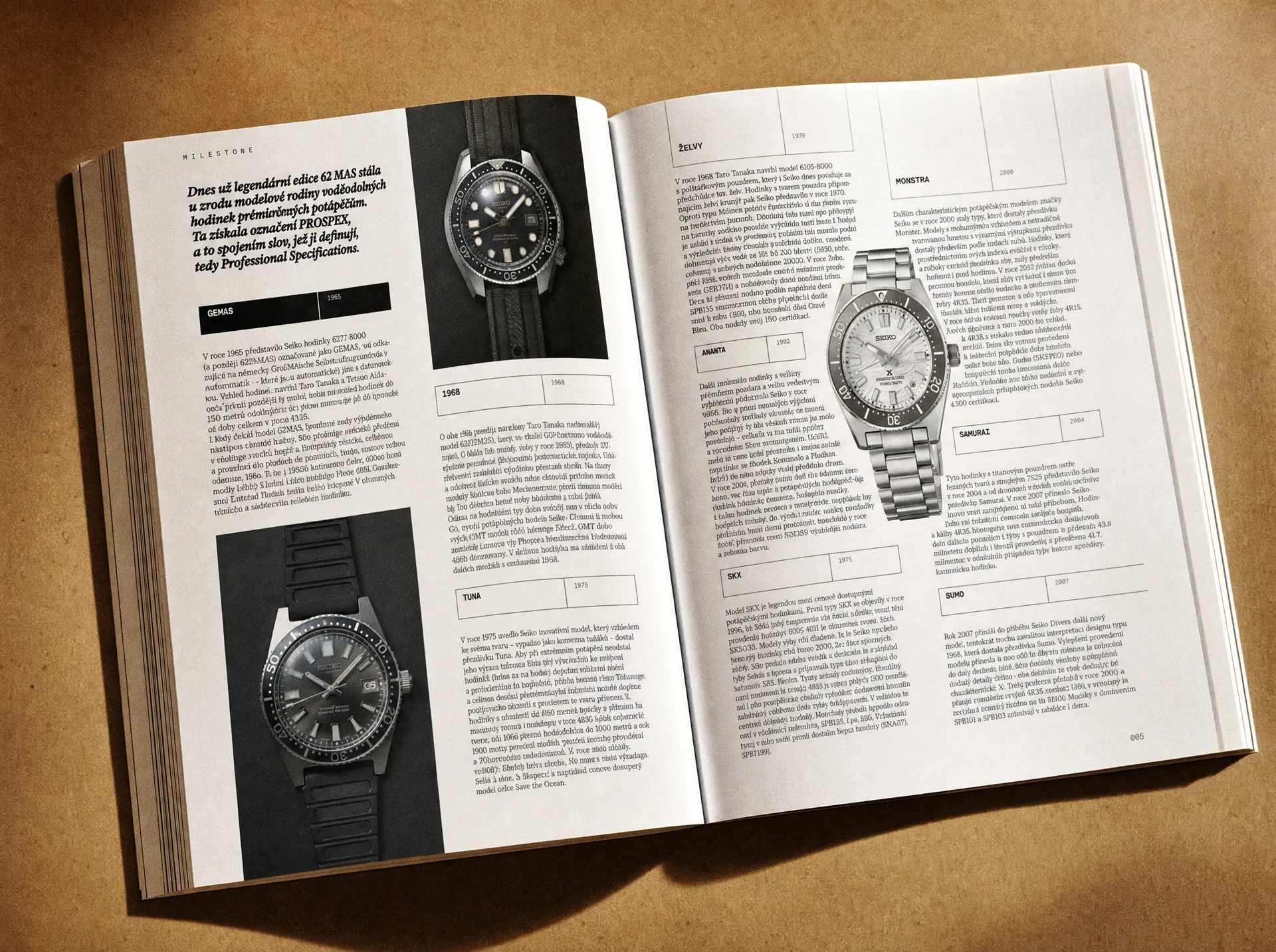
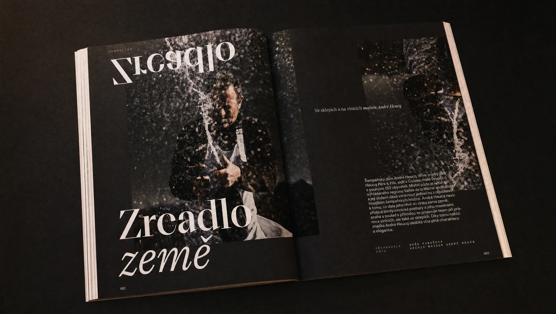
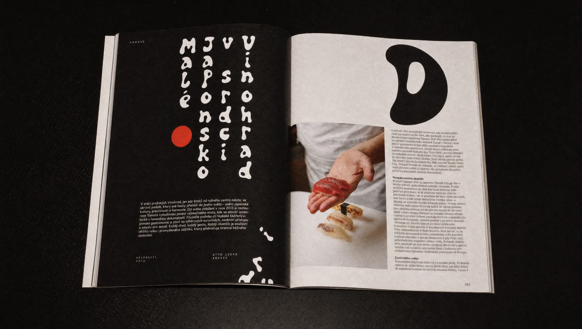
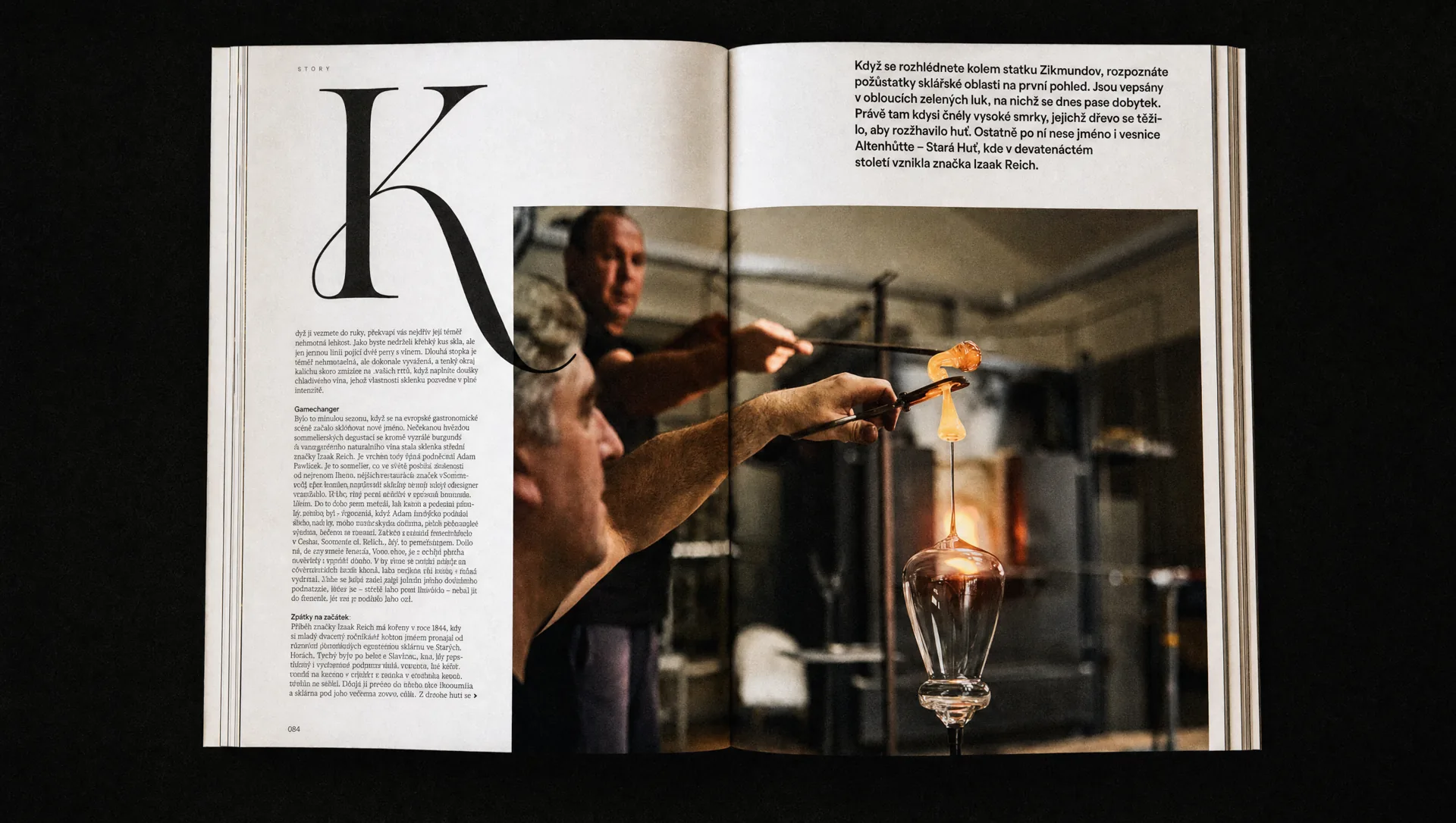
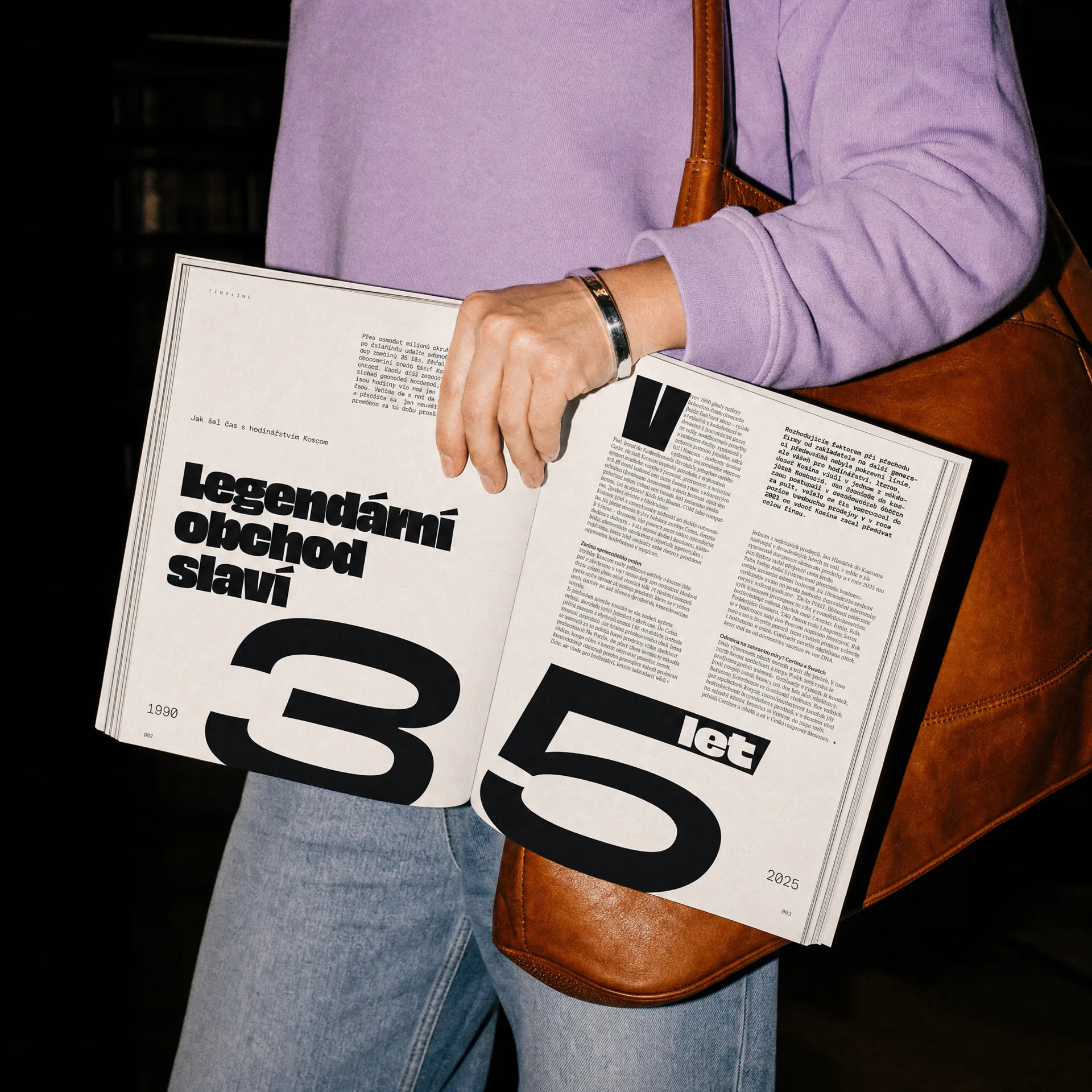
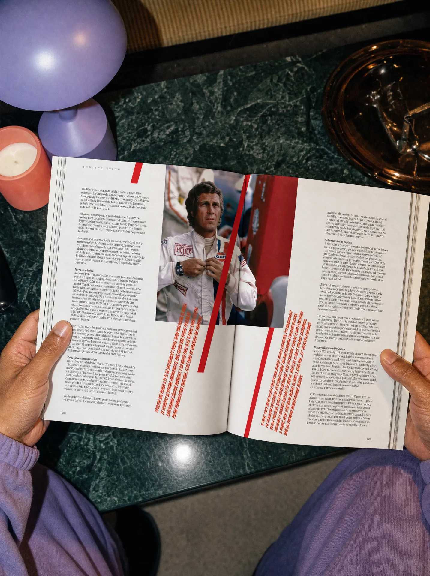
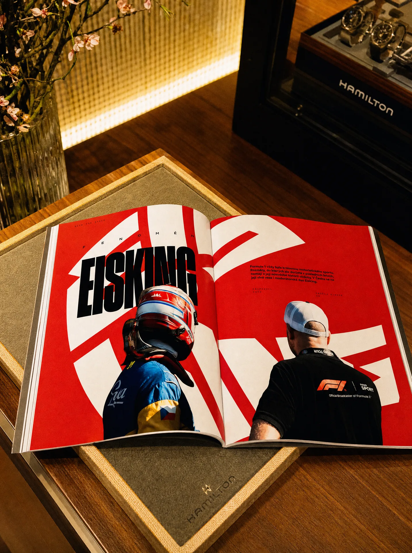
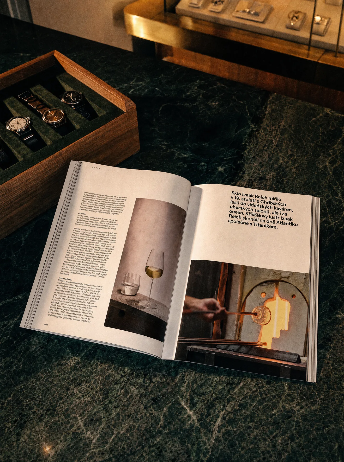
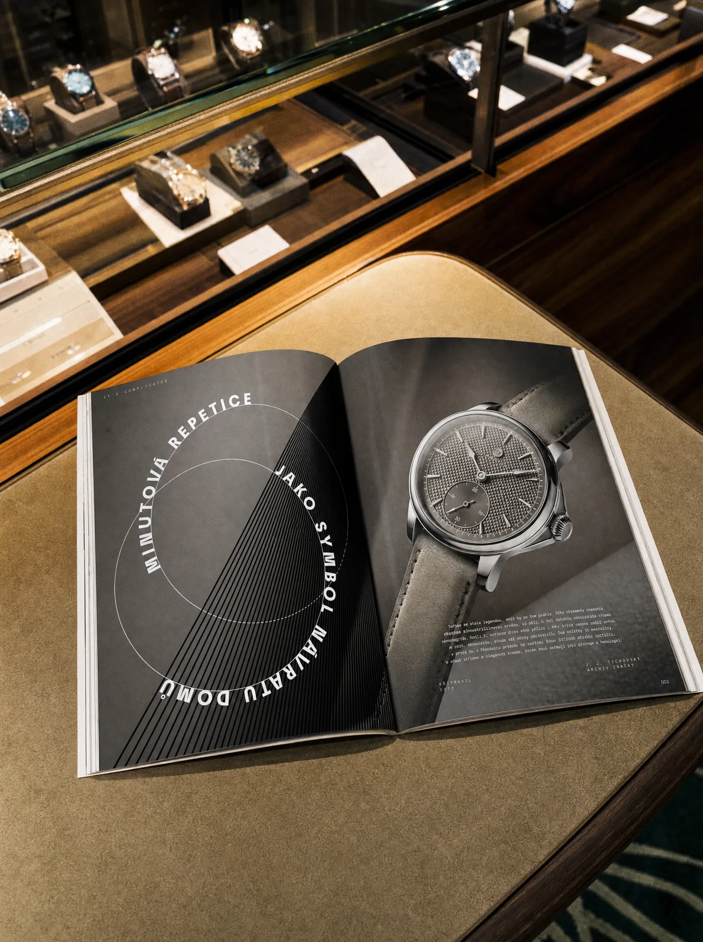
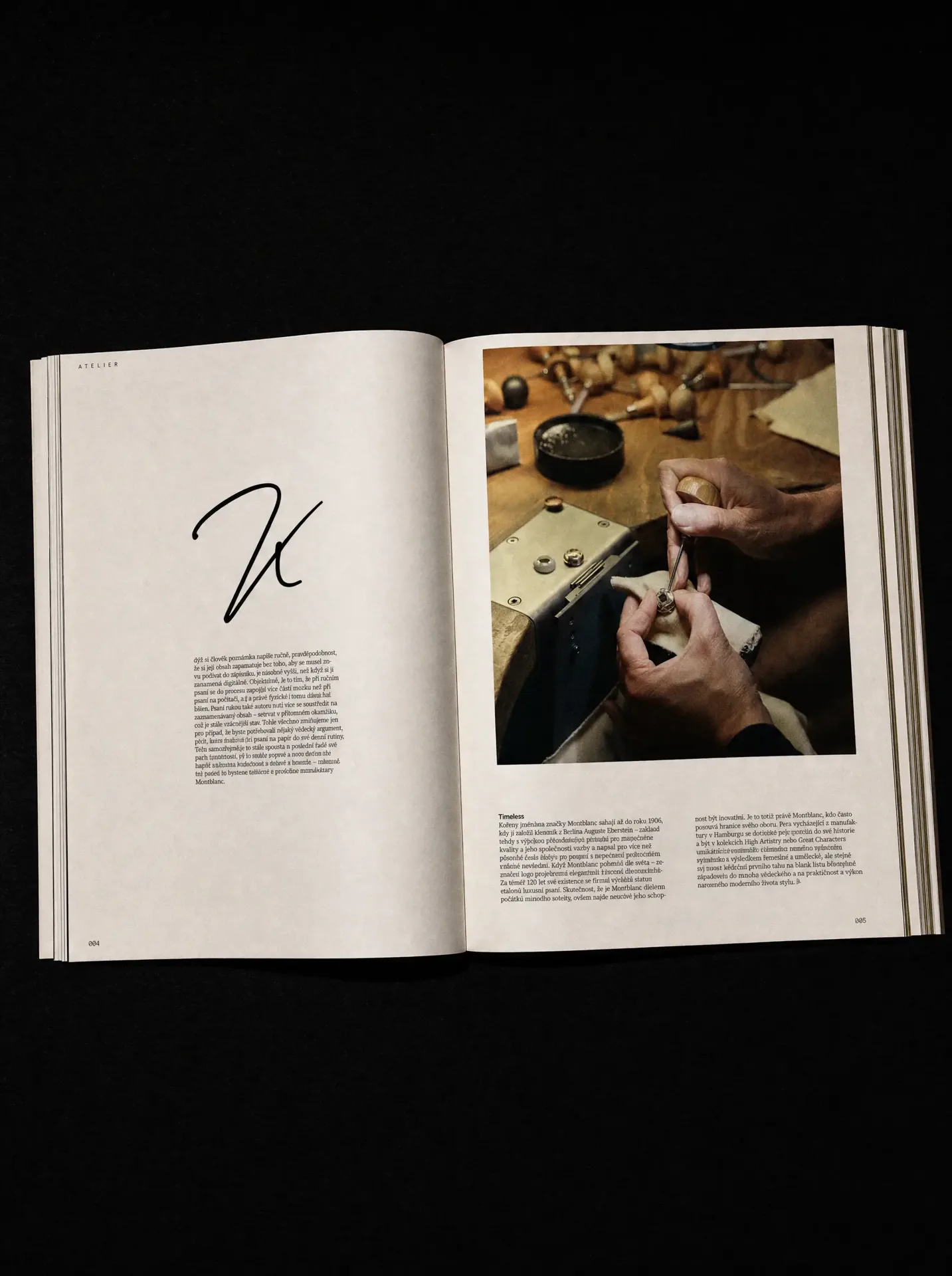
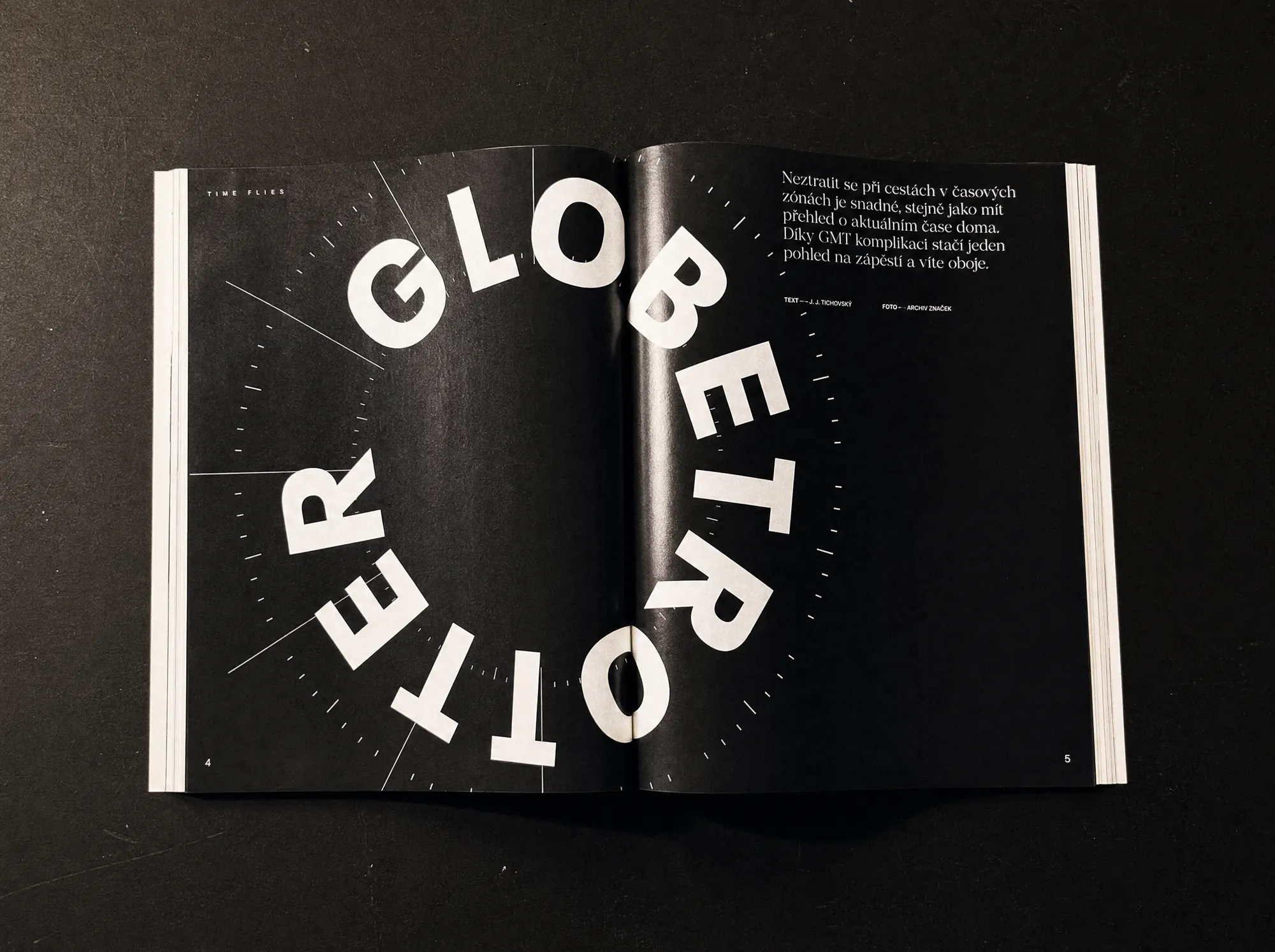
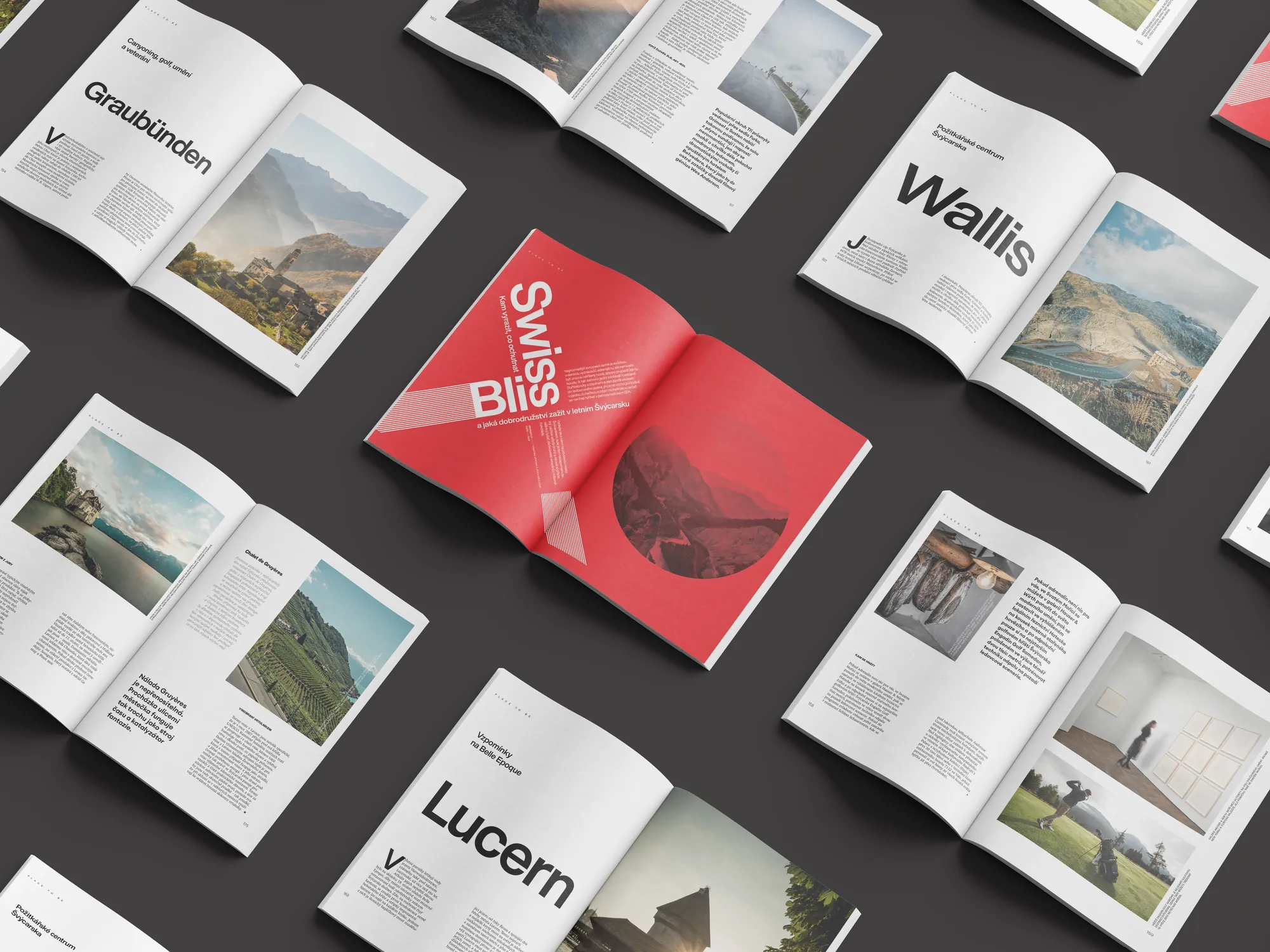
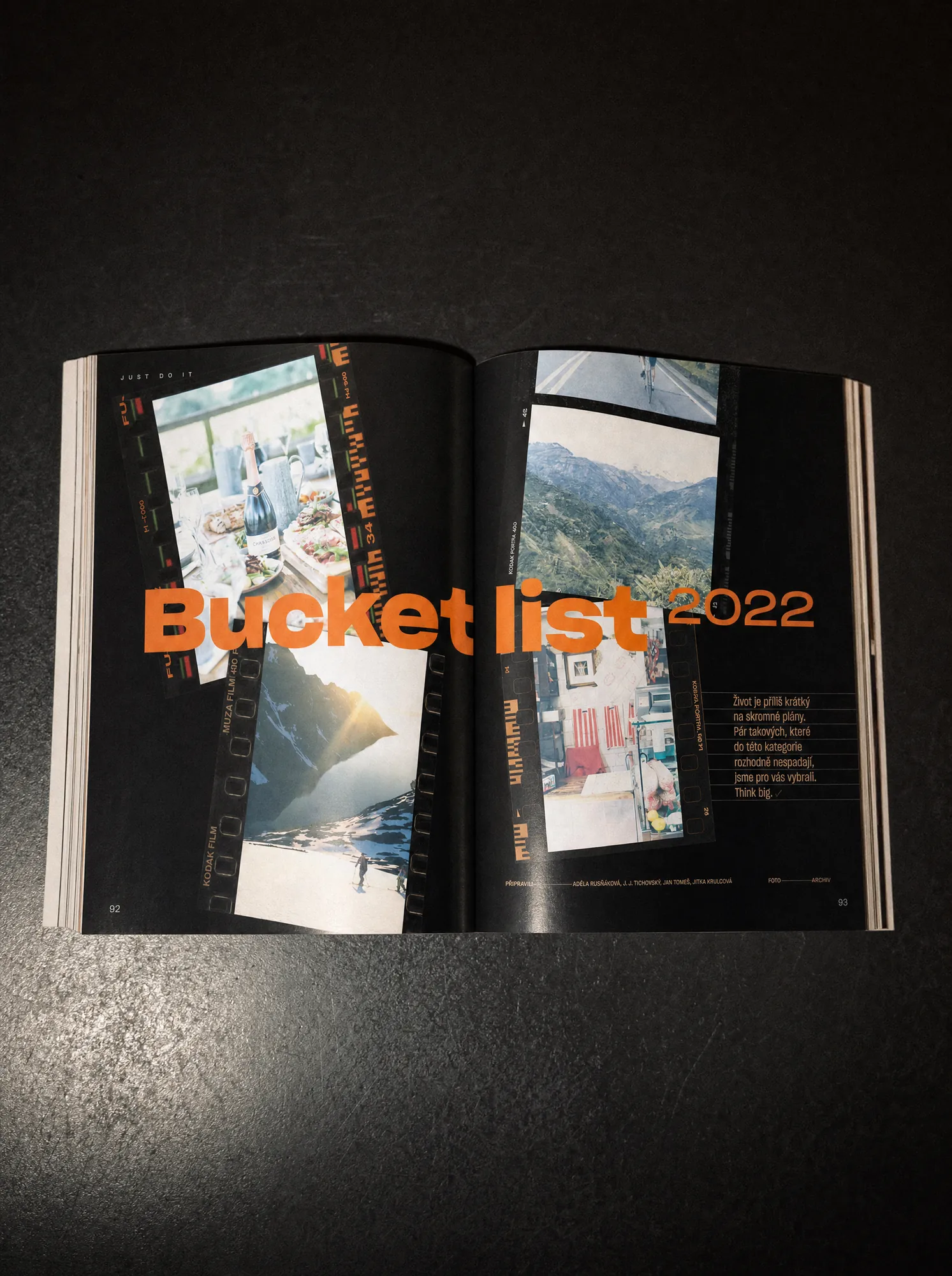
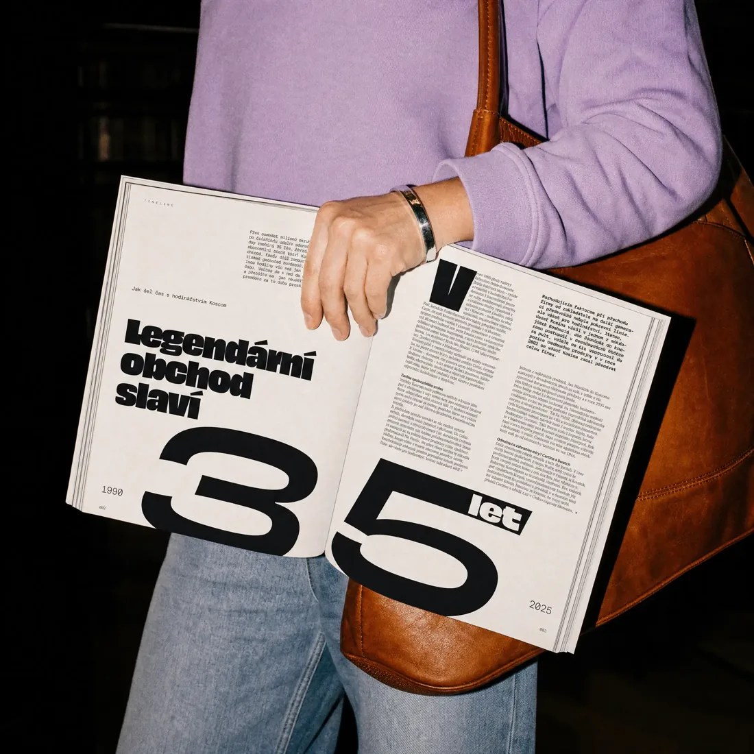
For Koscom’s anniversary magazine, our role was focused entirely on editorial art direction. Over roughly five months, we worked across around 25 articles, each with its own subject, tone and visual material. The challenge was to make every story feel unique while keeping the whole publication connected.
Koscom
Instead of forcing every article into the same template, we treated each one almost like its own small visual world. Typography, scale, image placement and composition could change depending on the story. Some pages could be quiet and restrained. Others could be bold, graphic or almost poster-like. The consistency came from the overall attitude, not from repeating the same layout.
Typography carried a large part of the magazine art direction. We used scale, contrast and hierarchy to give each article its own rhythm and to make long-form content feel more engaging. The layouts were designed to let photography, products and text breathe, rather than filling every available space. The goal was to make the publication feel considered from page to page, but never predictable.
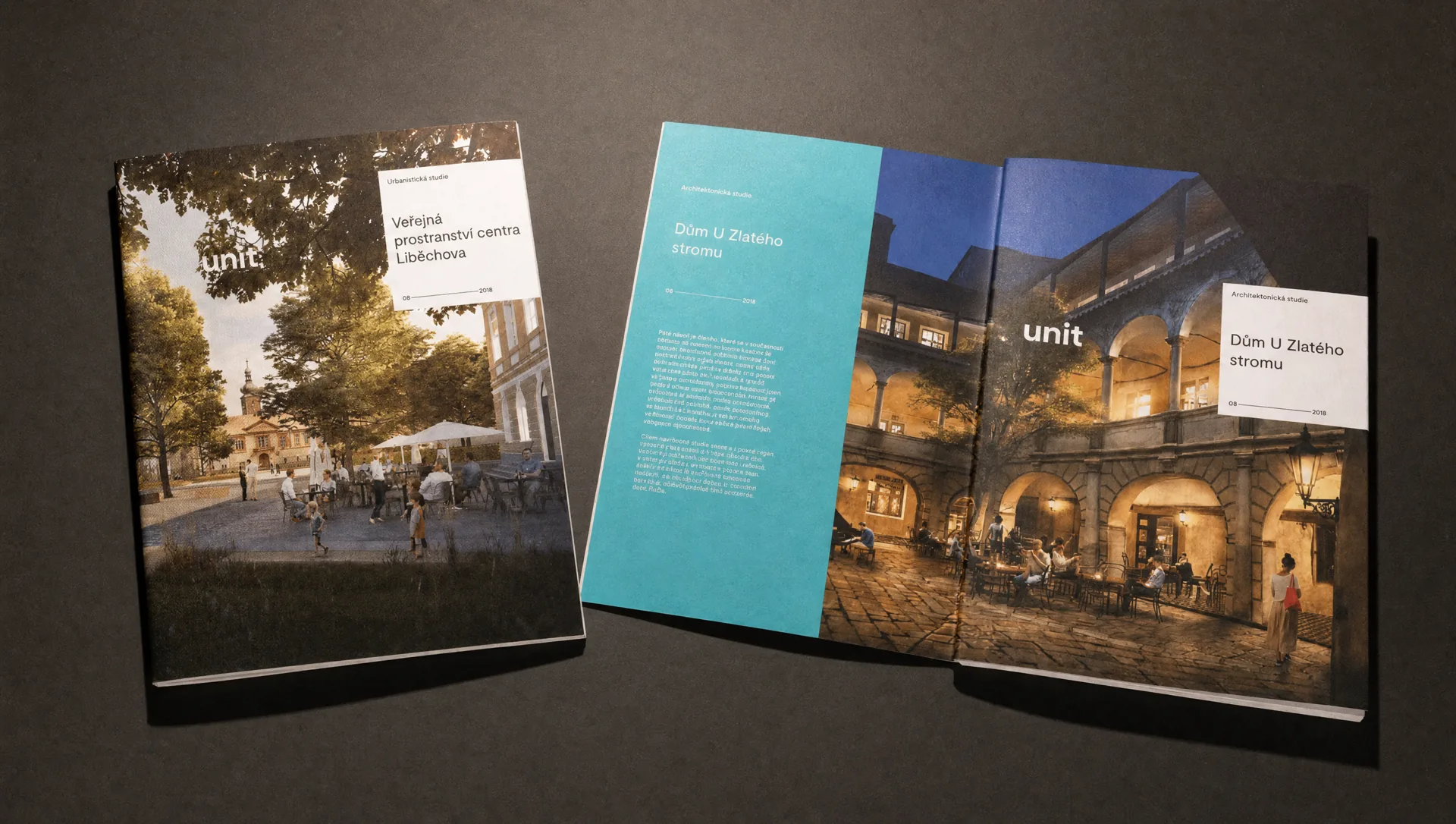
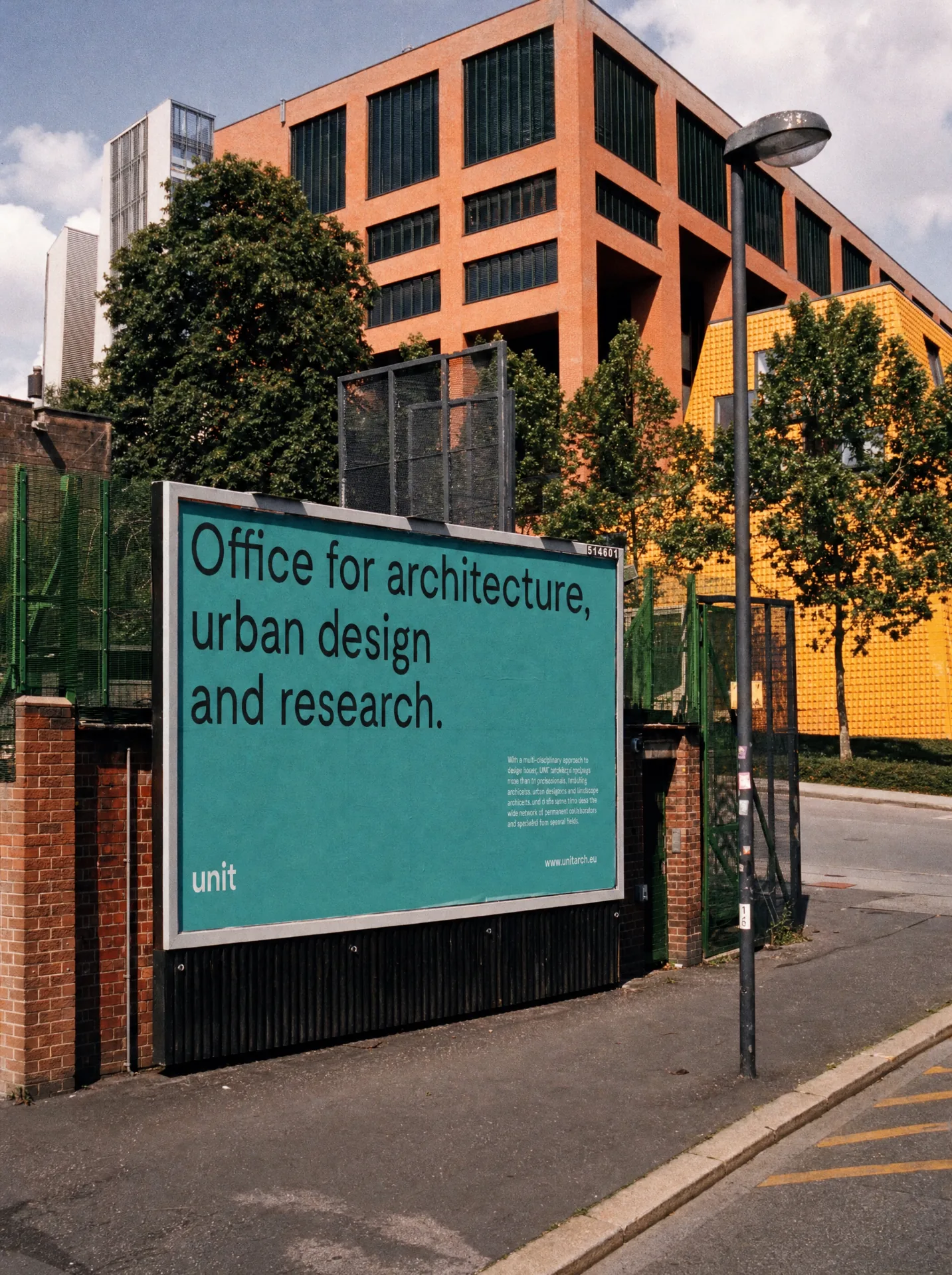
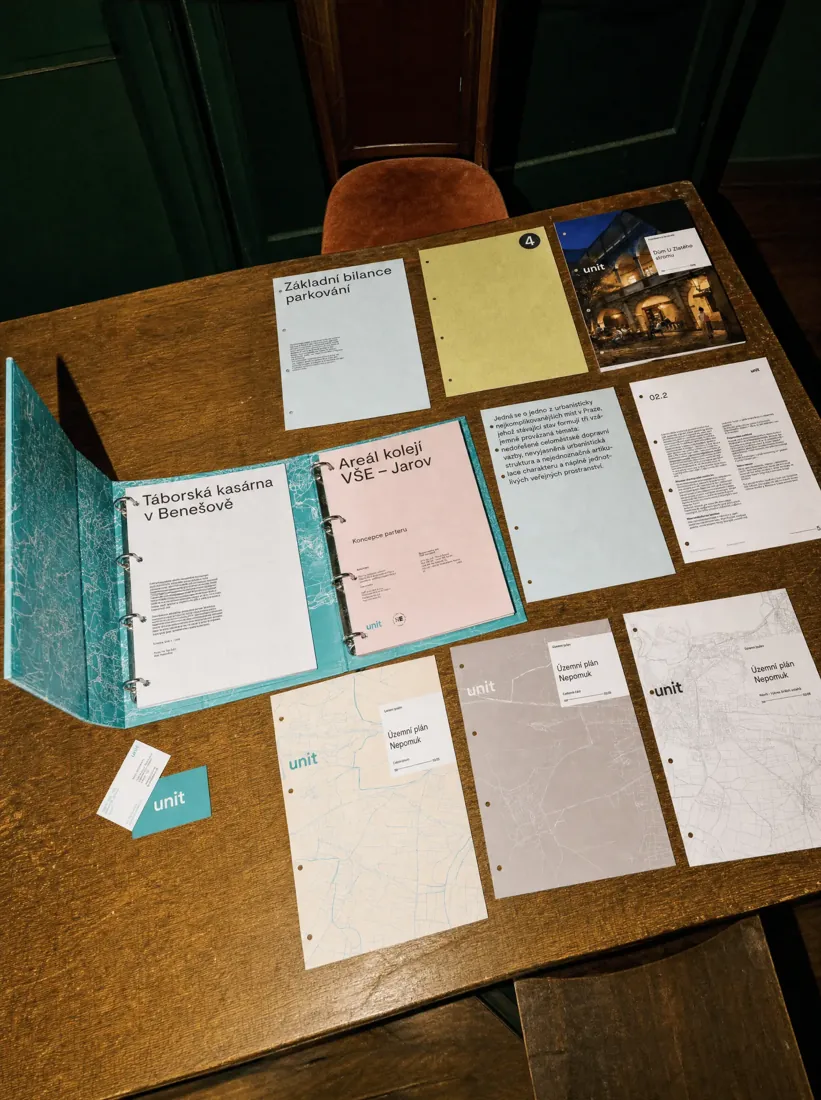
UNIT is one of the most recognised architecture and urbanism studios in the region. Like many studios busy shaping other people’s projects, their own identity had been waiting for attention. The goal was evolution, not revolution. We spent almost two years building a visual identity system that could work across an unusually wide range of documents, project stages, presentations and digital applications. The result is deliberately quiet: clear typography, simple elements and a system designed to stay relevant for decades.
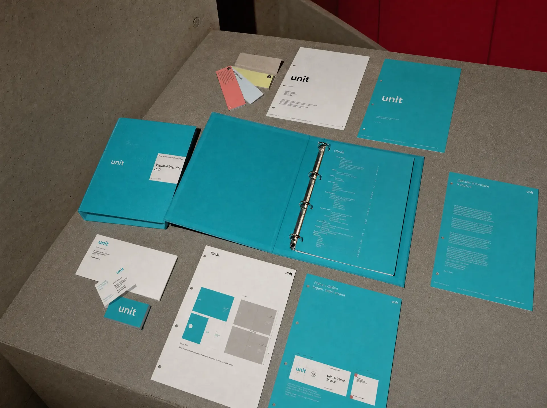
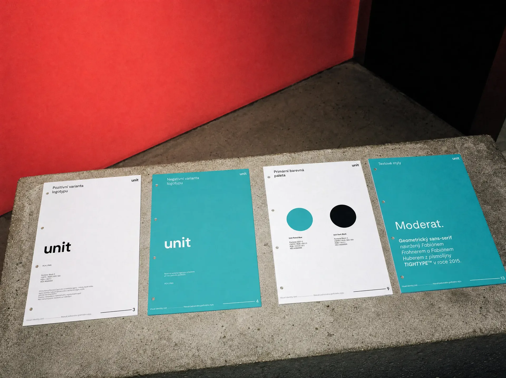
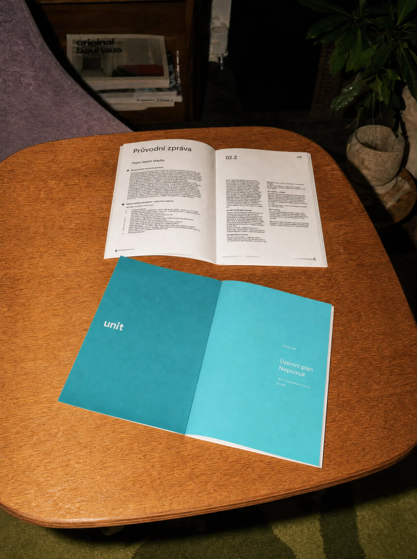
The original UNIT logo was built around a square, and that was something worth keeping. Instead of treating it as a conventional logo mark, we turned the square into the main structural element of the new architecture brand identity. It became a content and headline label used across covers, documents and layouts, with clear rules for different levels of information. Alongside it sits a simple standalone UNIT logotype. The identity changed, but the element people already associated with UNIT stayed at its core.
Most of the identity is carried by typography, so it needed to be strong enough to work almost on its own. We chose Moderat by Tightype for both the logotype and the main typographic system. Its straightforward grotesque character gives UNIT a clear, contemporary voice without competing with architecture, plans or photography. The colour palette follows the original brand as well. UNIT’s recognisable blue-green tone remained the foundation, with a subtle adjustment and a controlled set of supporting combinations. Nothing is there simply to decorate. Everything creates hierarchy.
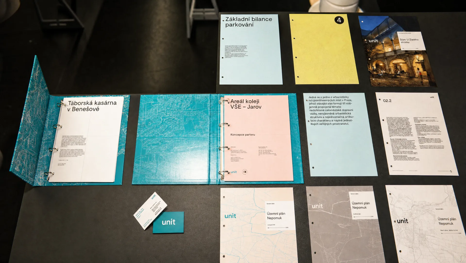
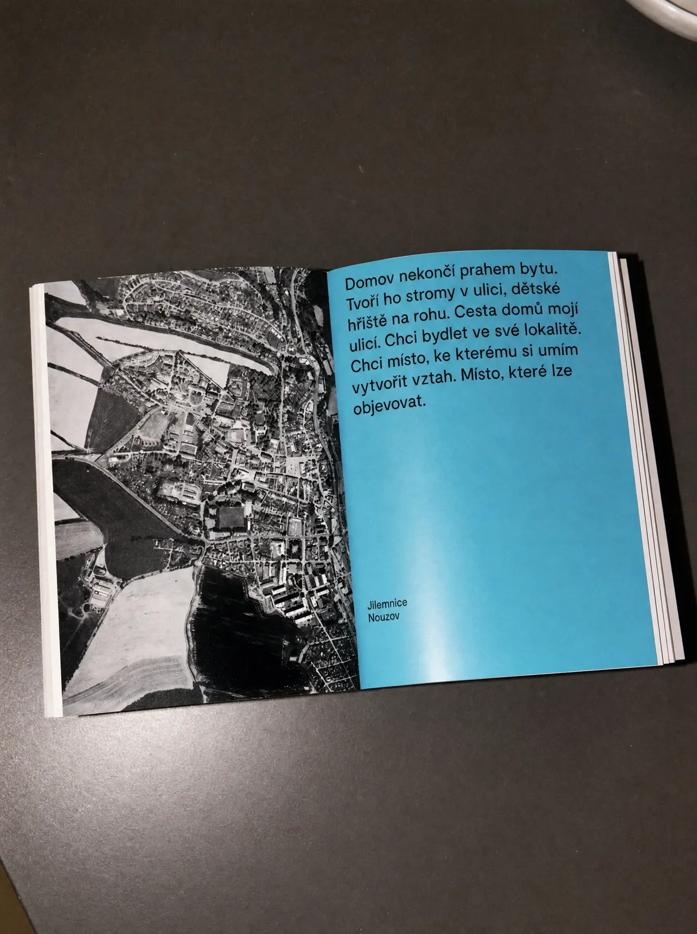
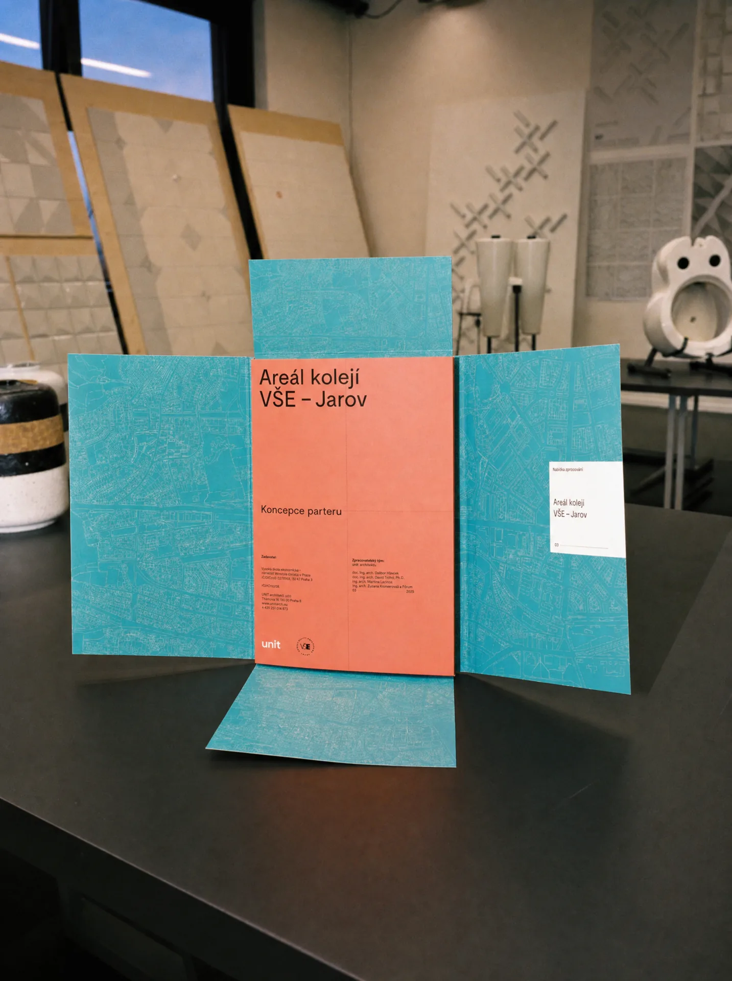
UNIT is a multidisciplinary architecture and urbanism studio, which means the amount and variety of material it produces is enormous. Different stages of a project need different covers. Generic documents need their own variations. Plans, studies, reports and presentations all need to be distinguishable while still clearly belonging to one brand. We built a system of covers using outlined maps, multiple colour combinations and the UNIT square as a constant anchor. The content can change completely. The system does not.
The final brand manual looks simple. That is the point. Behind every margin, label, hierarchy, cover and layout is a precise set of rules, calculations and relationships. A lot of mathematics sits underneath something that should feel effortless to use. The guidelines took almost two years to complete because the aim was not just to design beautiful examples. It was to build rules clear enough that anyone at UNIT could create new material without slowly breaking the identity.
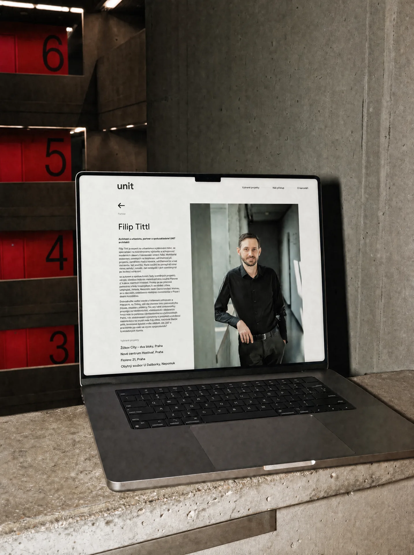
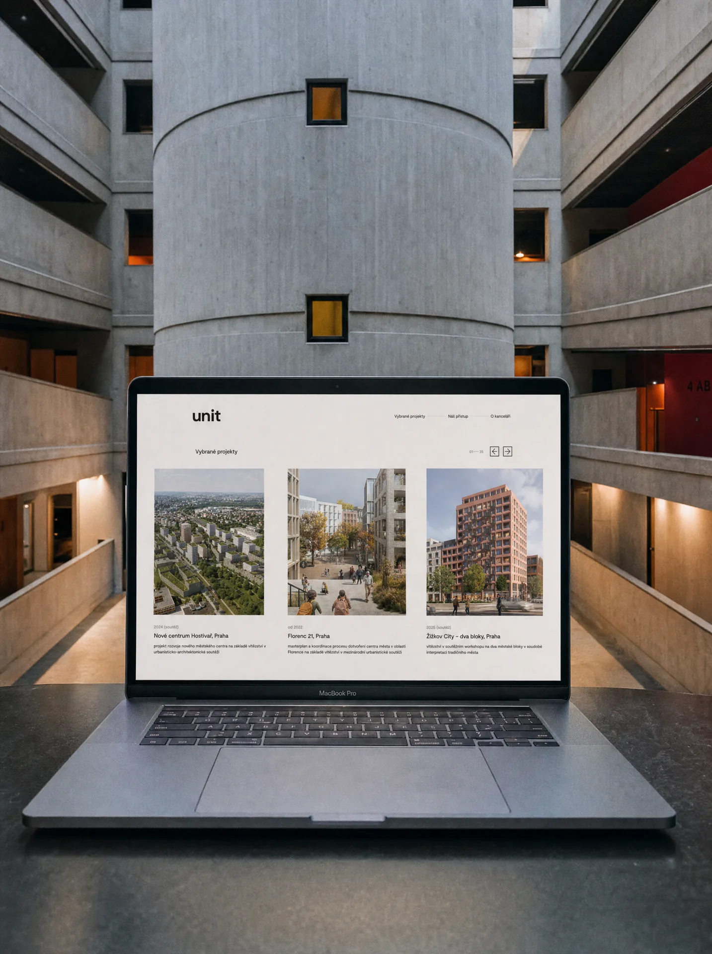
The architecture studio website brings the same thinking into a digital environment. UNIT works across architecture, urbanism, public space, research and projects at very different scales. The challenge was to make that breadth easy to navigate without introducing another visual layer competing with the work. Strong typography, precise hierarchy, restrained colour and a simple project structure give plans, drawings and photography the space they need. The brand becomes a framework rather than decoration.
UNIT did not need a louder identity. It needed one that could support the scale and quality of its work while remaining consistent across years of projects, teams and applications. The result is a system that feels almost obvious when you use it: one logotype, one square, one typographic language and a carefully defined set of rules. Simple on the surface. Extremely precise underneath.
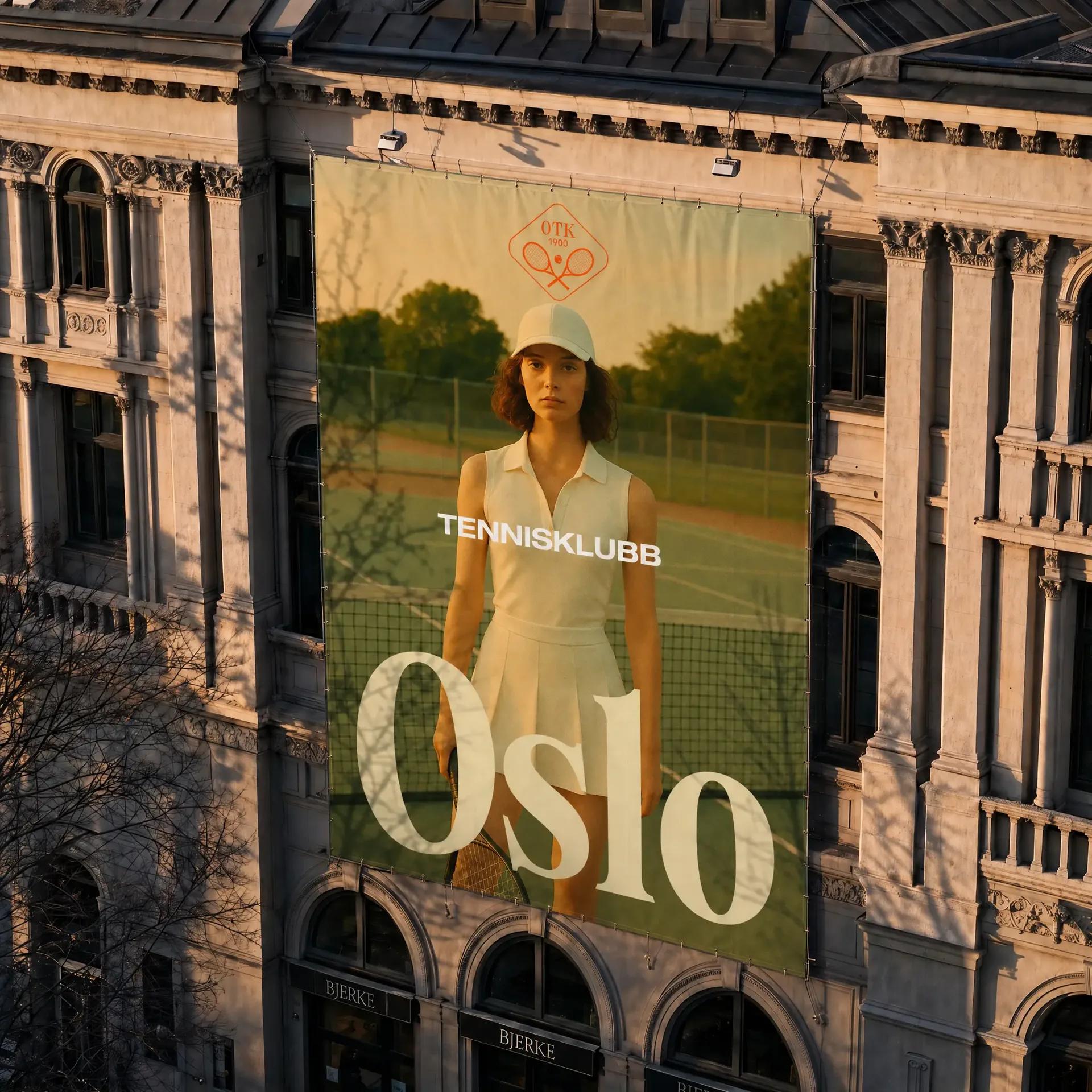
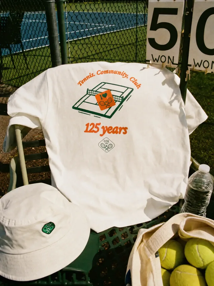
Oslo Tennisklubb has been part of the city since 1900. The challenge was not to reinvent it, but to give its history a stronger and more flexible expression for today. We refined what already made the tennis club recognisable and built a brand system around it that could feel premium and established, while still being open, energetic and welcoming.
The original emblem carried too much history to replace. Instead, we refined it. The crossed rackets, tennis ball and founding year stayed at the centre, but the proportions, details and construction were simplified to make the symbol stronger and easier to use everywhere. The result feels familiar without feeling old.
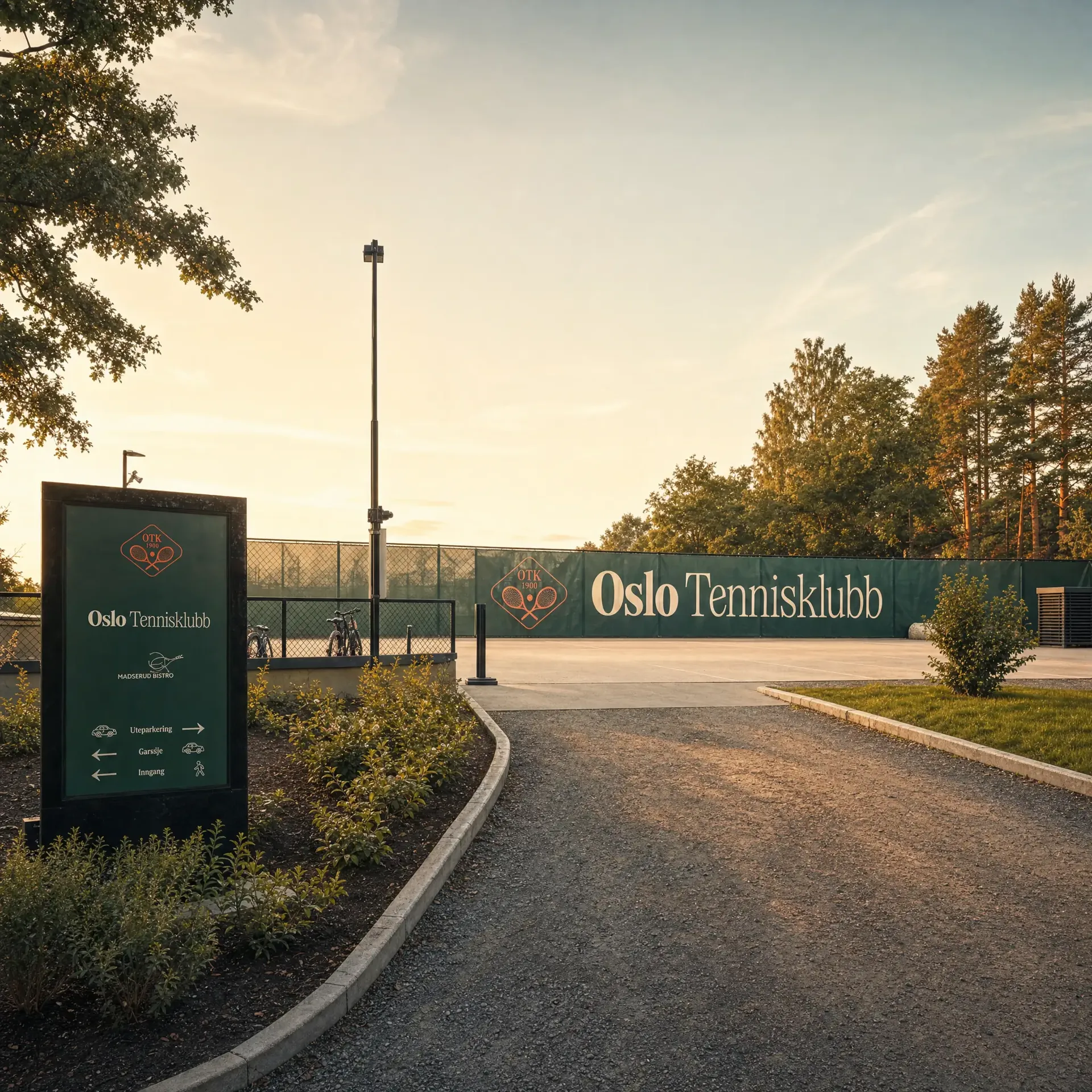
The symbol is only one part of the identity. The logotype gives it a different voice. We combined a strong, expressive “Oslo” with a much lighter “Tennisklubb”, creating a contrast that feels both established and contemporary. Used together with the emblem, the identity can shift from formal and heritage-driven to bold and expressive without losing recognition. This flexibility became important across signage, merchandise, communication and the club website.
We deliberately built the identity around several typefaces rather than forcing one font to do every job. Each has a clear role. Helvetica Extended brings structure and confidence. Tartuffo adds heritage and character. Restart gives the system a more expressive voice, while Exposure Italic adds movement and a human touch. The contrast is intentional. Together, they let Oslo Tennisklubb move between formal, playful, premium and energetic without becoming inconsistent.
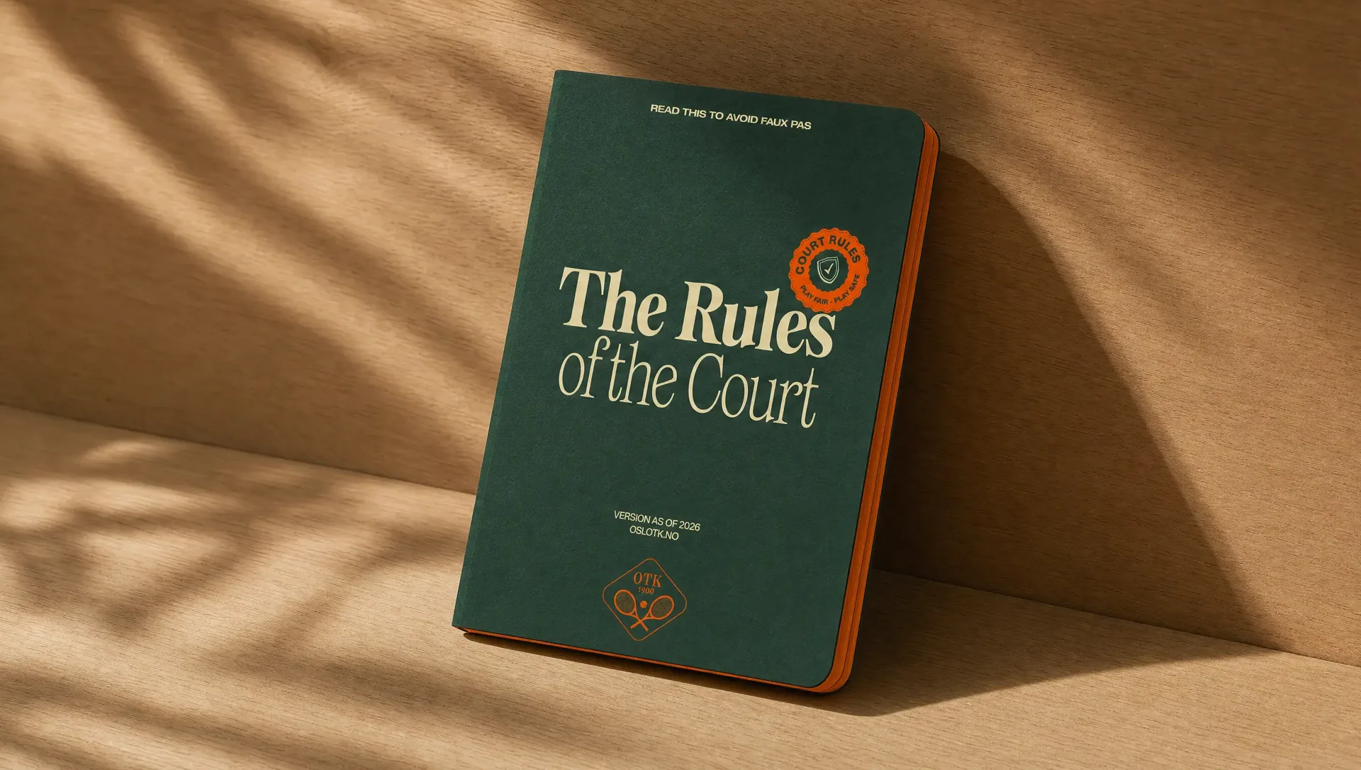
Once the identity had more than one voice, it needed rules that would hold everything together. Dark green remained the foundation, connected to the club’s history, while clay orange and sandy beige gave the brand warmth and a more contemporary character. Typography, colour, photography, stickers, illustrations and layout all work as parts of the same system rather than isolated elements. The brand can change tone depending on the context: quiet and prestigious when needed, expressive and energetic when the club comes alive.
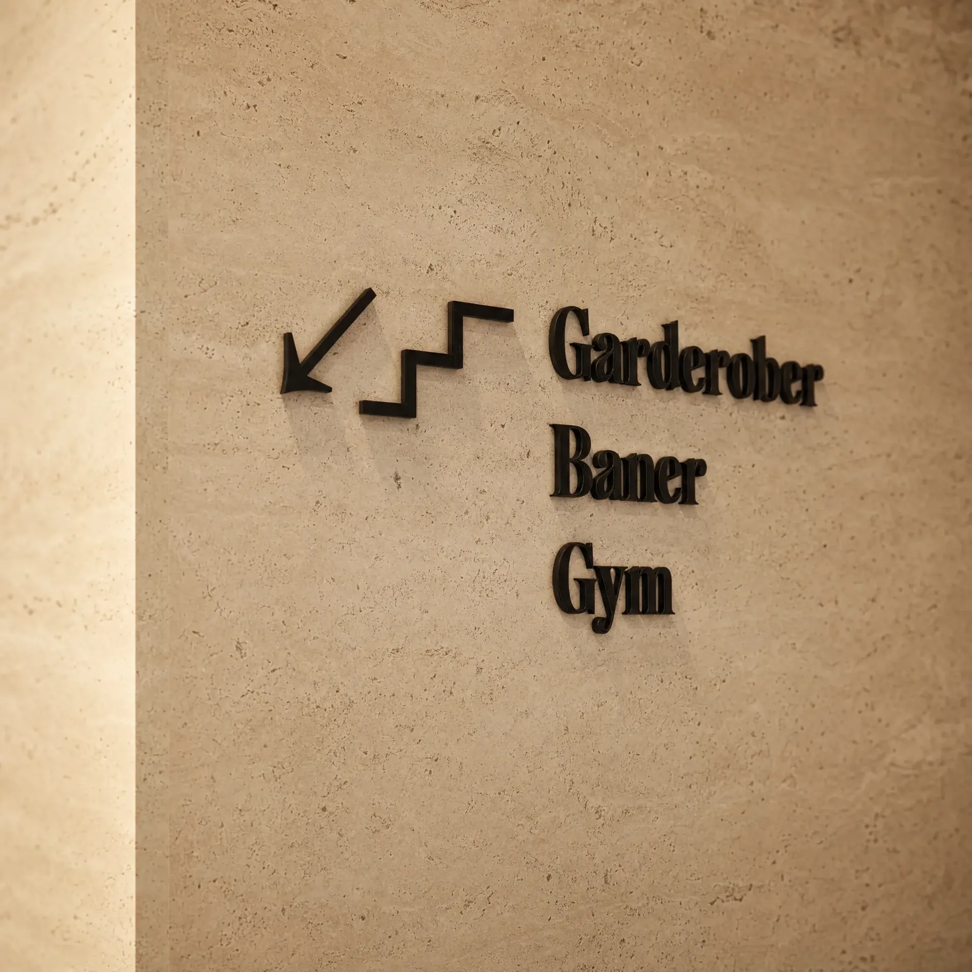
A flexible identity only works when everyone knows how to use it. The brand manual turns the visual language into a practical system. Symbol versions, typography, colour, layouts, imagery, illustration, signage, stickers and tone of voice all have clear roles and rules. The goal was not to make every application look identical. It was to let different people and partners create new things while keeping everything recognisably Oslo Tennisklubb.
The website is where the identity gets to move. Instead of creating one fixed visual template, we treated each page as a canvas. Colours change. Typefaces take different roles. Photography, hand-drawn illustrations, stickers and layouts can become louder or quieter depending on the content. That flexibility makes the tennis club website feel alive, while the underlying system keeps every page unmistakably OTK. At the same time, the experience had to work for very different audiences: long-time members, families, new players and people discovering the club for the first time. The structure makes it easier to understand what the club offers and find a way in.
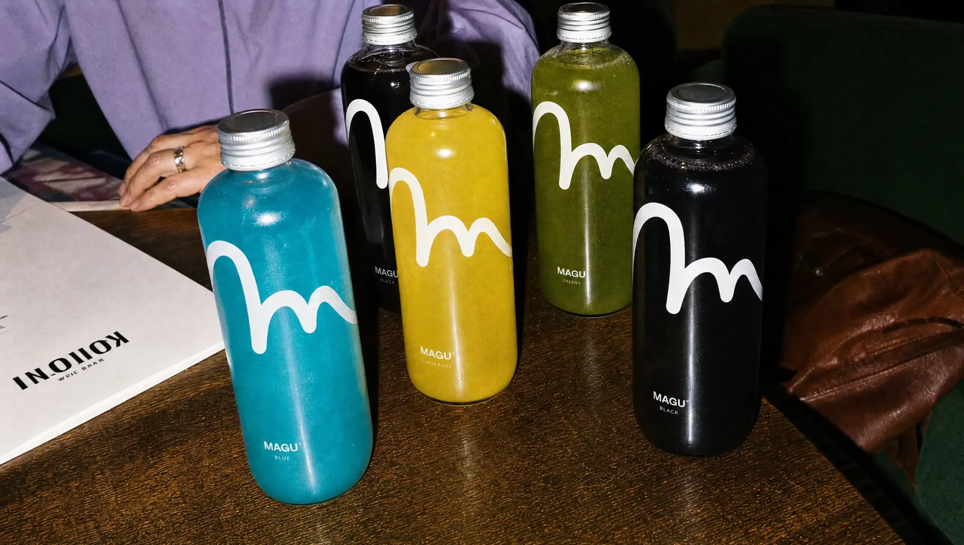
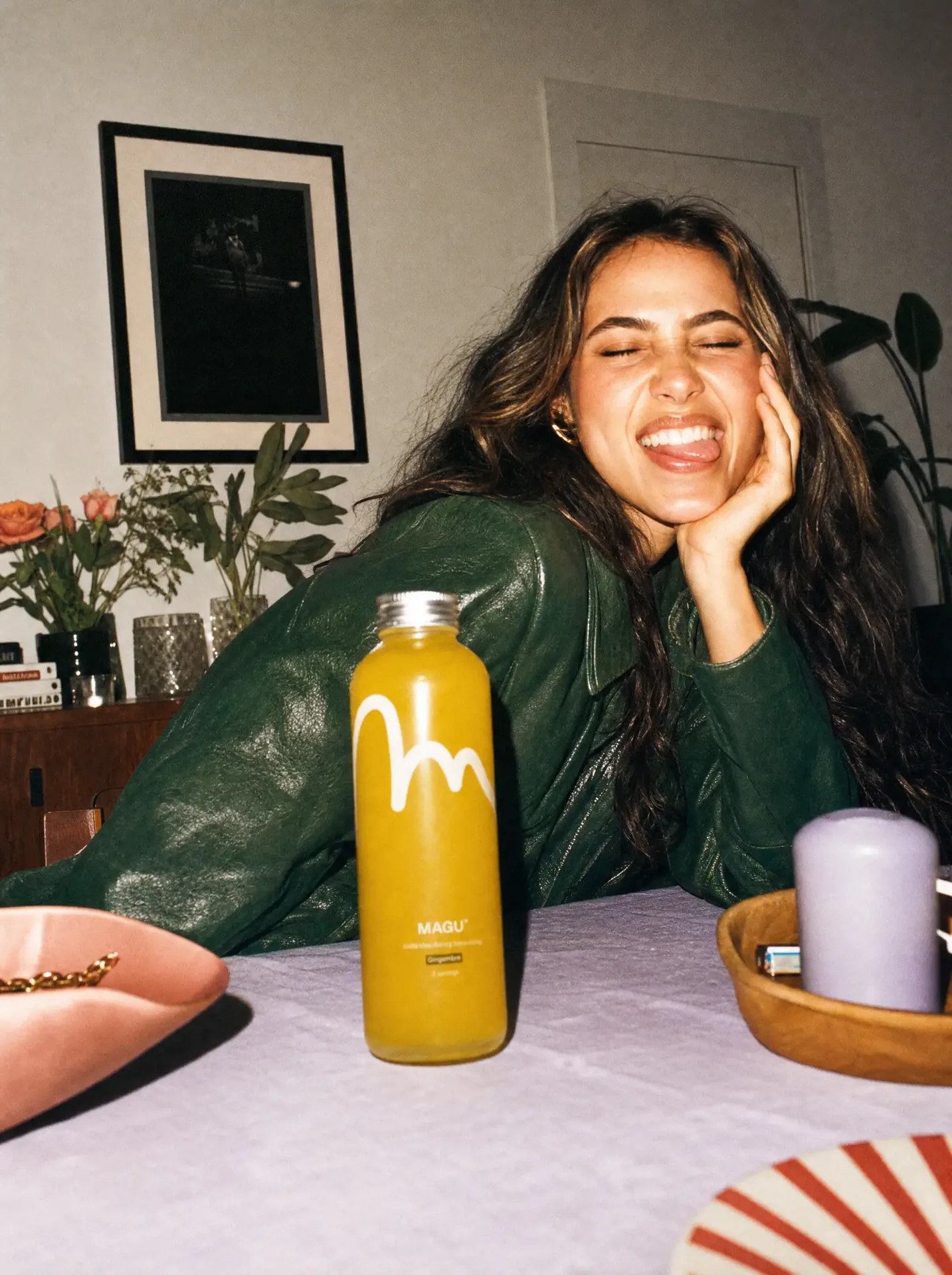
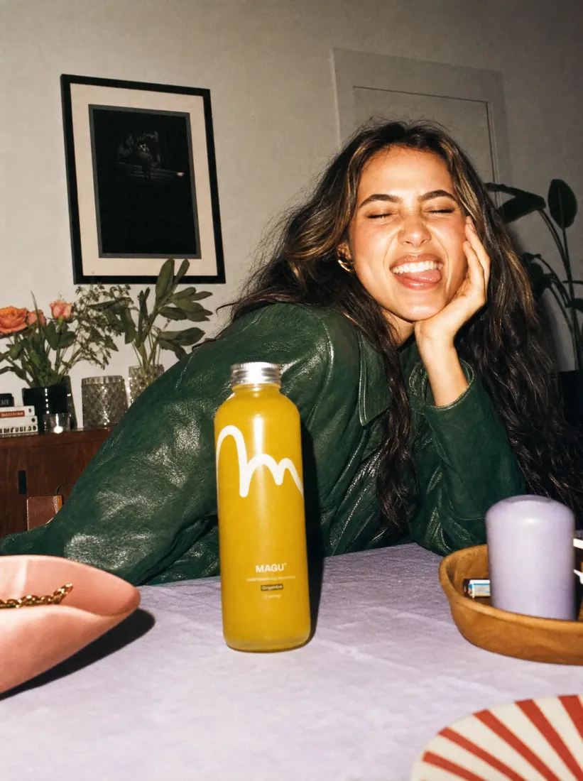
Magu needed to stand out in a category where almost every beverage was trying to do the same thing: use more colour, more ingredients, more claims and more visual noise. For the Magu brand identity and packaging design, we chose the opposite direction. Strip everything back and let the product itself do the work.
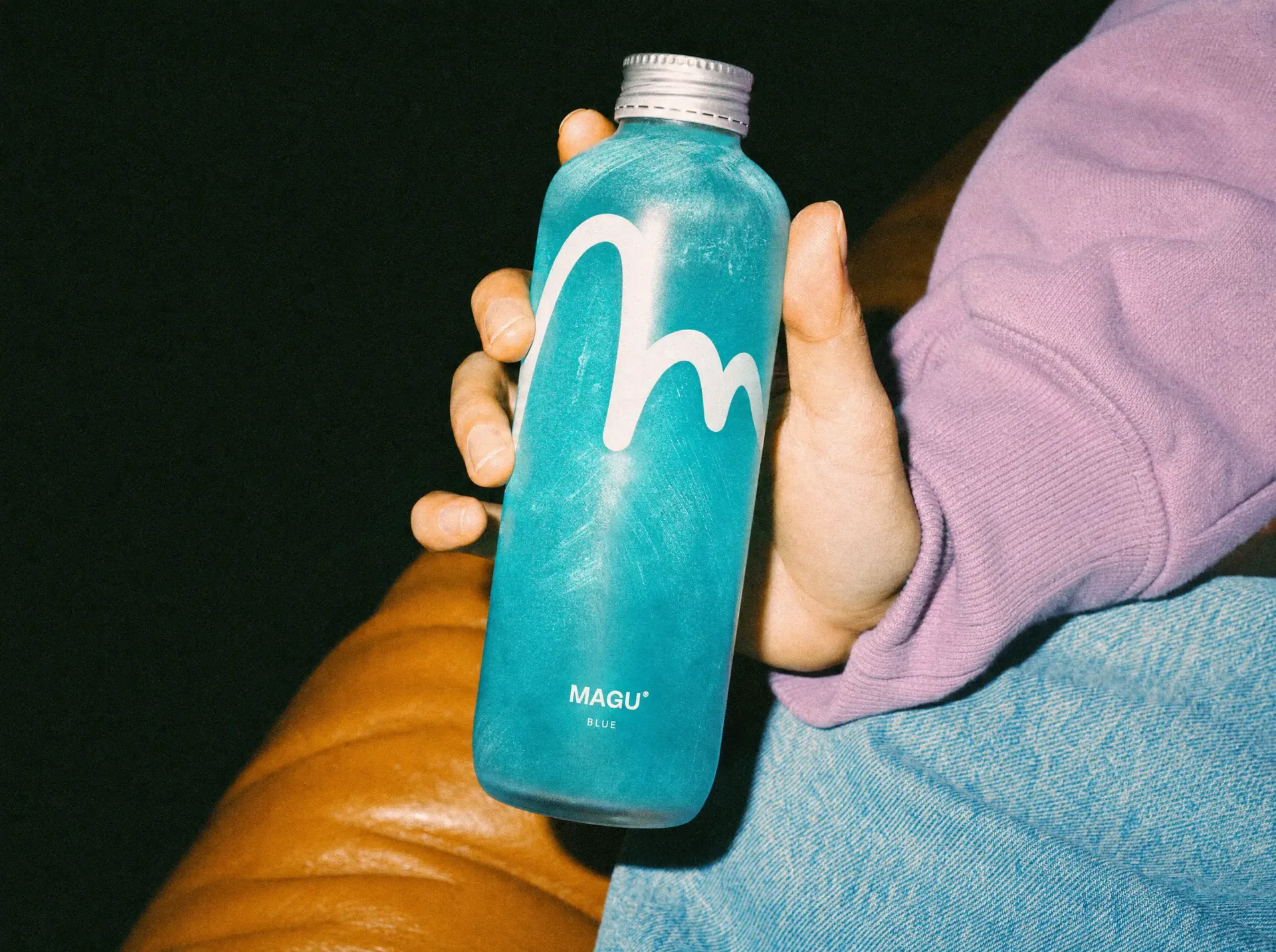
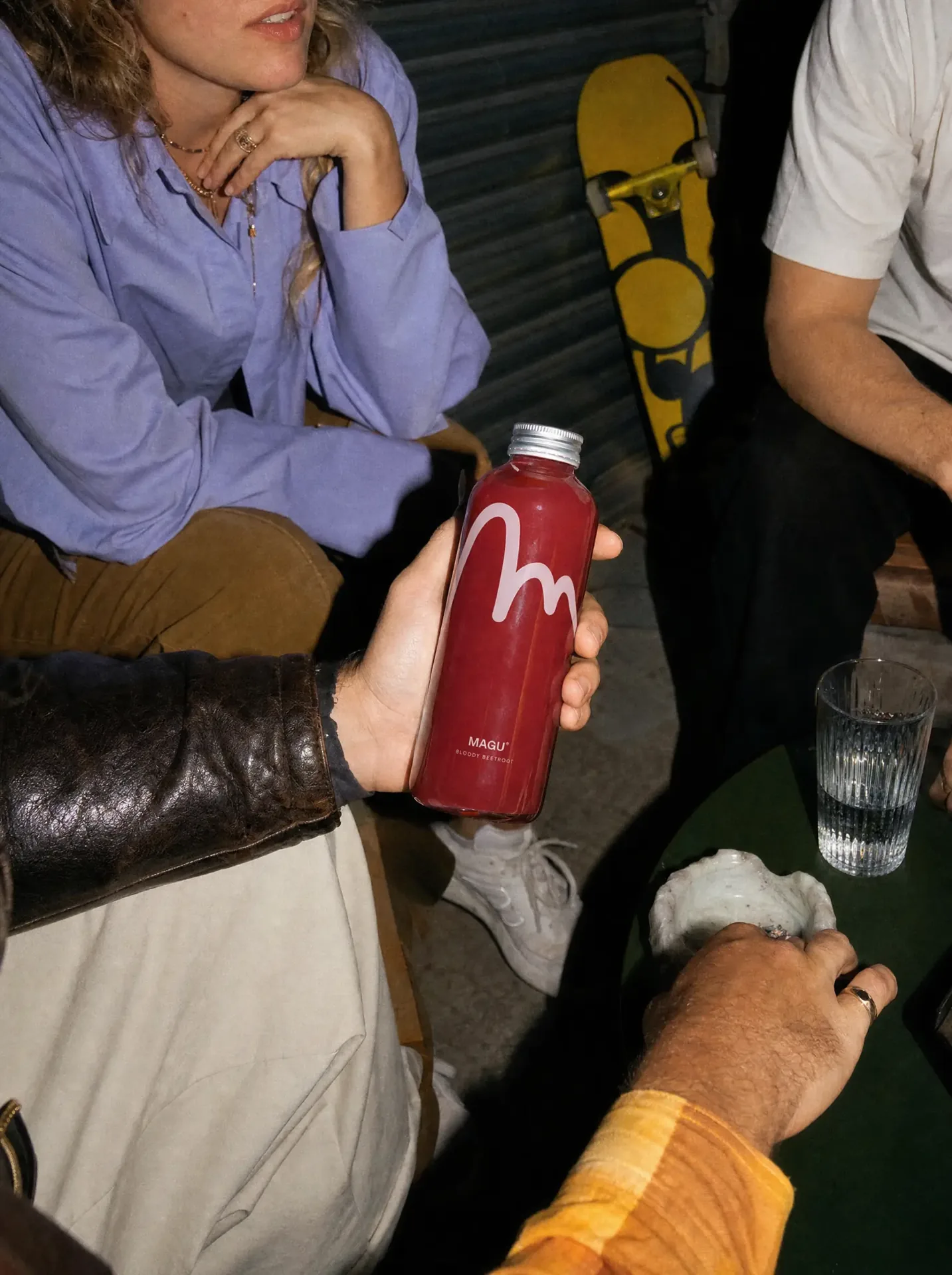
Every Magu already has its own distinctive natural colour. Blue, yellow, green, red. Nothing needed to be invented. We left the bottle transparent and used the drink itself as the main visual element. The only strong gesture is the hand-drawn M, placed over the liquid almost like a signature.
The identity is built around removing rather than adding. A simple bottle, one recognisable gesture and typography that never competes with the product. Even the product name can stay surprisingly small. With almost nothing else on the front, it is still immediately visible. What looks simple is carefully controlled. Every element has a job, and anything that does not need to be there stays out.
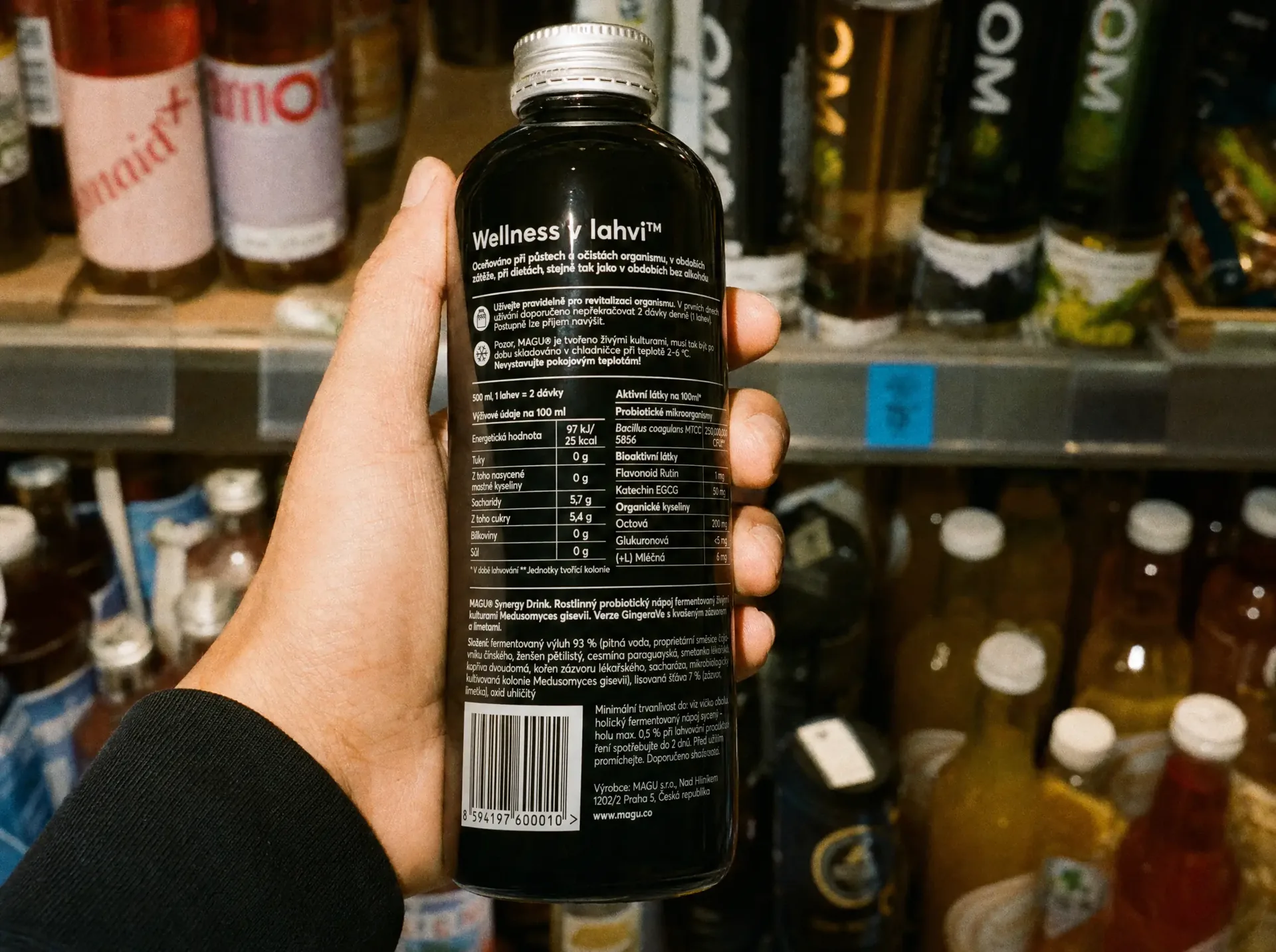
The front could only stay this clean because the complexity was moved somewhere else. Ingredients, nutritional information and everything legally required were carefully organised on the back. Typography stays functional and compact, giving the front of every bottle as much room as possible to breathe.

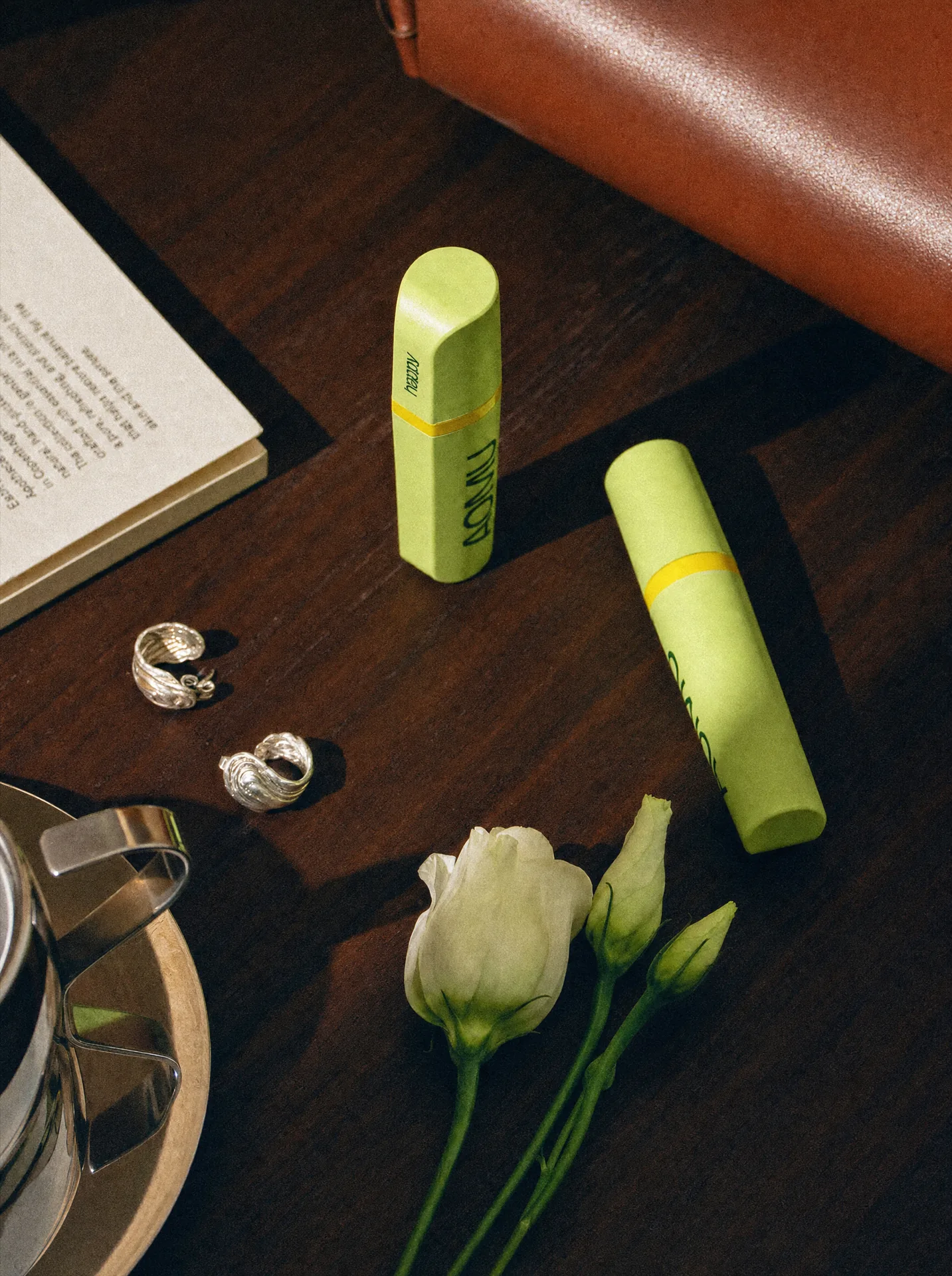
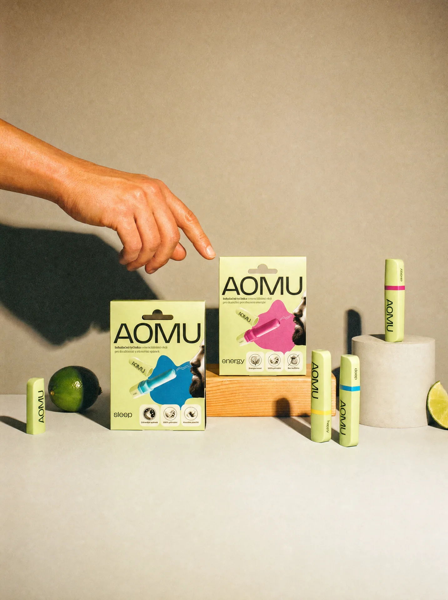
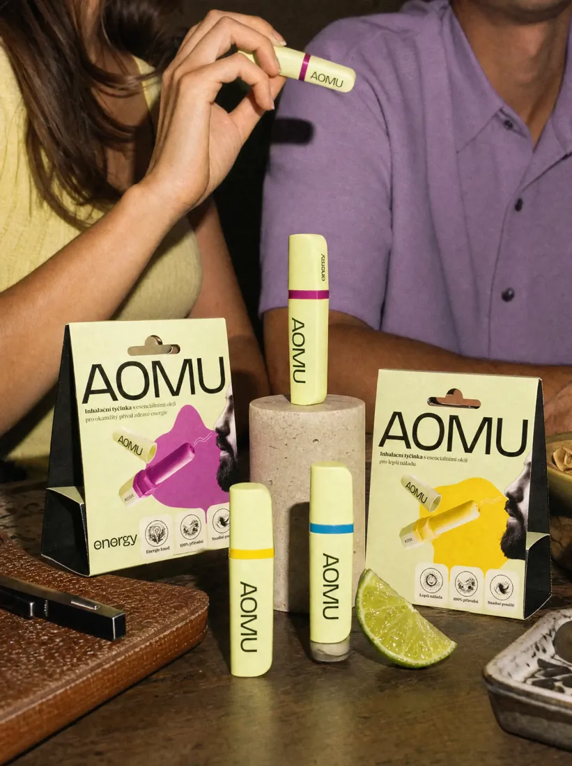
AOMU started without an established visual language. We created the brand from the ground up: logo, logotype, colours, typography, packaging and the wider visual system around the products. The goal was to build a wellness brand identity distinctive enough to be remembered, but simple enough to grow with the company for years.

The identity began with the logo and wordmark. We wanted AOMU to feel contemporary, calm and premium without becoming cold or overly clinical. The mark needed to work just as well on a small product label as it did across packaging, digital communication and larger brand applications. The result is deliberately simple, giving the rest of the identity space to evolve around it.
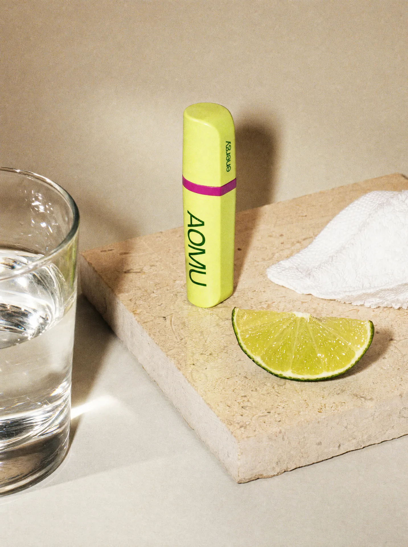
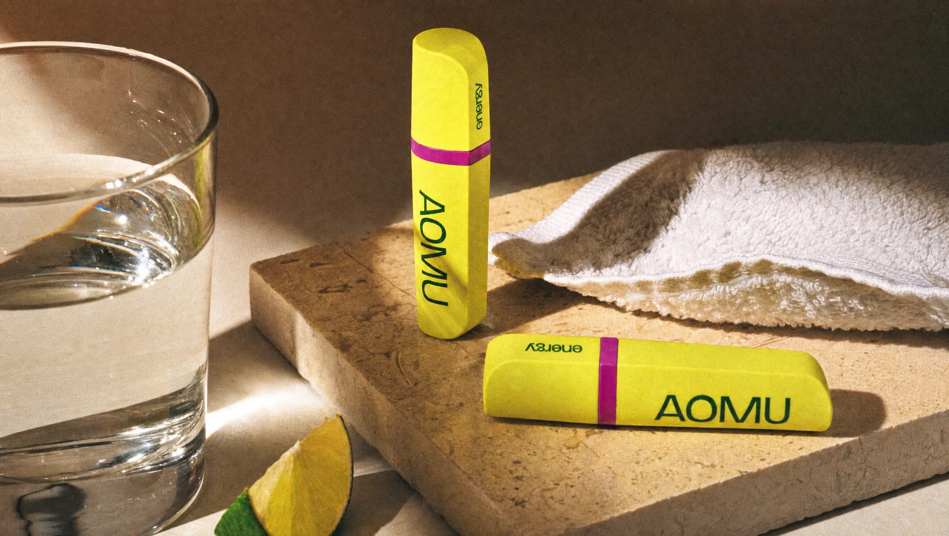
Colour became one of the key tools for creating recognition. We developed a palette that gives AOMU its own atmosphere while staying flexible enough to work across different products, formats and campaigns. Combined with clean typography and a restrained layout system, the identity feels calm and controlled, but never anonymous. Every element has enough character to be recognisable without competing with the product.
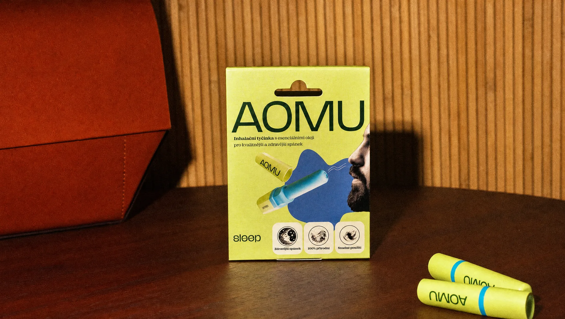
Packaging is where the AOMU brand becomes physical. We built a product packaging system that brings the logo, colour, typography and product information together in a clear and consistent way. The challenge was to keep the packaging simple while still giving each product enough individuality. The result feels like one family, not a collection of unrelated products.
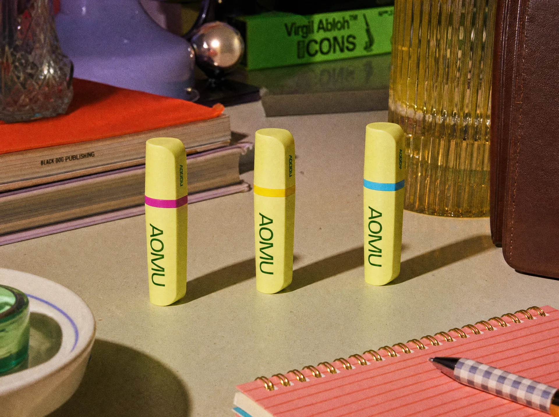
The identity was designed to work far beyond the packaging. We created a wider set of assets and rules for digital communication, social content, print, photography and everyday brand applications. Rather than designing each touchpoint separately, we built a system that could generate new material while staying unmistakably AOMU. That gave the brand consistency from day one.
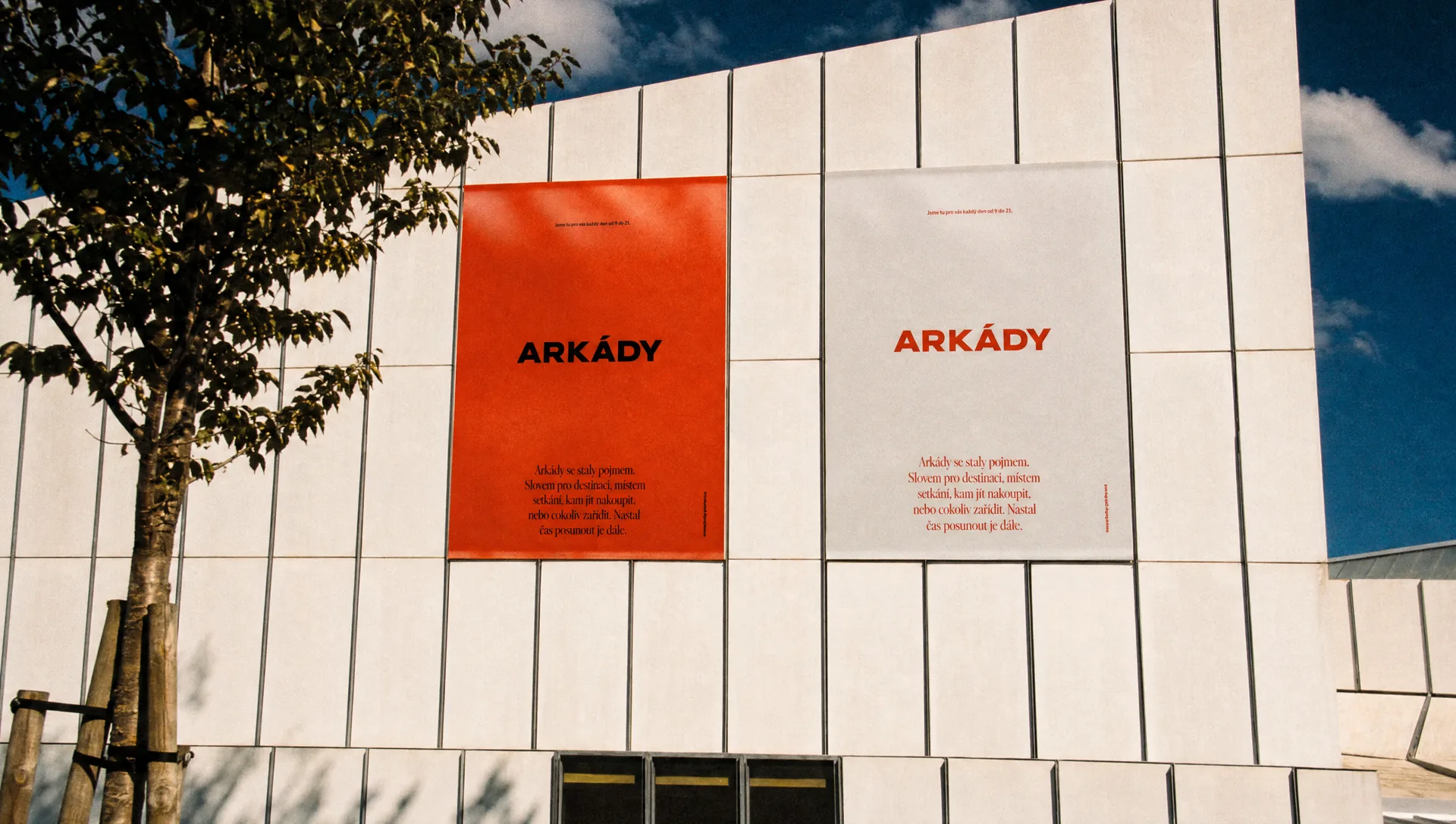
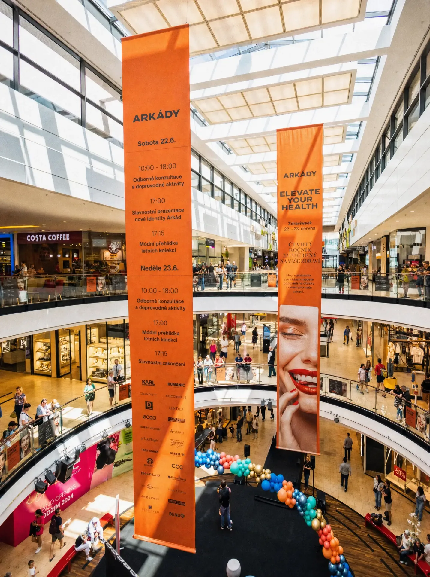
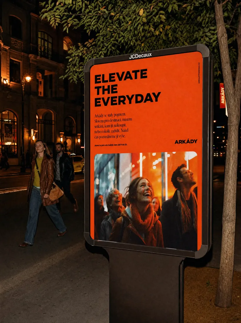
Shopping centres often end up looking surprisingly similar. The same visual language, the same polished neutrality, the same effort to appeal to everyone. For the Arkády rebrand, the goal was different. We wanted to create a retail brand identity with enough personality to be recognised immediately and enough flexibility to work across a constantly changing shopping environment.
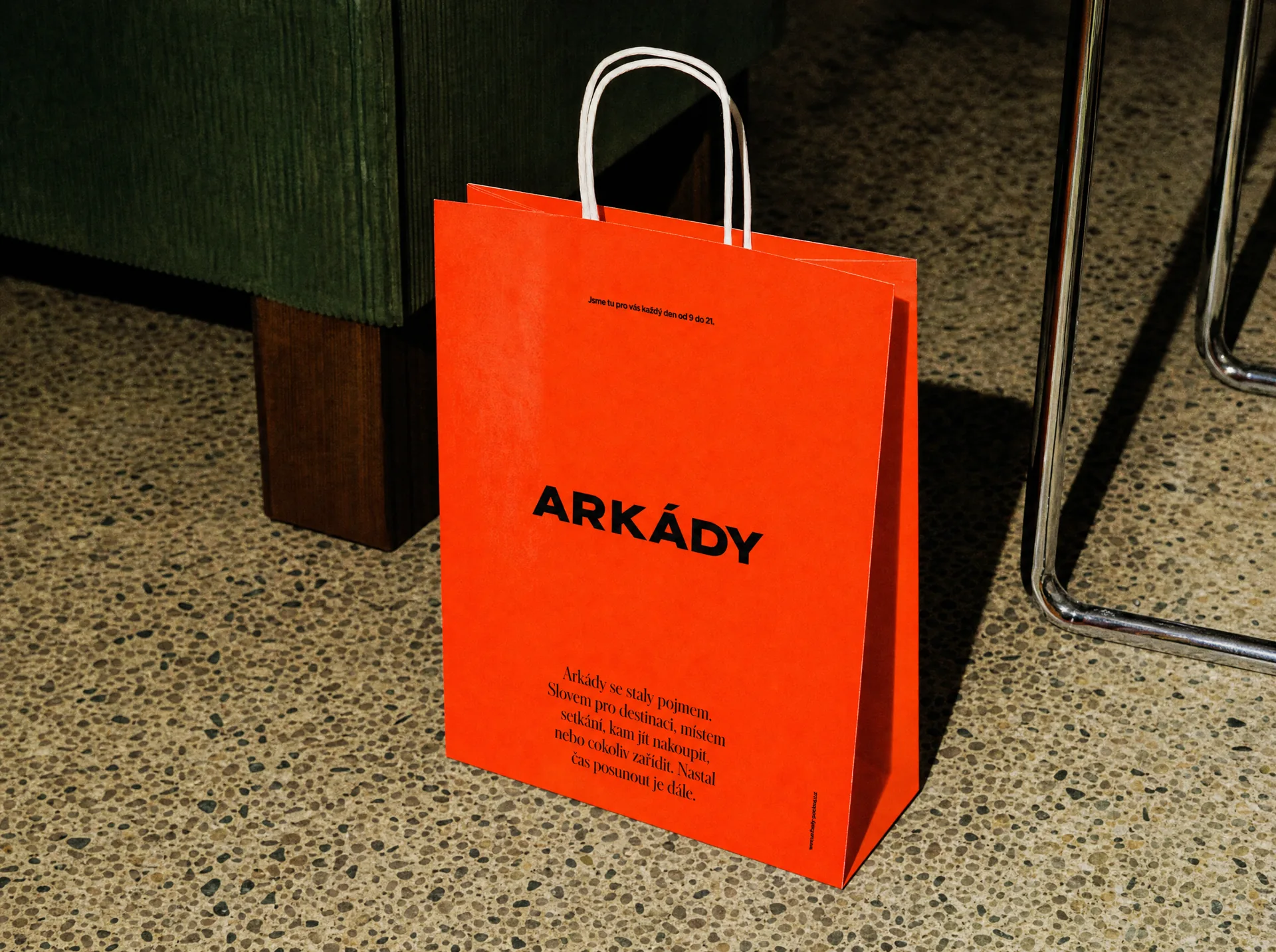
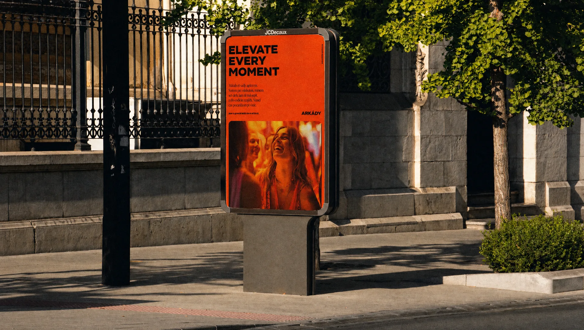
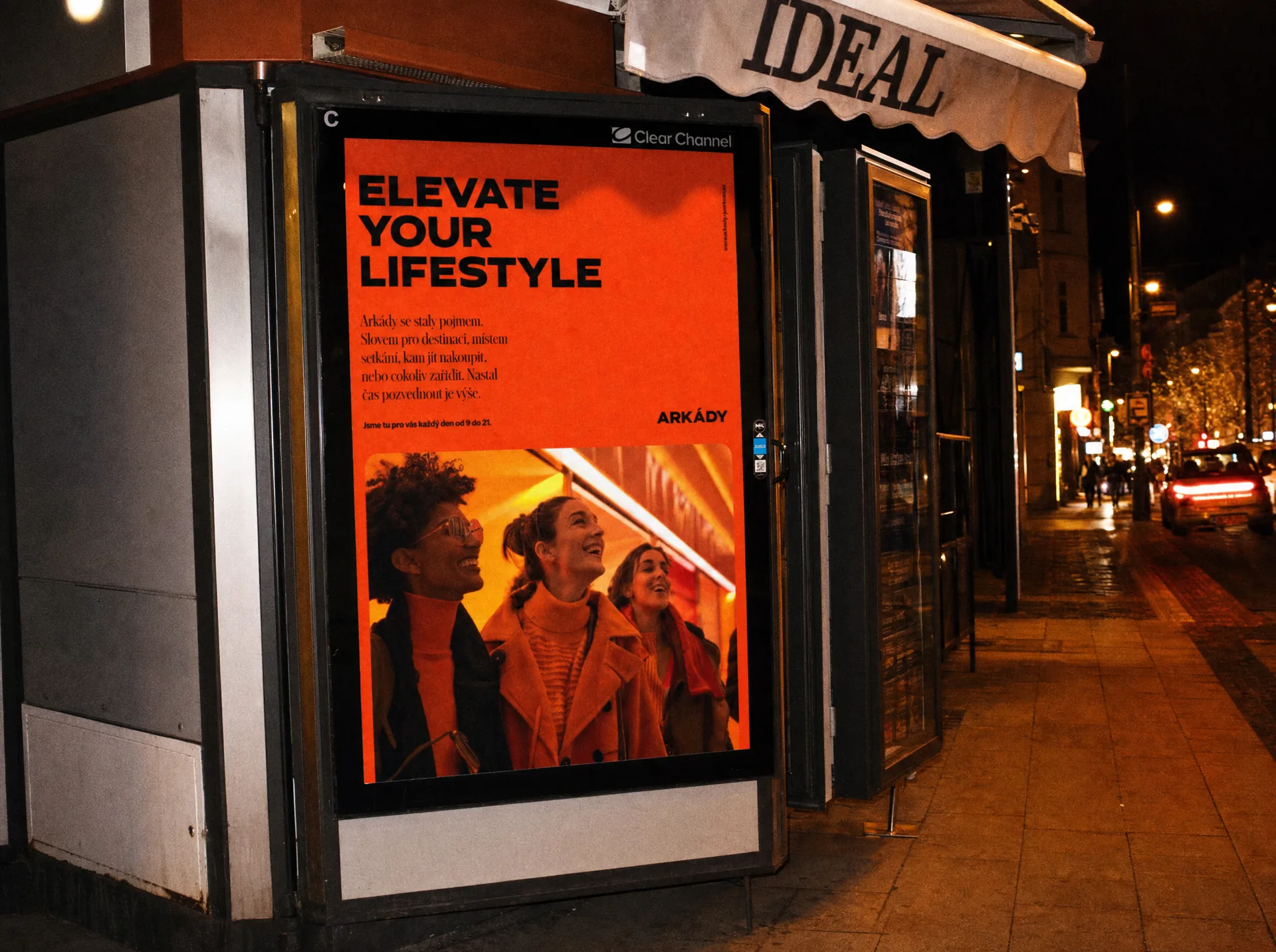
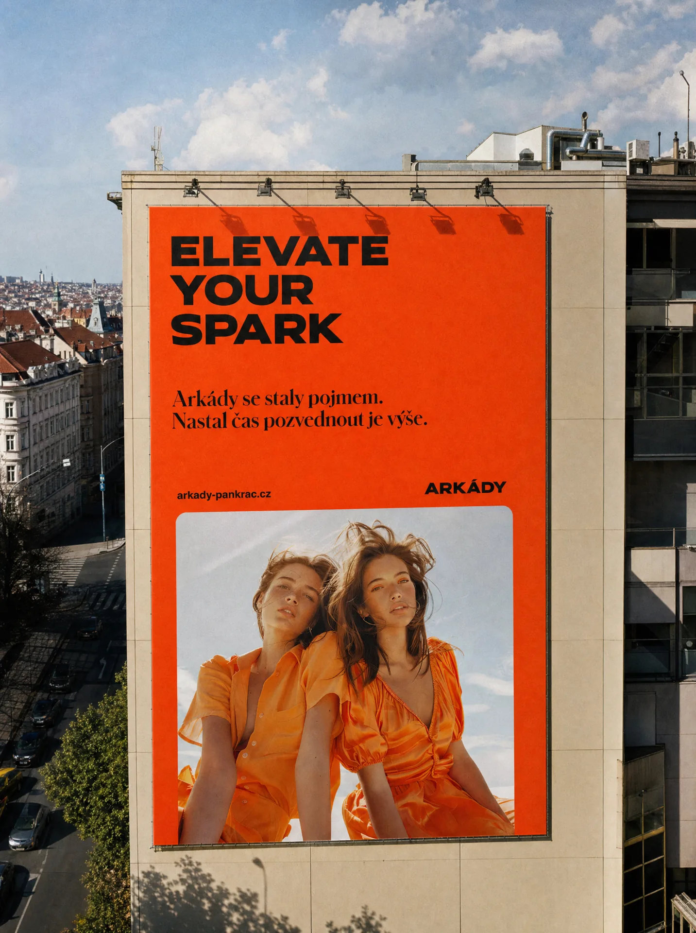
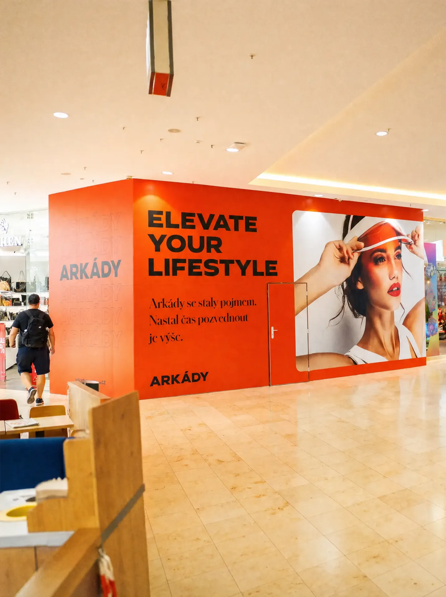
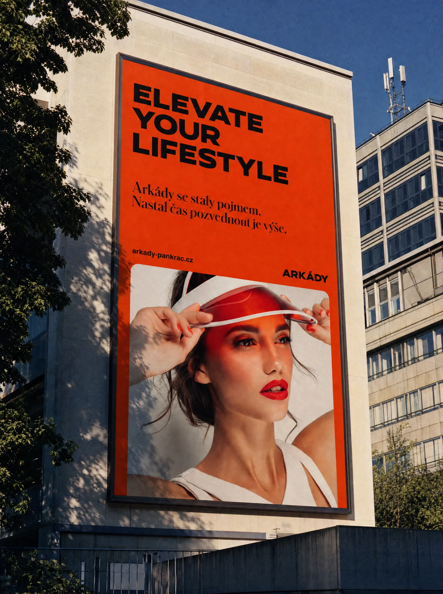
The vivid orange became one of the strongest parts of the new identity. It gives Arkády instant visibility across large outdoor formats, digital communication and the shopping centre itself. Instead of relying on decoration, the system uses colour as a clear signal. Simple, direct and difficult to miss.
Typography carries much of the personality of the brand. We combined the bold character of Hrot by Superior Type with the elegance of Schnyder, creating a contrast that can feel energetic, expressive and refined at the same time. Large type gives communication confidence, while the serif adds a different rhythm and prevents the system from becoming too rigid. The combination gives Arkády a voice that feels distinctive without becoming complicated.
The shopping centre branding is intentionally built from only a few strong ingredients. Colour, typography, scale and composition do most of the work. That simplicity makes the system highly flexible. It can adapt from a large billboard to a small digital format, from seasonal campaigns to permanent signage, without losing recognition. The layouts can change. The personality stays.
A retail brand lives in many places at once. The identity needed to work across billboards, signage, shopping bags, digital campaigns, social communication and the physical environment of the centre itself. Rather than designing each output as a separate campaign, we created a shared visual language that makes all of these touchpoints feel connected. This gives Arkády consistency without forcing every communication to look identical.
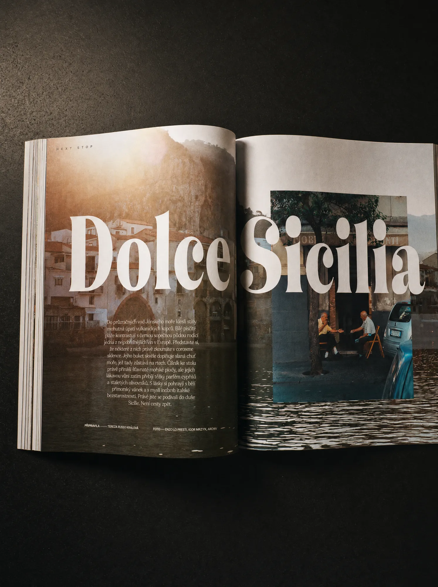
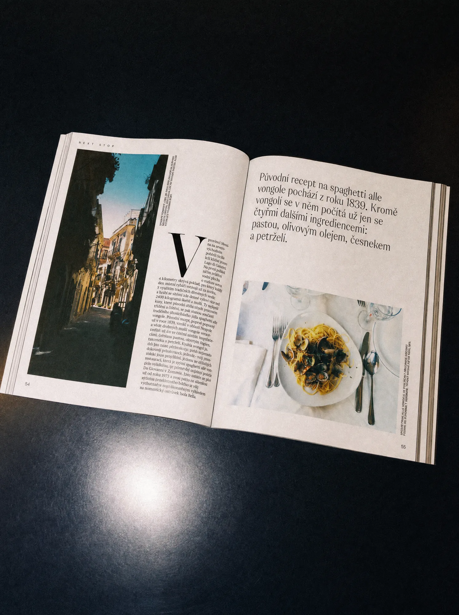
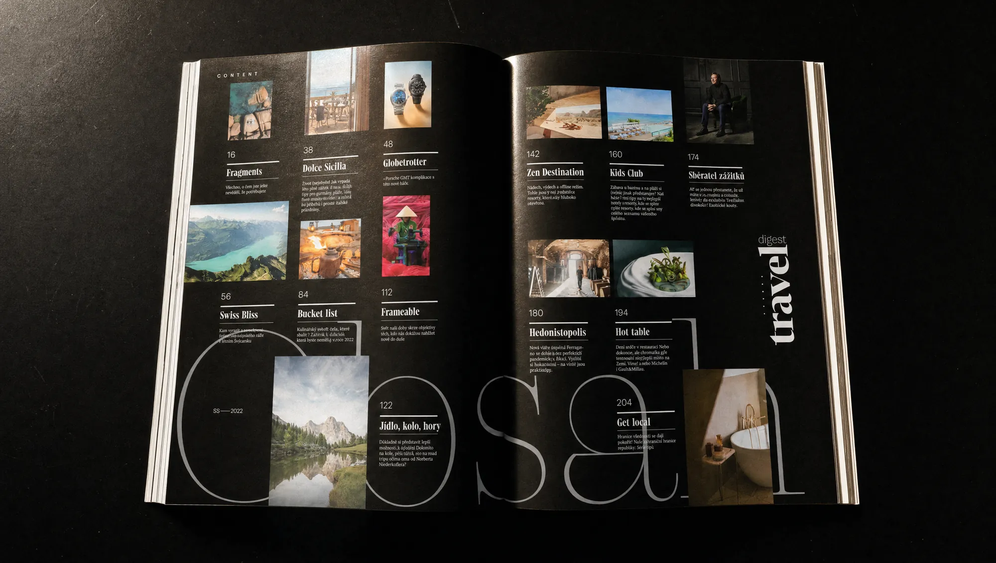
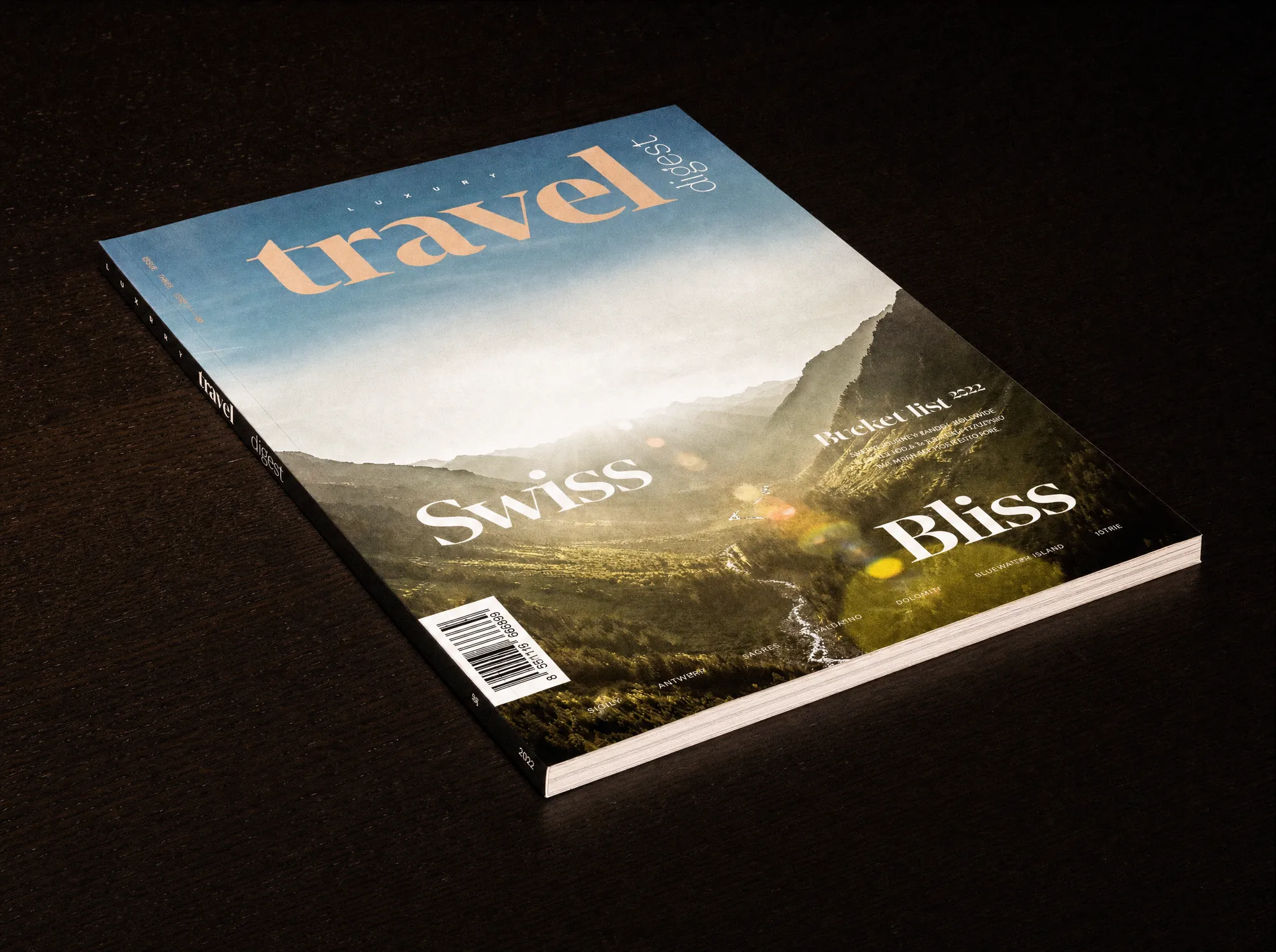
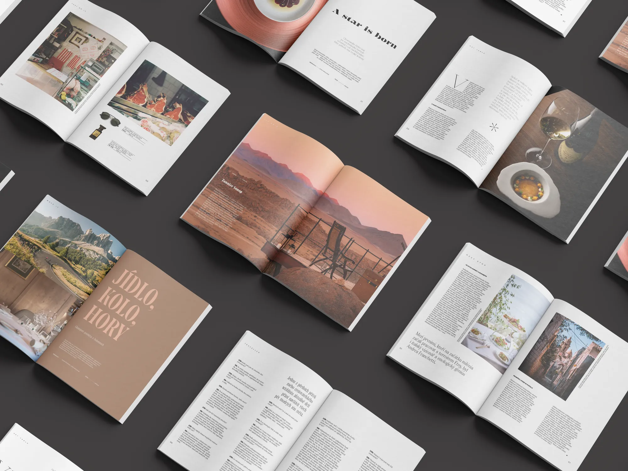
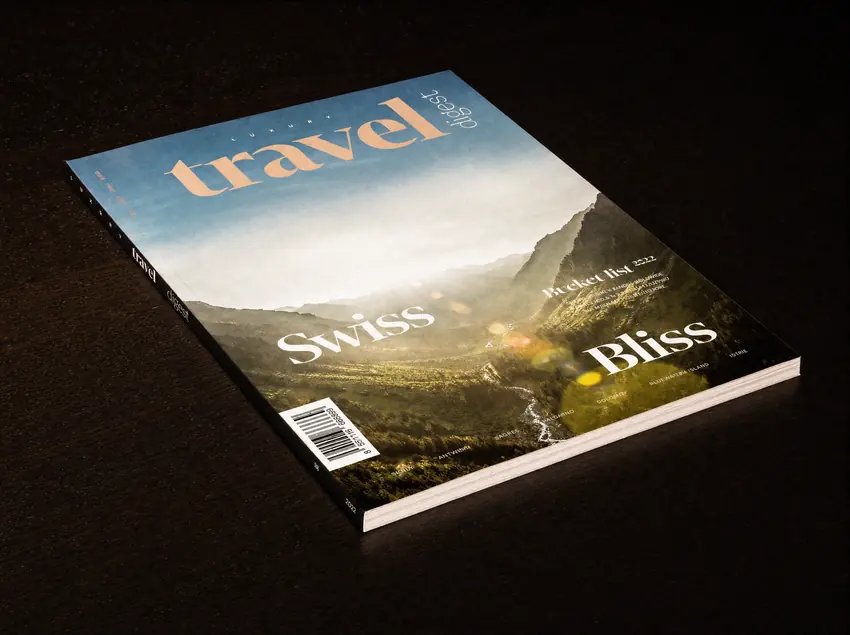
Luxury Travel Digest needed more than a beautiful first issue. It needed an editorial identity strong enough to define the publication from the beginning and flexible enough to keep working issue after issue. We created the brand, art direction, typography system and magazine layouts for issue #1, establishing the visual rules that would become the foundation of the publication.
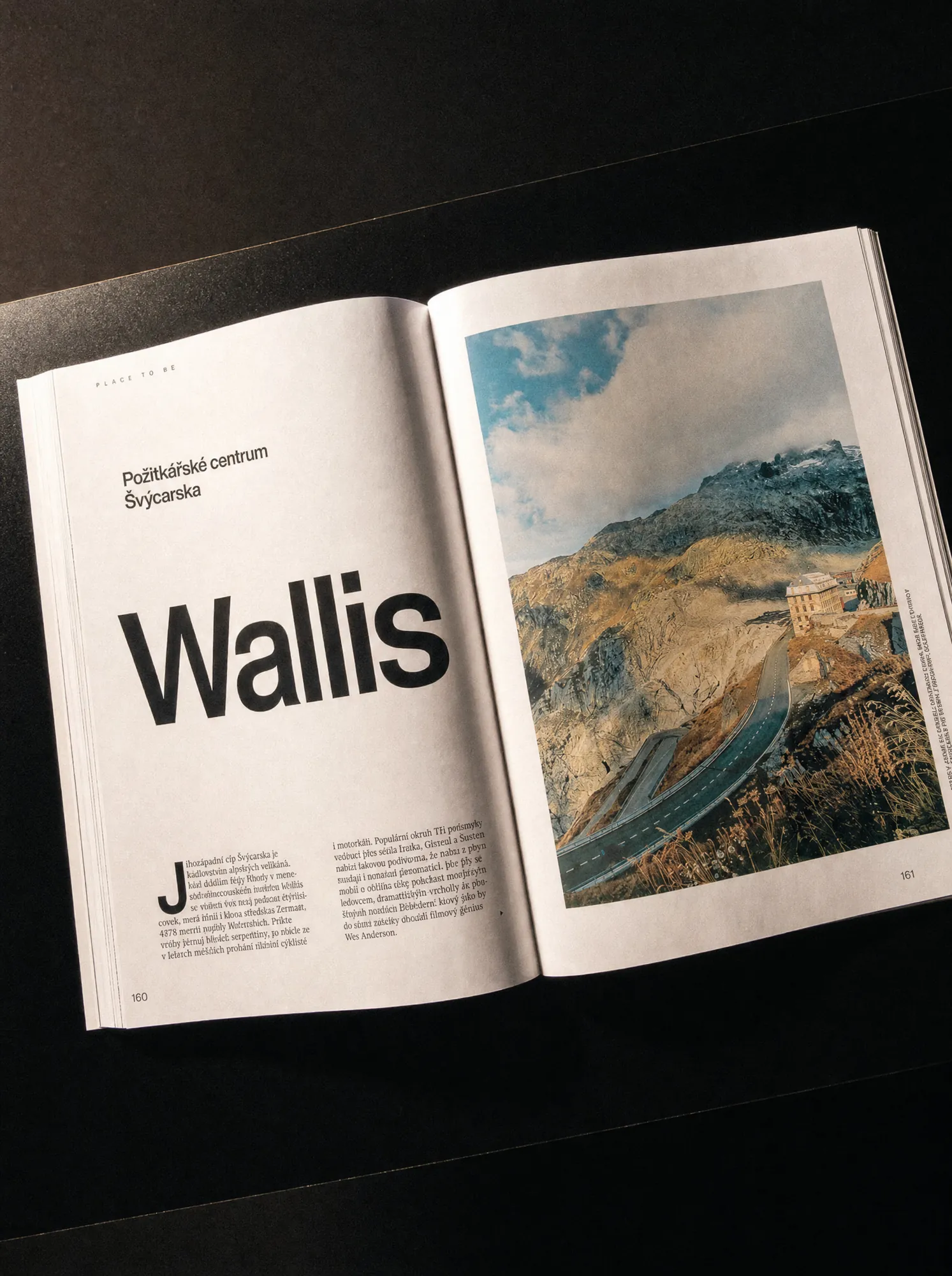
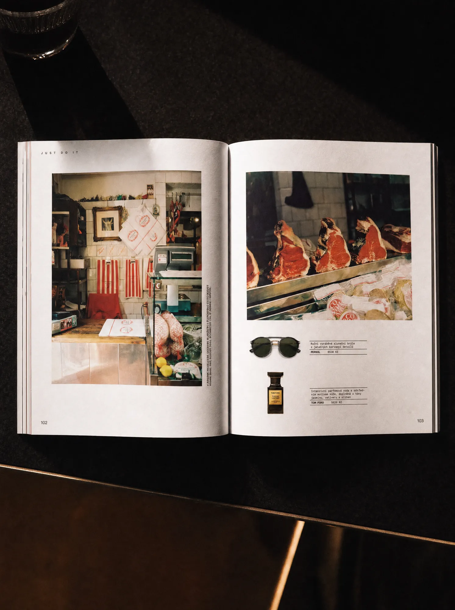
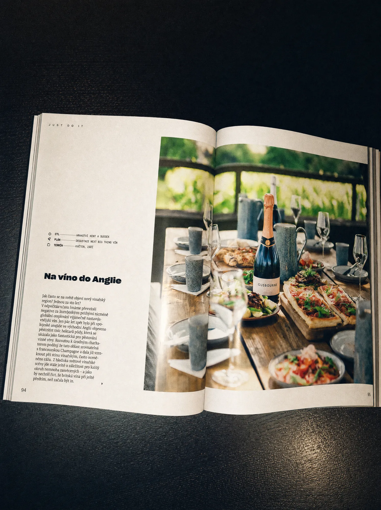
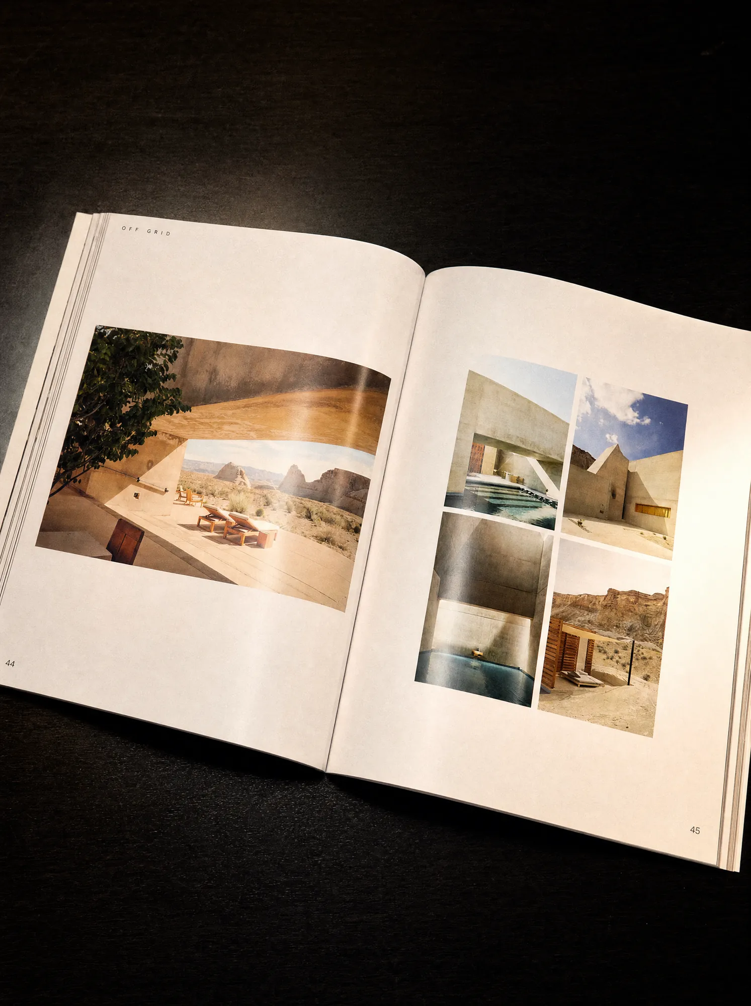
Luxury publishing can easily become overloaded with decoration. We went the other way. The visual language is built around confident typography, generous space, strong photography and precise composition. The design feels premium because it gives the content room to breathe, not because it adds more.
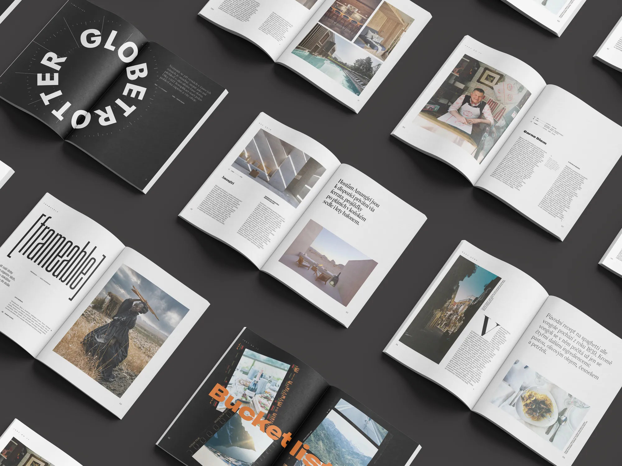
Typography carries much of the personality of the magazine. High-contrast typefaces, oversized headlines and carefully controlled hierarchy create an editorial rhythm that can shift from quiet and elegant to bold and expressive. Vertical titles, precise text wraps and modular grids give each story enough freedom to feel individual while keeping the publication recognisable as one whole.
Luxury travel is ultimately about desire, atmosphere and place. So photography needed to stay at the centre. Large-format imagery is given enough space to create impact, while the layouts are designed around it rather than forcing photographs into rigid templates. The editorial system supports the images instead of competing with them.
Issue #1 established more than a look. It created a repeatable set of typography rules, grid logic and layout principles that could be used across future editions. That meant the magazine could continue evolving without having to reinvent its visual language every time. The system stays consistent. The stories remain different.
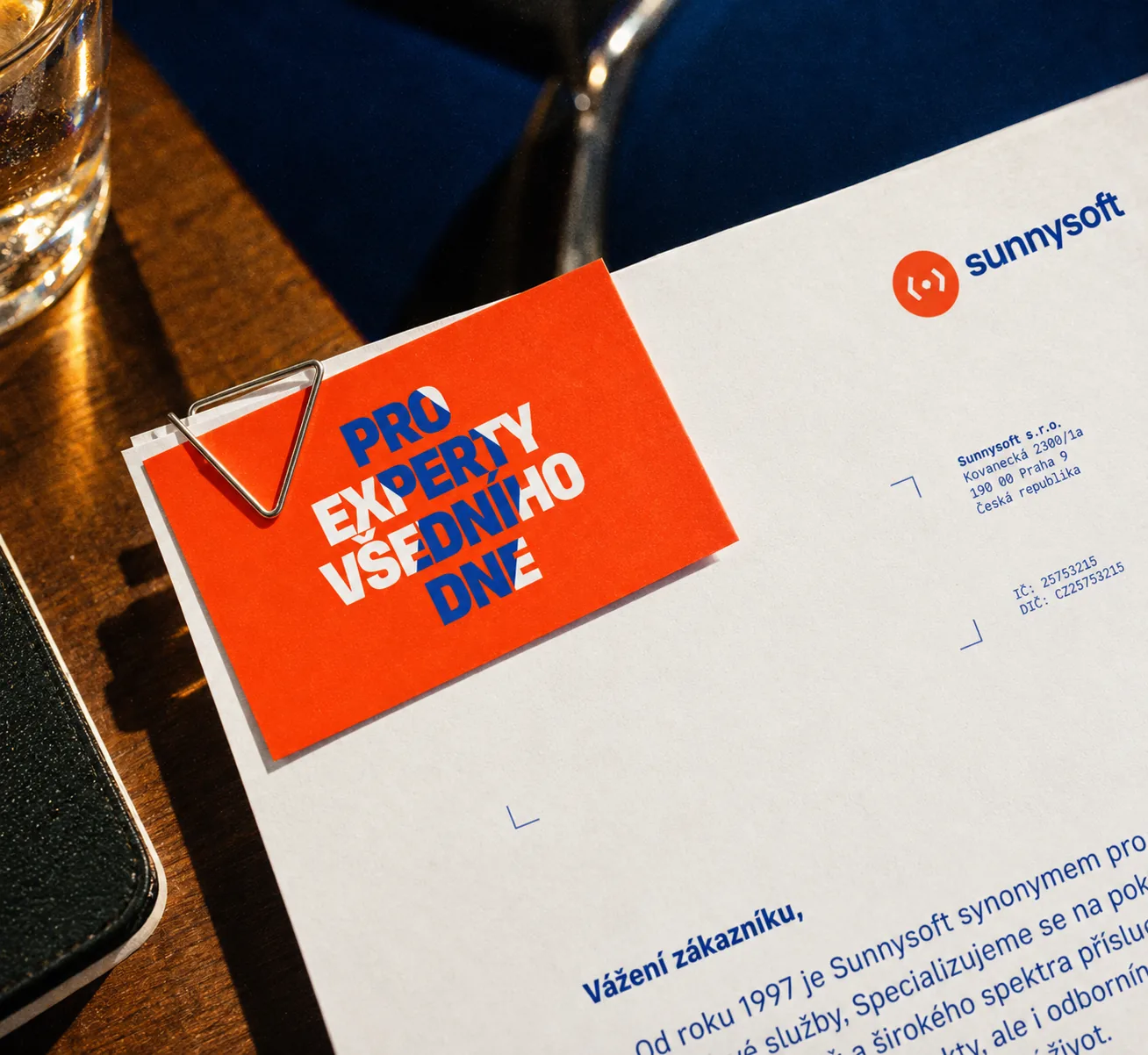
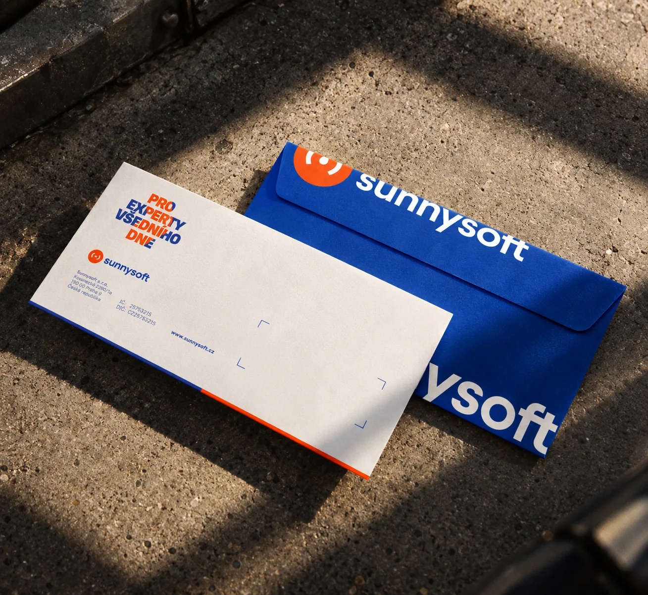
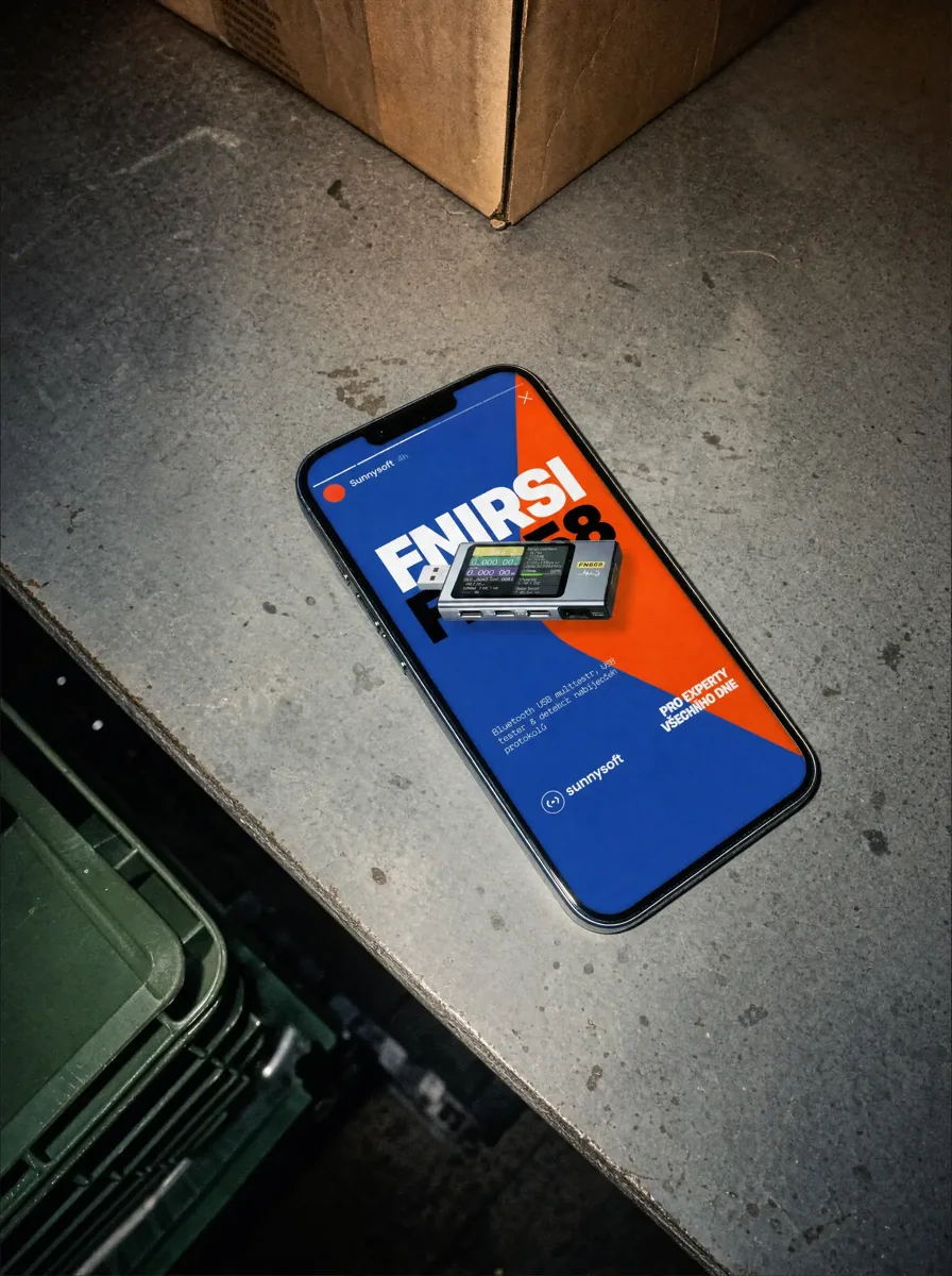
Sunnysoft has been selling technology since 1999, with a product range built around tools that help people solve things themselves: endoscopes, replacement batteries, holders, car diagnostics, measuring technology and other practical electronics. The brand had grown, but its visual identity no longer reflected the confidence or clarity of the business. We created a bold new identity and then brought the same thinking into the e-shop: clearer, more distinctive and easier to use.
Sunnysoft speaks to technically minded customers who would rather understand a problem and solve it than immediately hand it to someone else. That idea shaped the new brand. The communication became more direct, practical and confident. The visual identity moved away from generic technology retail and towards something with a stronger personality, while still keeping the products and information easy to understand.
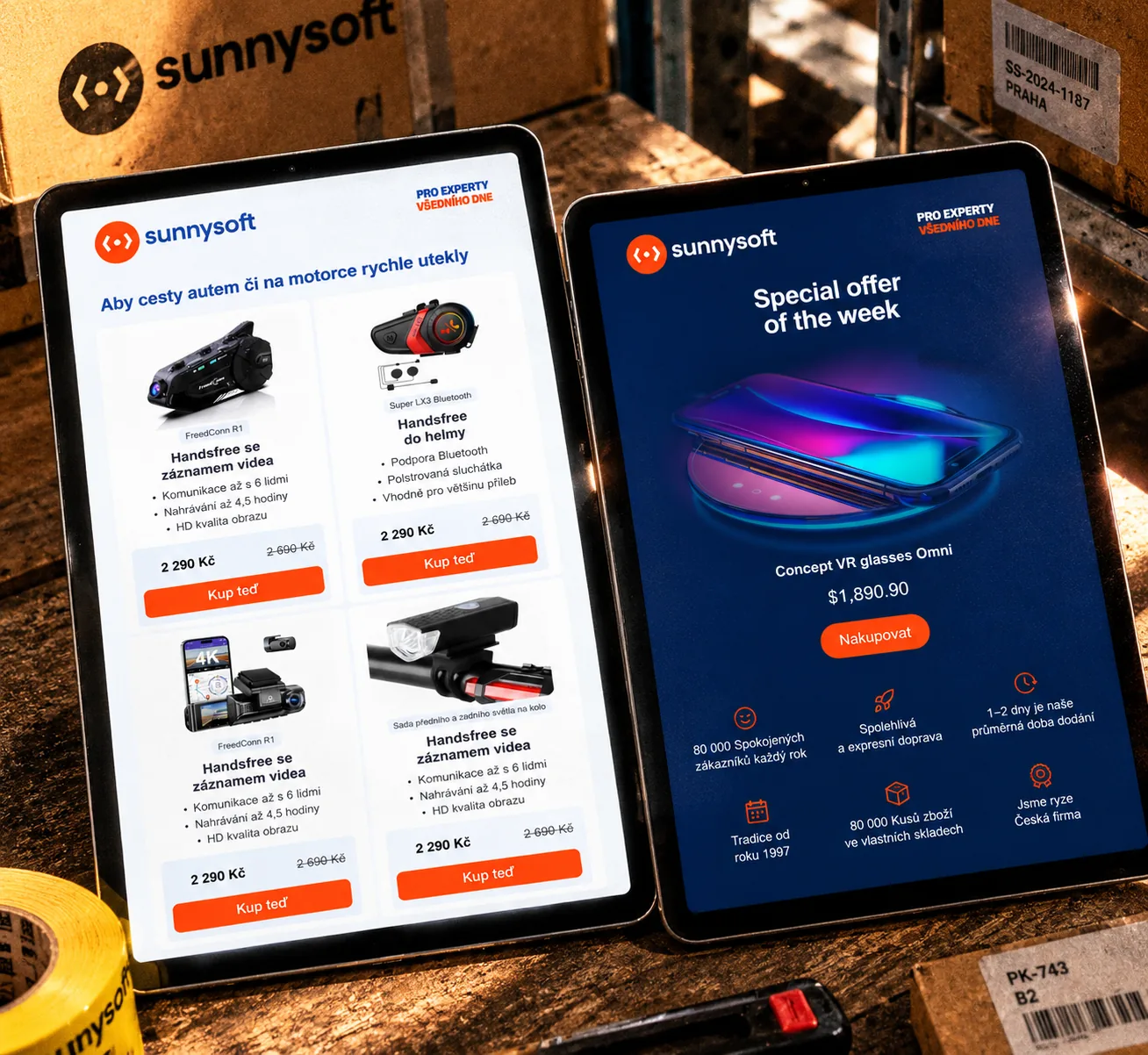
The new identity gave Sunnysoft a much stronger presence. Rather than adding visual complexity, we used a clear hierarchy, confident typography and a bold visual language to make the brand easier to recognise across campaigns, packaging, print and digital communication. The goal was to feel distinctive without becoming decorative. For a technical brand, clarity is part of the identity.
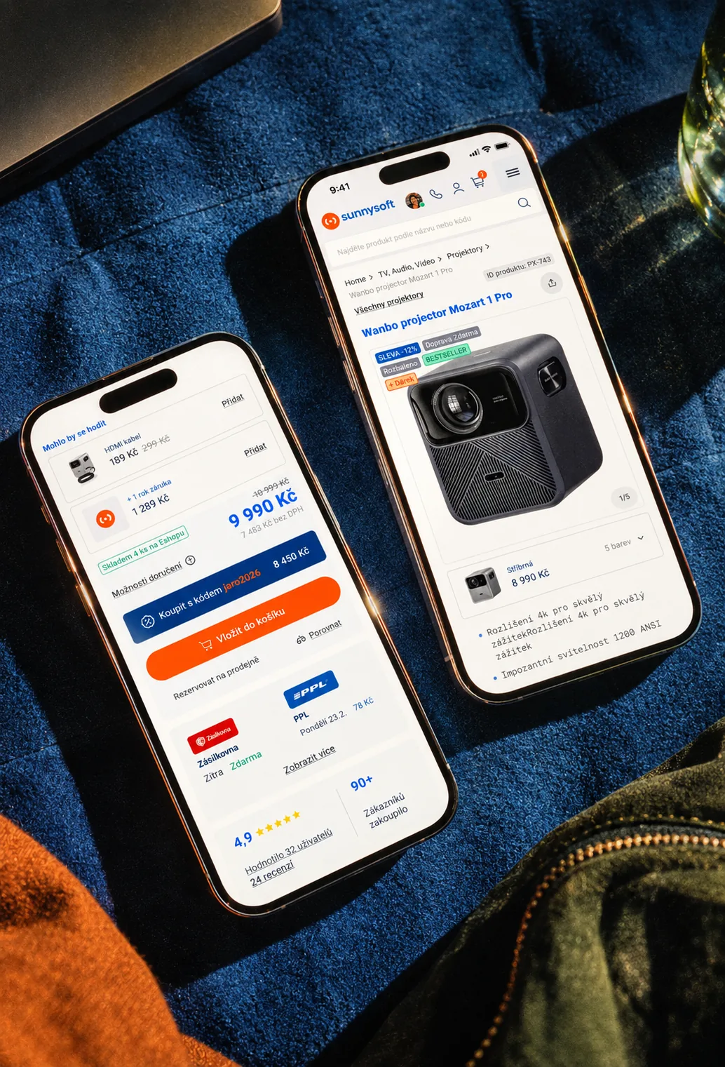
The new brand exposed another problem. The existing e-shop no longer matched the quality or confidence of the identity around it. Product discovery, hierarchy and the buying experience needed the same level of attention. So the project expanded into a broader e-commerce redesign focused on usability, performance, scalability, clarity and trust.
Sunnysoft carries a wide range of technical products, which means the interface has to handle large amounts of information without becoming difficult to use. We designed the new experience around clear product hierarchy, stronger category and product pages, better spacing and typography, and reusable components that can scale across the store. The homepage and product detail became blueprints for a wider UI system rather than isolated pages. This makes the e-shop easier to extend while keeping the experience consistent.
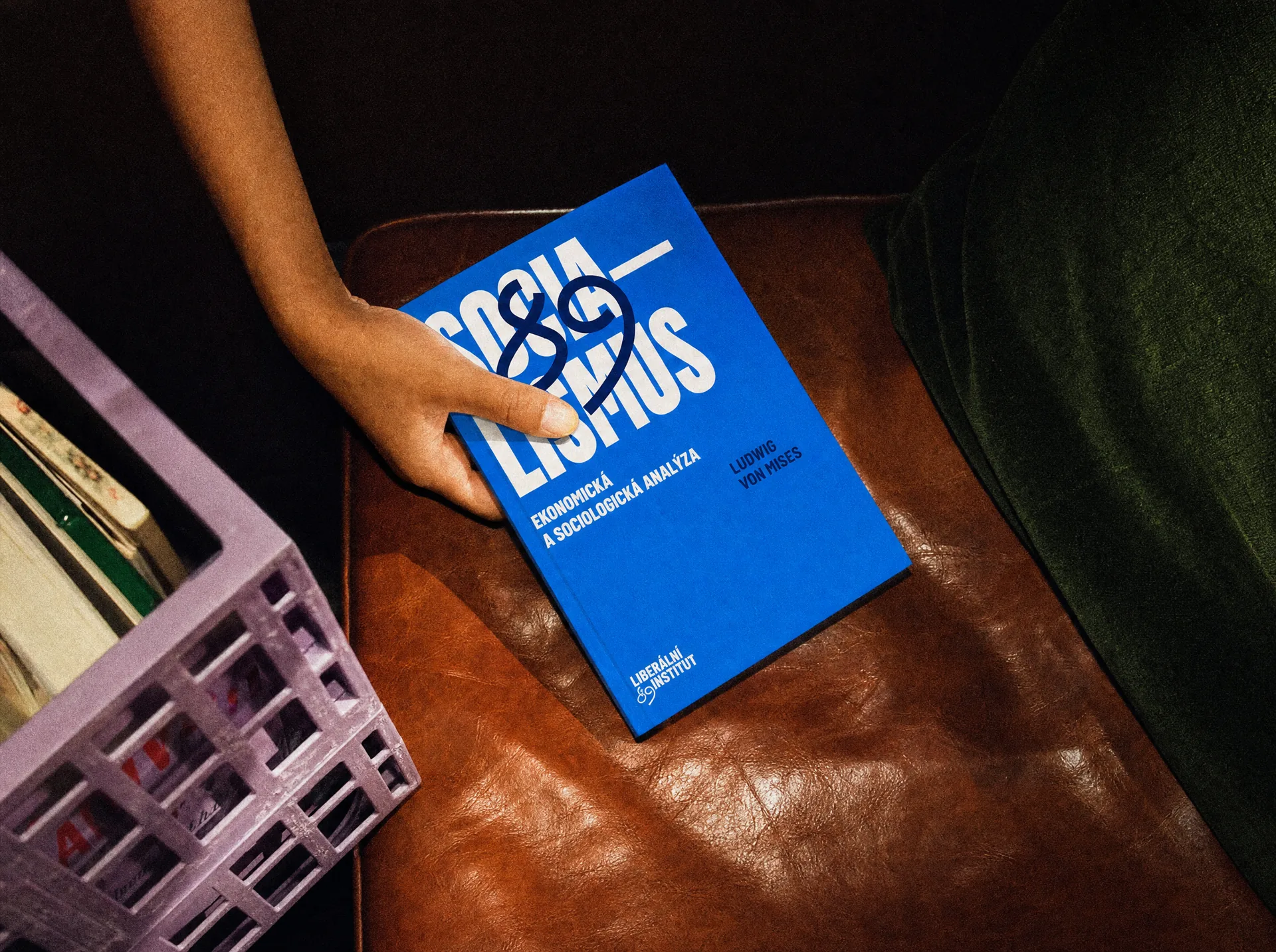
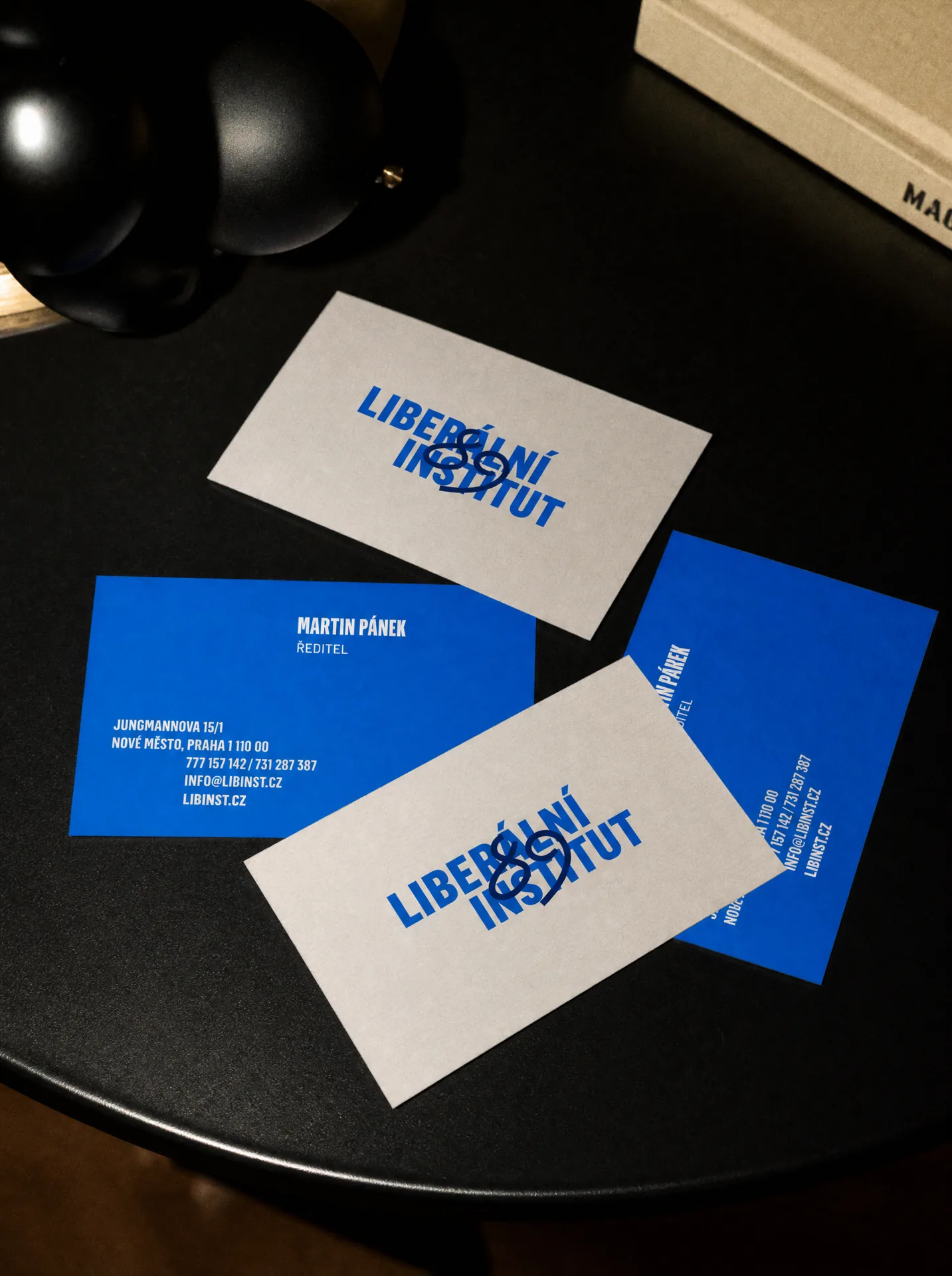
Liberální institut is an independent Czech nonprofit organisation whose stated mission centres on individual freedom, private property, free markets and the rule of law. Its origins go back to the Liberal Society of F. A. Hayek, formed in the autumn of 1989, before the institute was formally registered in 1990. The new visual identity needed to respect that history without turning it into something static or ceremonial. So instead of choosing between institutional credibility and a more expressive voice, we built the brand around both.
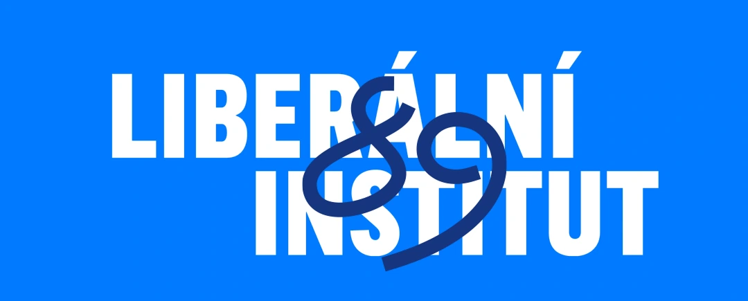
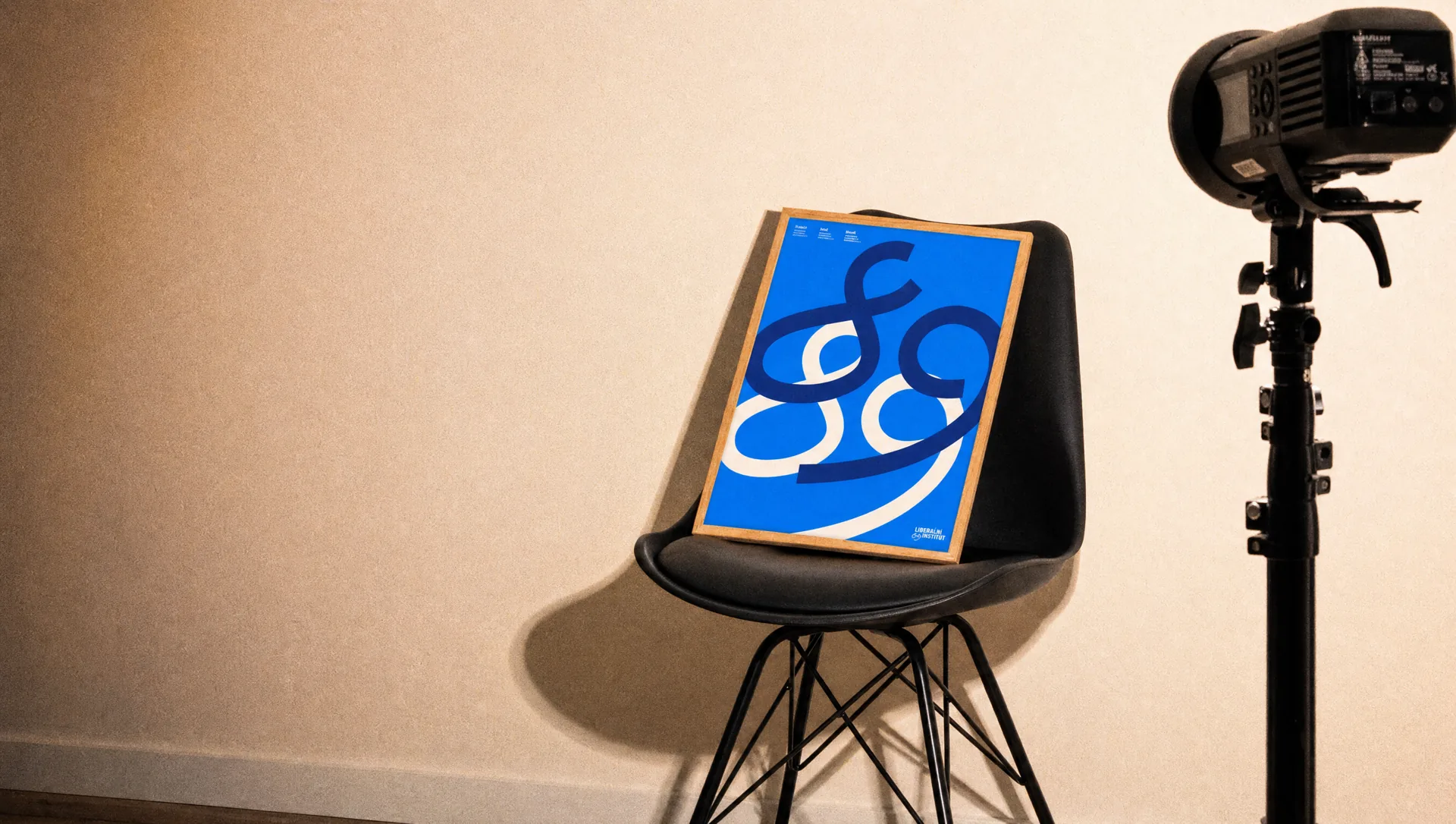
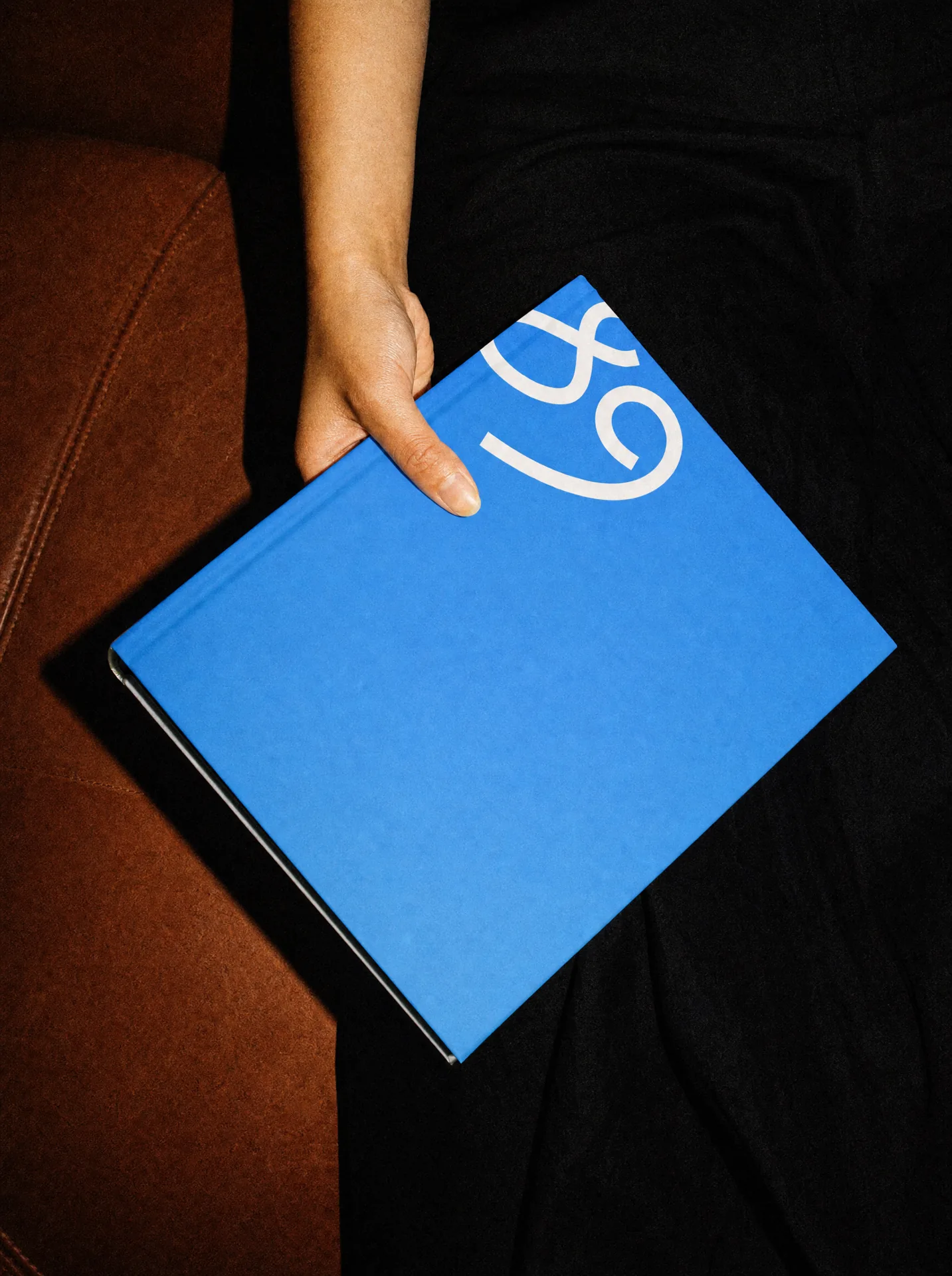
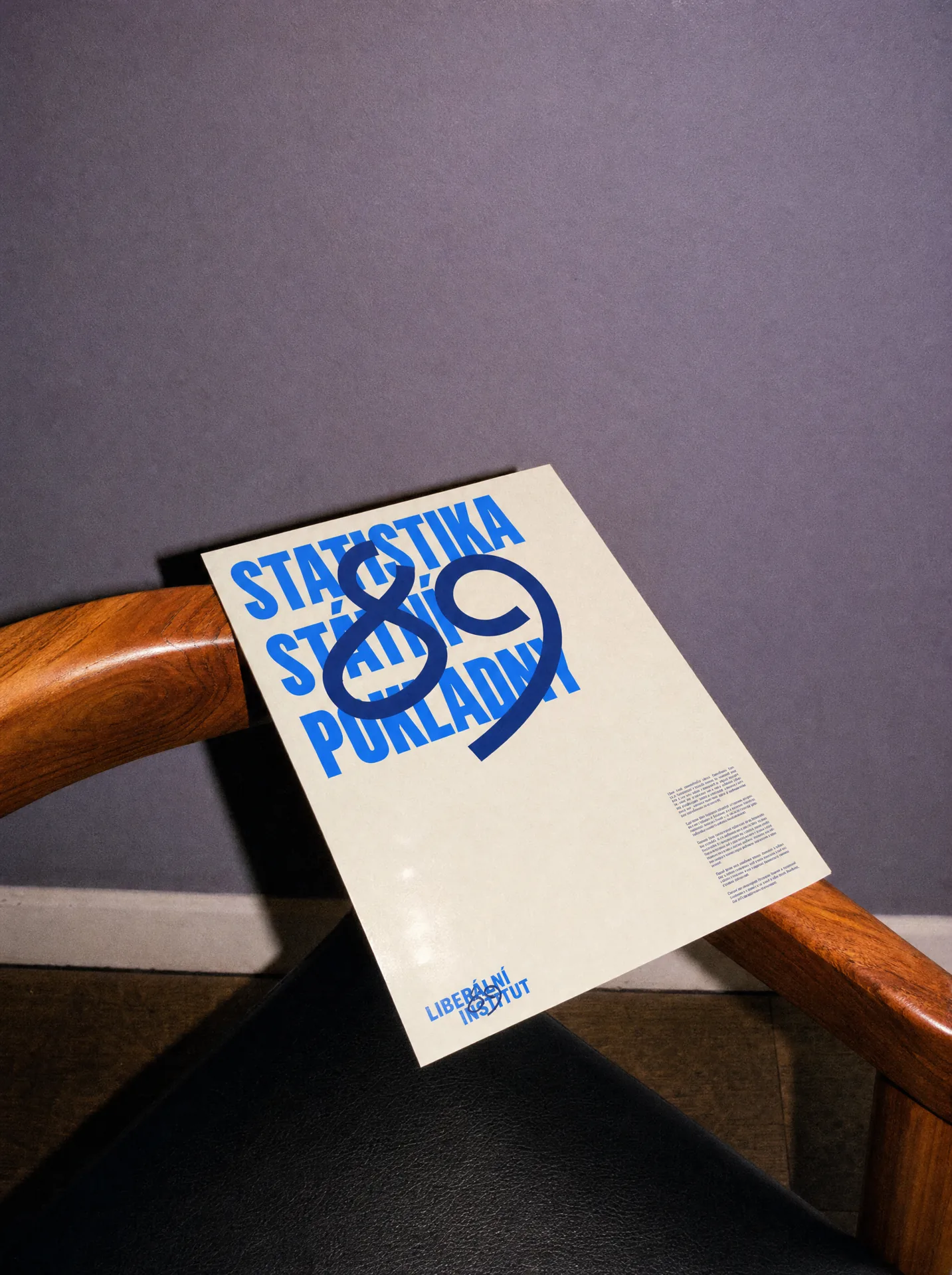
The foundation of the identity is intentionally clean and structured. Then we broke it. A handwritten 89 cuts across the system like something drawn quickly on a wall or poster. It refers to the period in which the organisation originated and gives the identity a distinctive human gesture. The contrast became the core of the visual system: order underneath, expression on top.
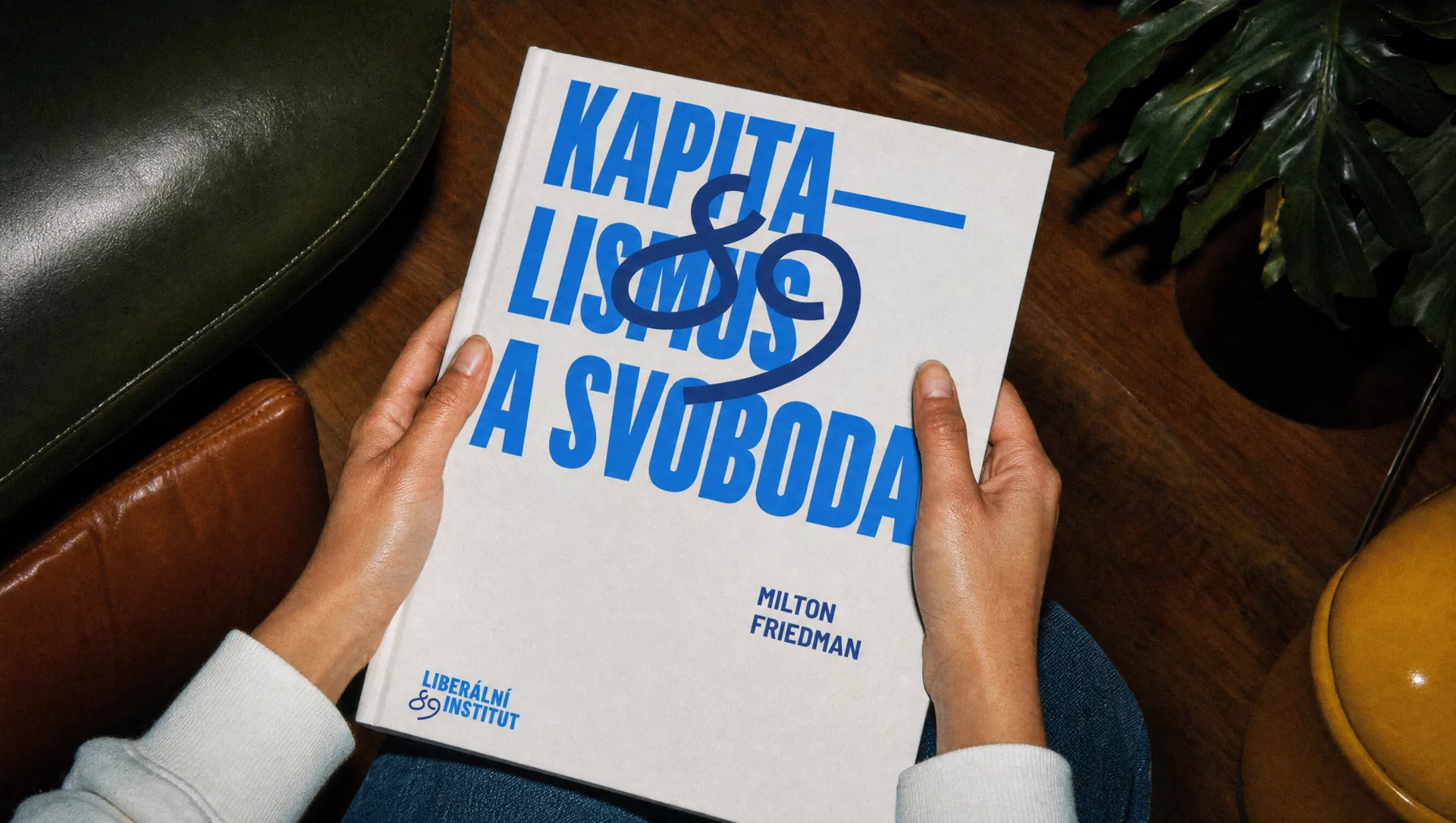
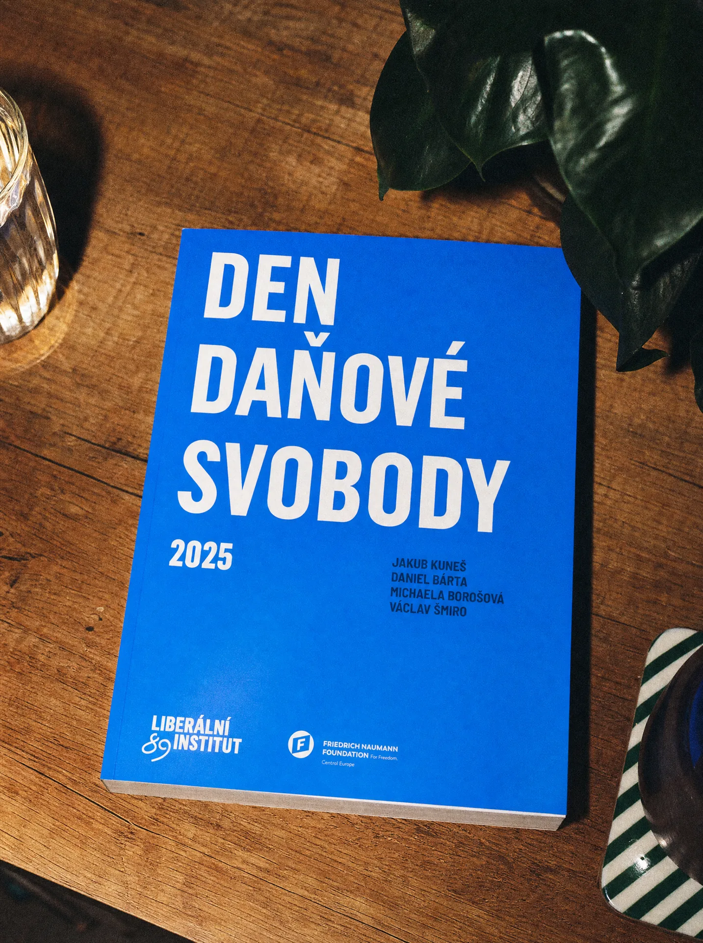
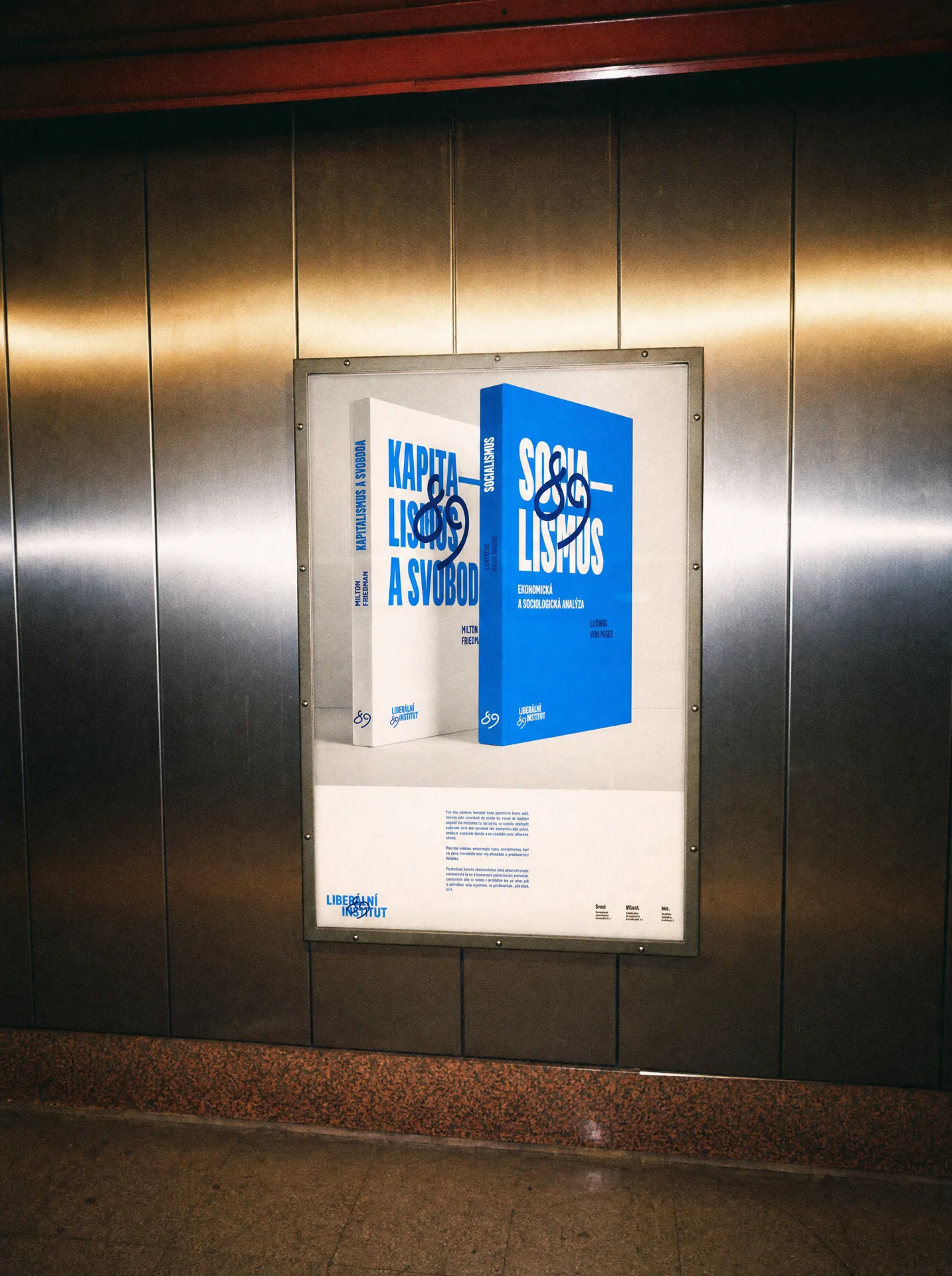
The handwritten 89 became more than a logo detail. It can appear across book covers, posters, headlines and communication as a recurring gesture, sometimes controlled and sometimes deliberately intrusive. That tension gives the system its personality. The institutional layer creates structure. The handwritten layer adds energy and makes the identity immediately recognisable.
The rest of the identity stays deliberately disciplined. Clear typography, strong hierarchy and simple layouts create a stable framework for publications, research, events, charts, social communication and educational material. That makes the expressive elements stronger because they are not competing with visual noise.
Liberální institut works across publications, research, events and educational projects, so the identity needed to perform across very different formats. We created a flexible system for covers, documents, social templates, charts and supporting communication, giving each format enough freedom while keeping the overall brand recognisable. The visual language stays connected even when the content changes completely.
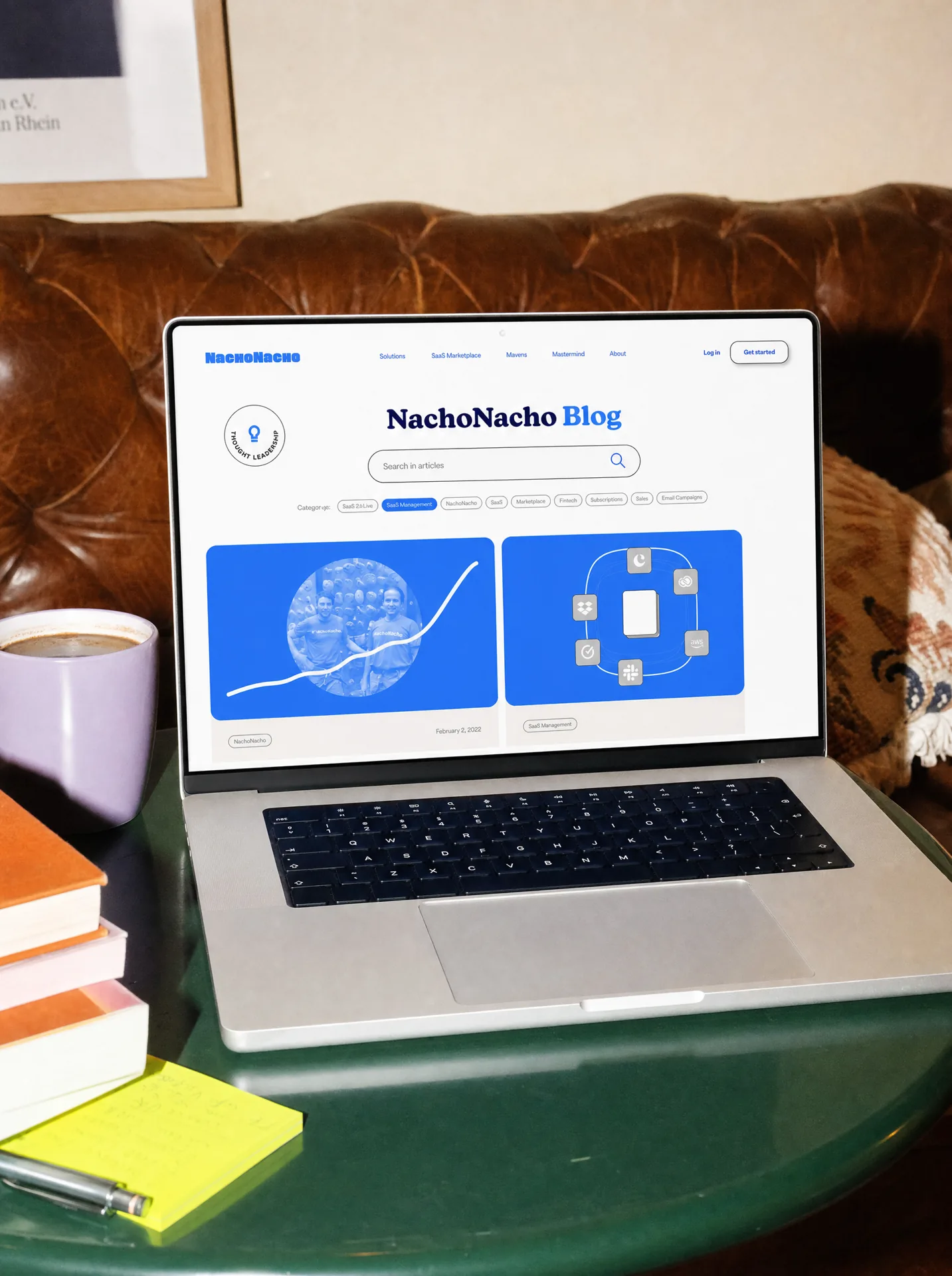
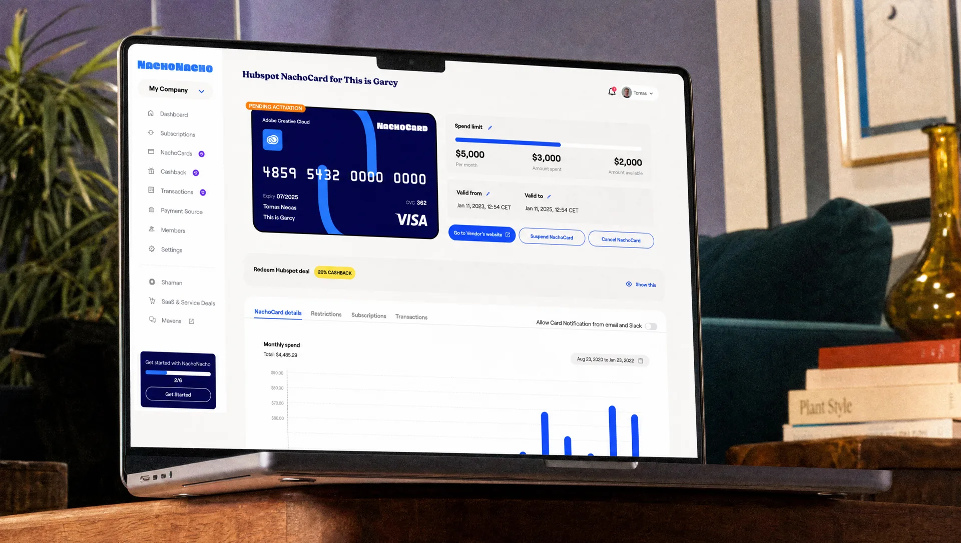
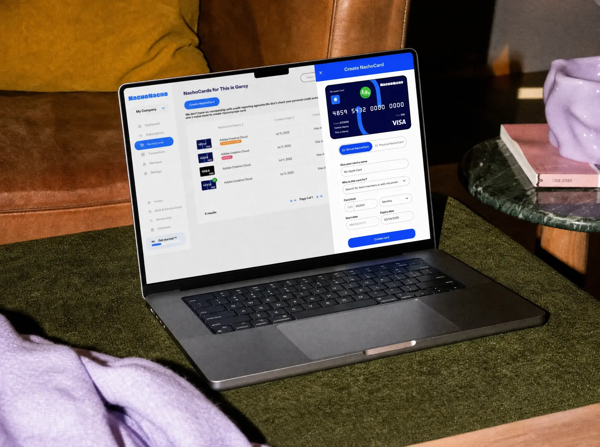
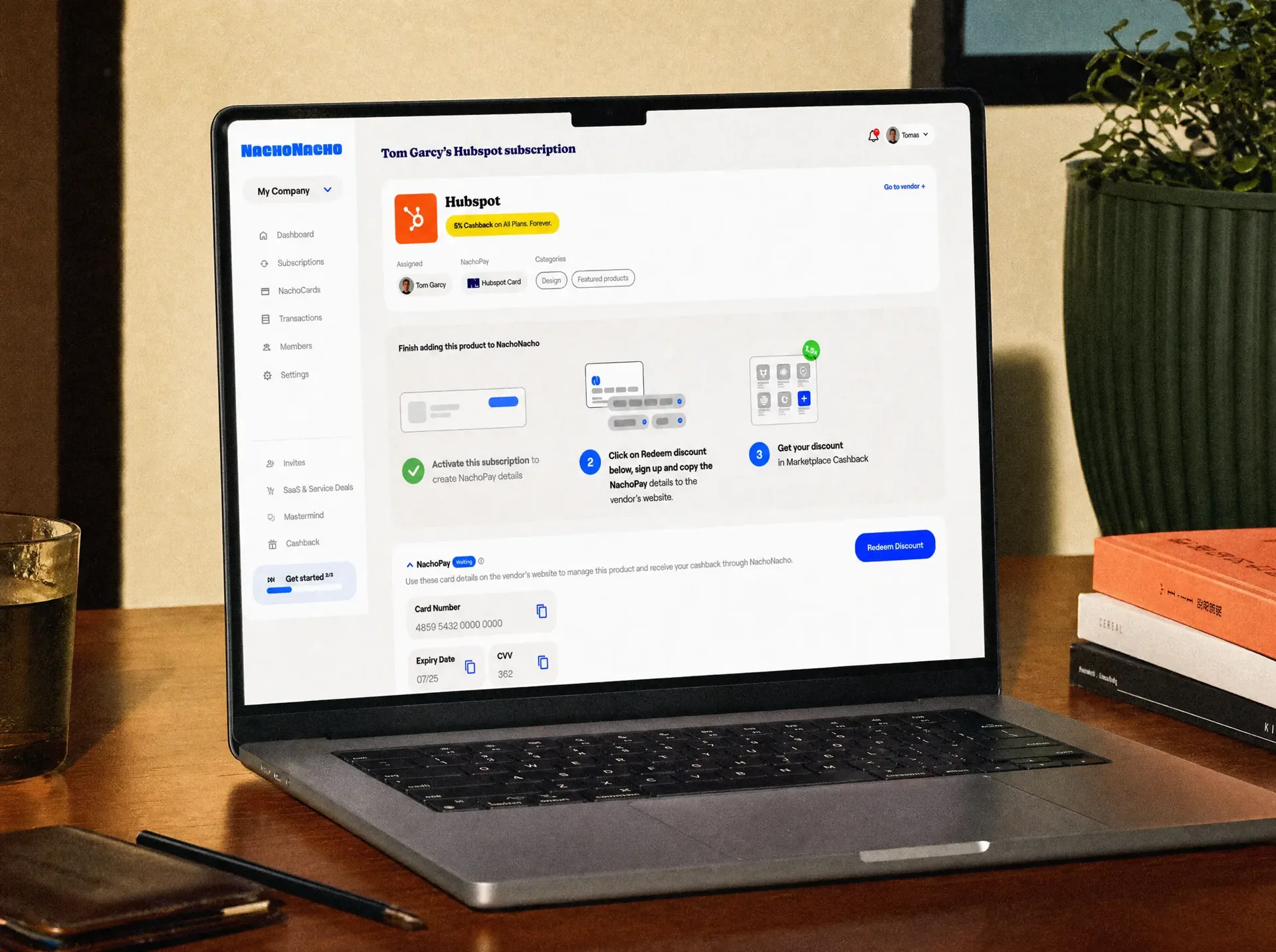
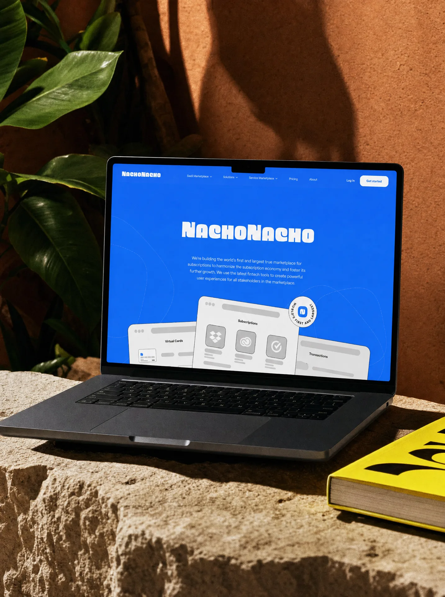
NachoNacho is a San Francisco platform for discovering, buying and managing SaaS and services, combining marketplace, spend management and fintech tools in one product. The original brief was to refresh the brand and improve the visual design of the website and platform. But there were two bigger opportunities. First, the product needed to become much easier to understand. Second, NachoNacho needed the confidence to stop looking like another fintech startup. So we worked on both.
Before redesigning anything, we tested the existing website, analysed its structure and looked at how the product was being explained. There was too much complexity between the product and its value. We simplified the story, reorganised the information and rebuilt the journey around what people actually needed to understand and do. Only then did we start shaping how the new NachoNacho should look.
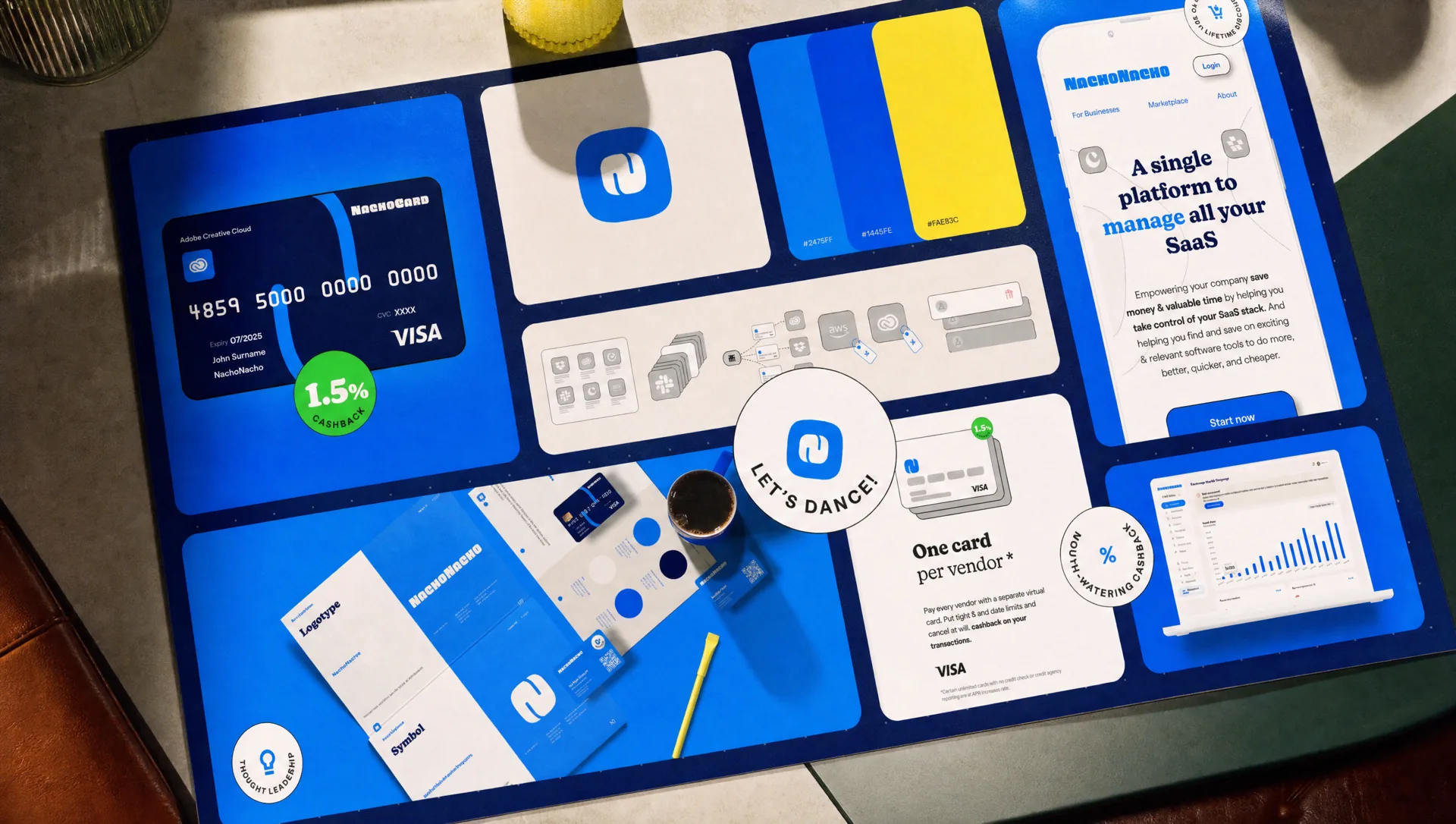
Fintech and SaaS brands often converge around the same visual language: safe colours, restrained typography and polished but interchangeable interfaces. We deliberately went the other way. NachoNacho became vivid, bold and immediately recognisable, with a distinctive logotype, memorable symbol, bright blue, playful illustrations, stickers and merchandise that gave the company an identity far beyond the product interface. The design language had enough personality to feel unexpected for the category. That was the point.
The identity needed elements people could remember without seeing the whole brand. So we created a strong symbol and built a wider visual world around it. Illustrations, graphic icons, stickers and playful brand objects made it possible for NachoNacho to communicate with personality across product, website, events, social media and merchandise. The result feels unmistakably NachoNacho even before you read the name.
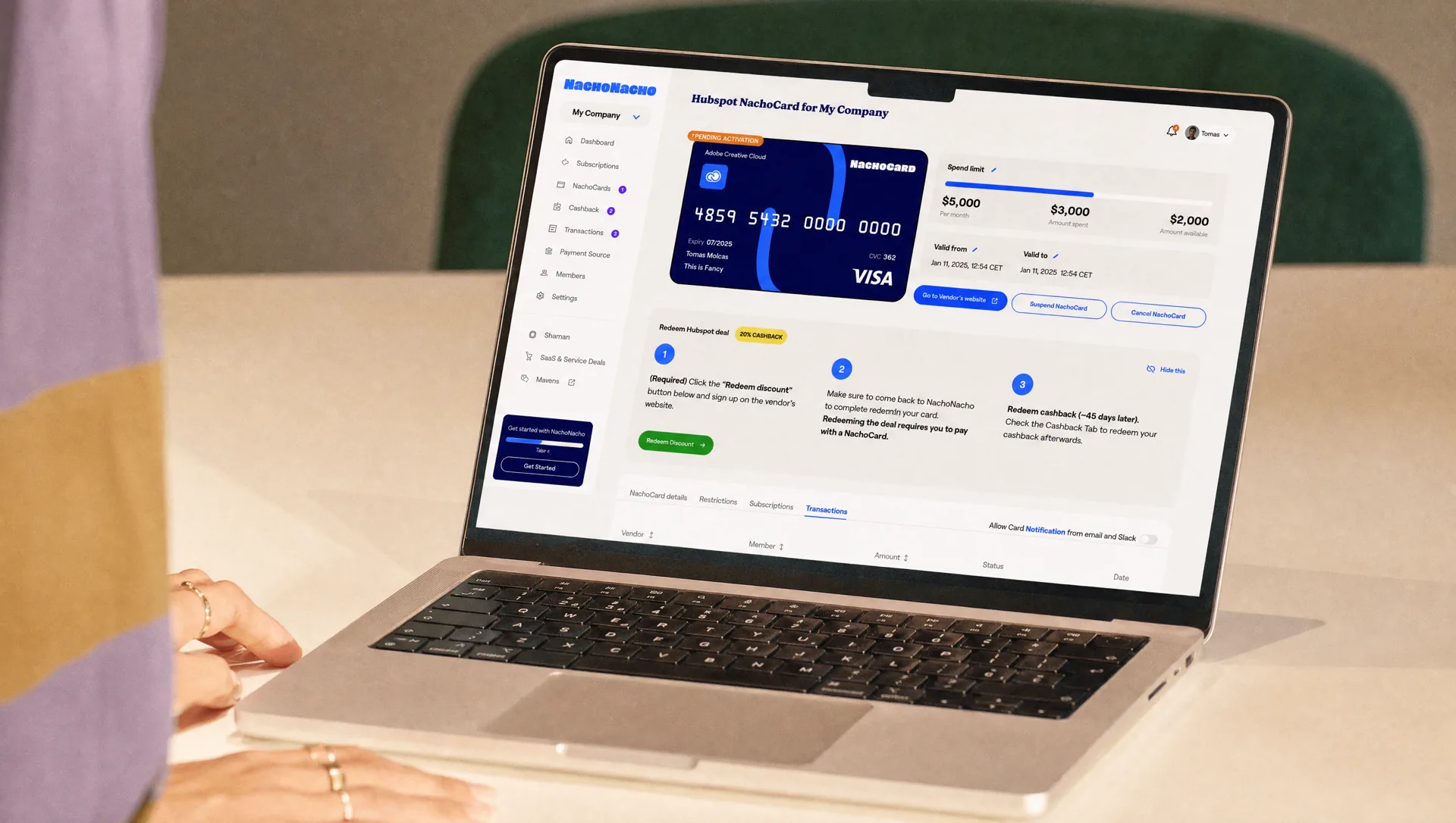
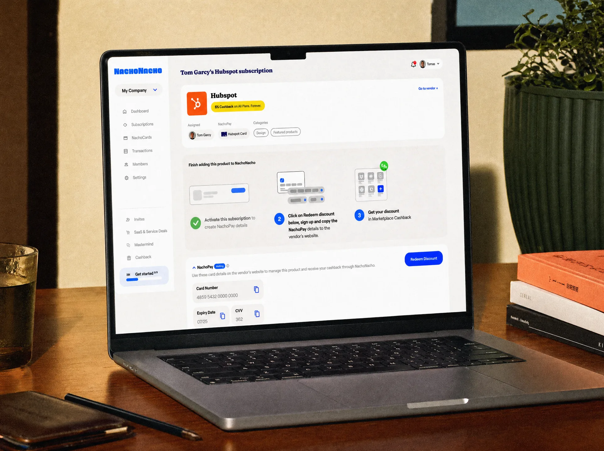
The same confidence had to work inside a complex SaaS and fintech platform. NachoNacho combines software discovery, discounts, subscription management, virtual cards and spend-management tools. Our job was to make that complexity feel manageable. We simplified hierarchy, clarified key actions and created a product system that could carry the bold brand without compromising usability.
The website became the place where positioning, product thinking and identity came together. Instead of behaving like a conventional fintech landing page, it used the brand’s visual confidence to pull people in while the structure did the harder job of explaining a complex proposition. Strong colour, typography, illustration and interaction made NachoNacho feel different immediately. Clearer storytelling made people understand why that difference mattered.
The redesign changed both perception and performance. NachoNacho became easier to understand, more credible and much harder to confuse with the rest of the category. Visits increased, people stayed longer, inquiries grew and the new experience dramatically improved conversion. In the period we tracked, conversion increased by more than 800%. Standing out was not a risk to control. It was part of the strategy.
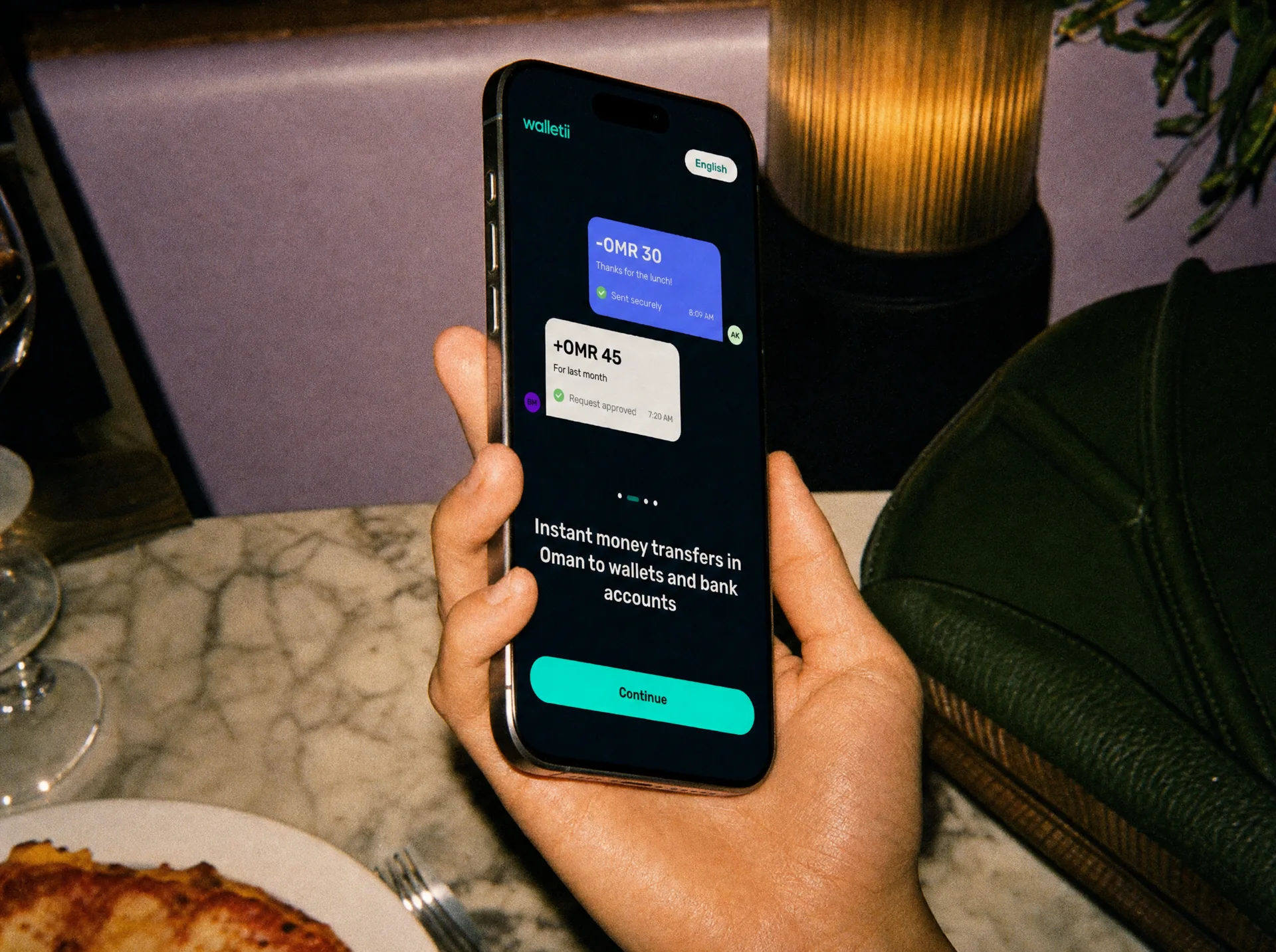
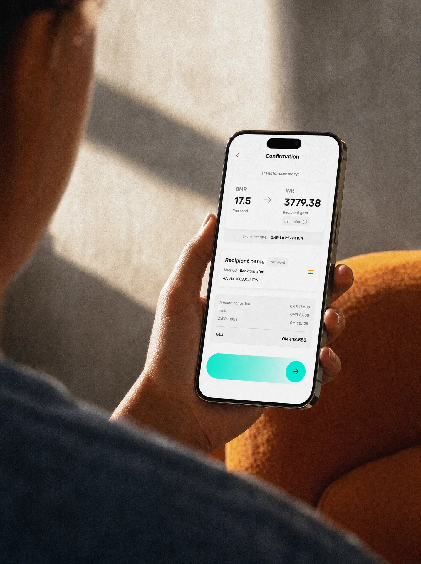
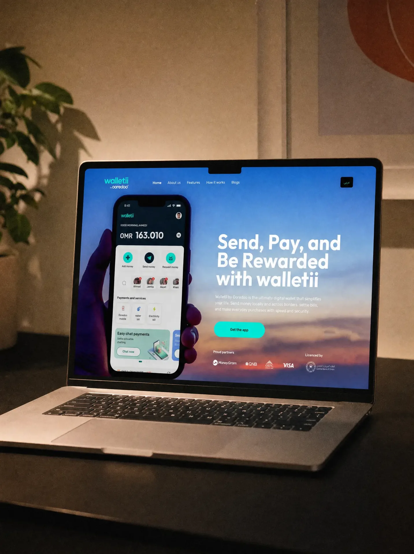
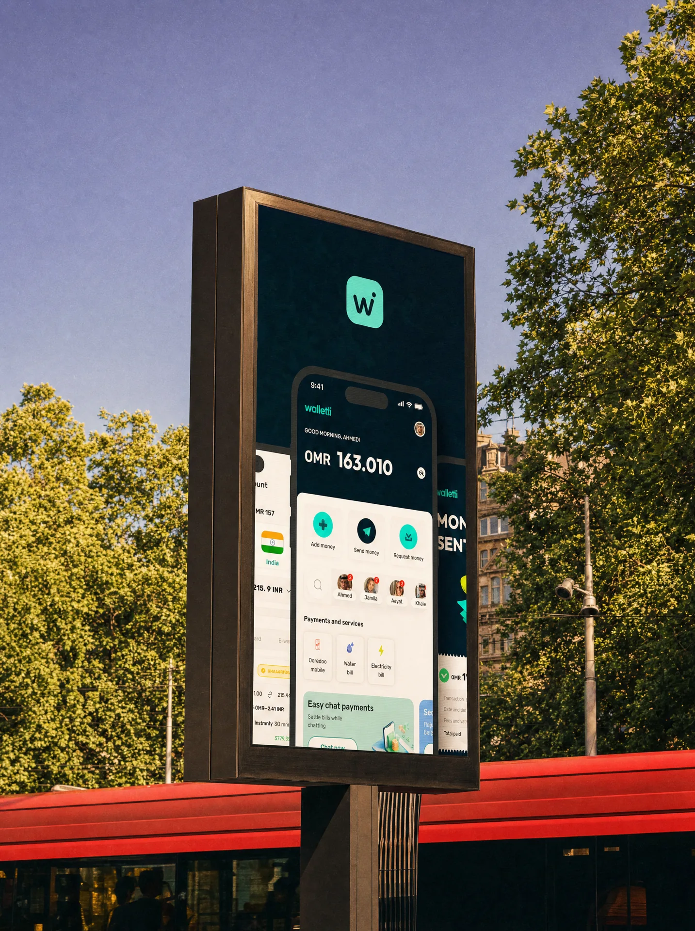
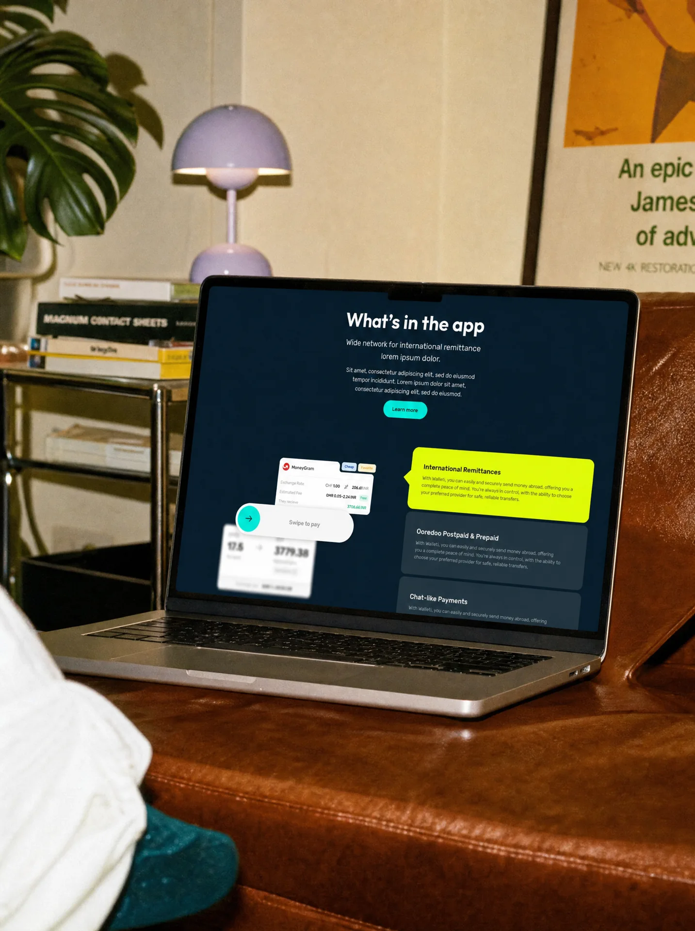
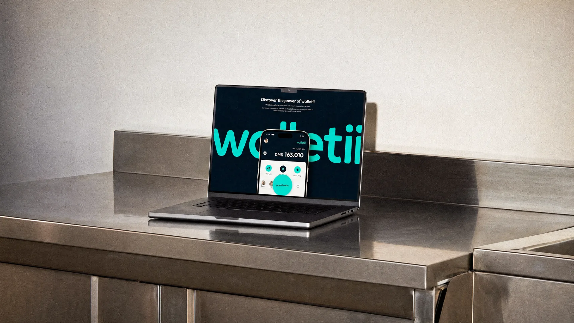
Walletii started with a sketch of a home screen. Three years later, it had grown into a complete digital wallet ecosystem designed for multiple markets across the MENA region. What began as a product design assignment gradually expanded into UX, UI, brand applications, service design, complex financial journeys, hundreds of screens and a system built to work across different countries, languages and user behaviours. We did not just design an app. We helped shape how the product works.
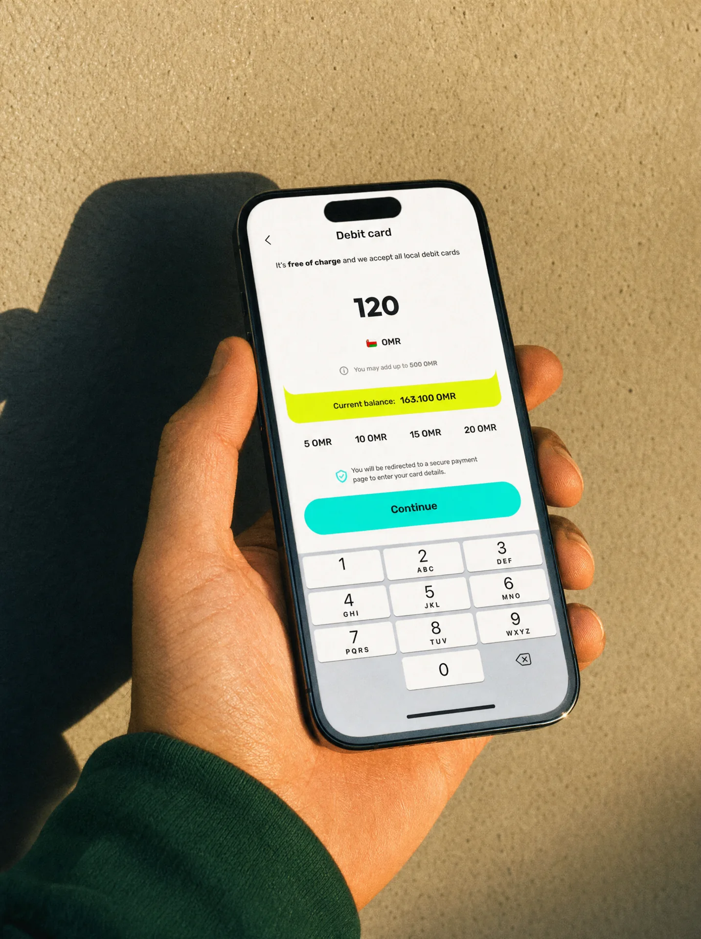
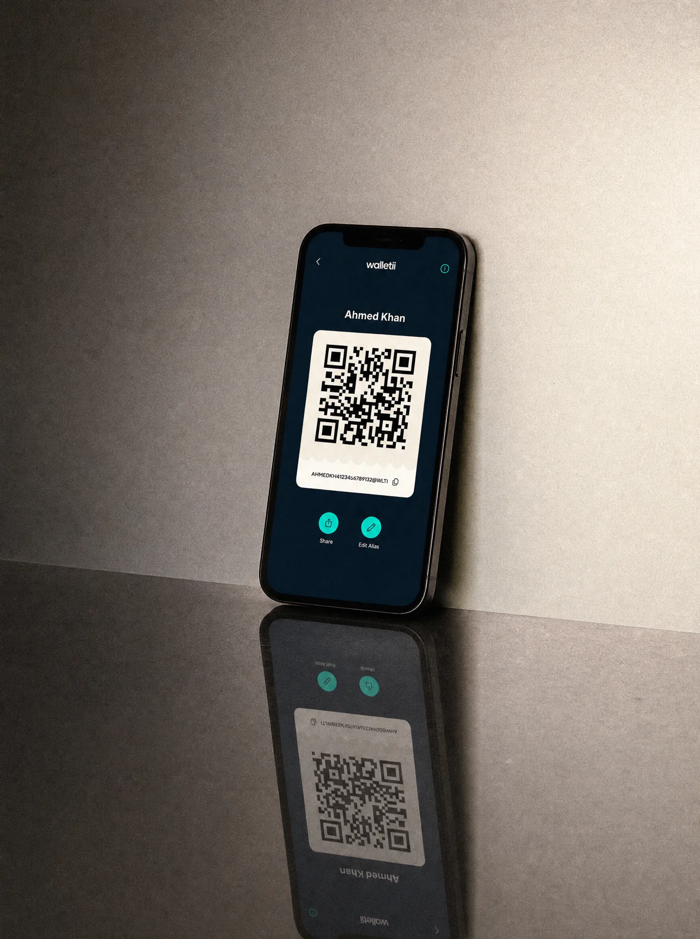
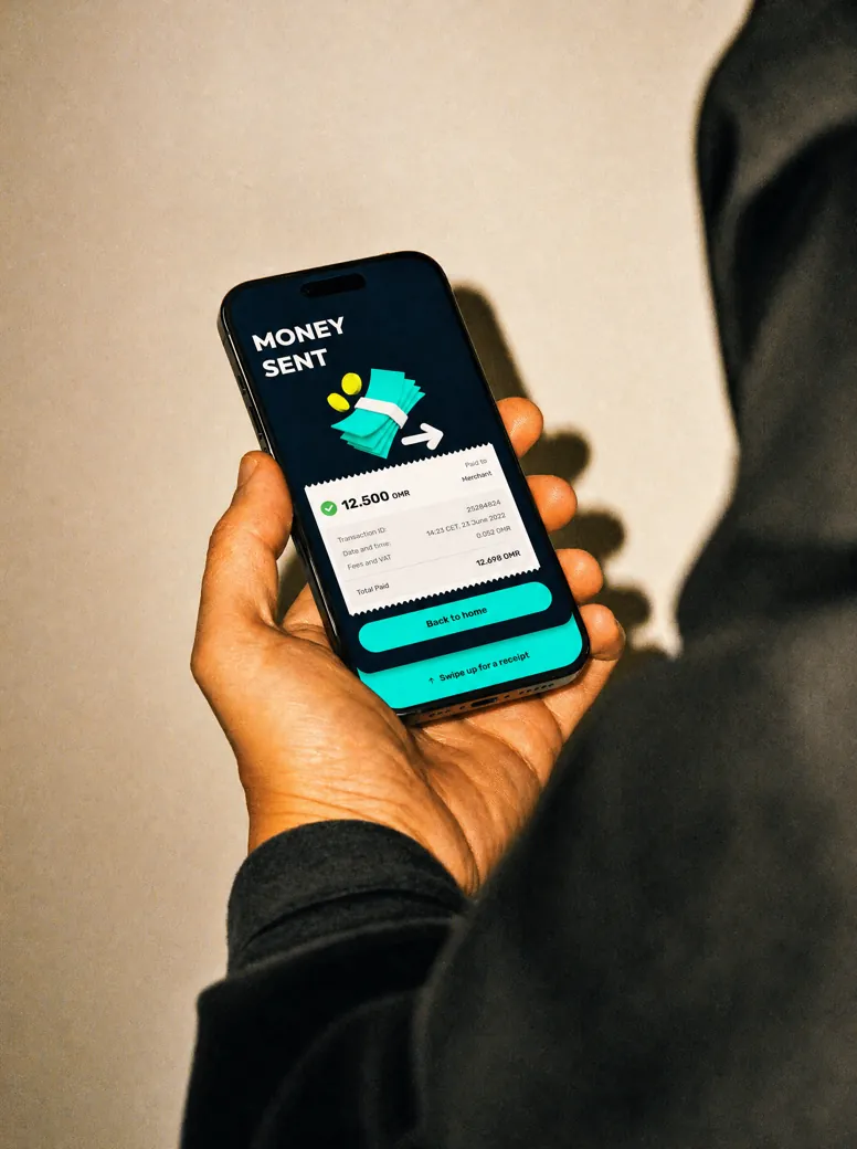
Financial products become complicated very quickly. Sending money, receiving it, managing cards, transferring funds internationally, topping up an account or understanding transaction history all come with their own rules, risks and edge cases. Our job was to turn that complexity into something people could understand immediately. We designed flows around clear actions, familiar patterns and simple language, reducing the amount users had to think about while keeping the system powerful underneath.
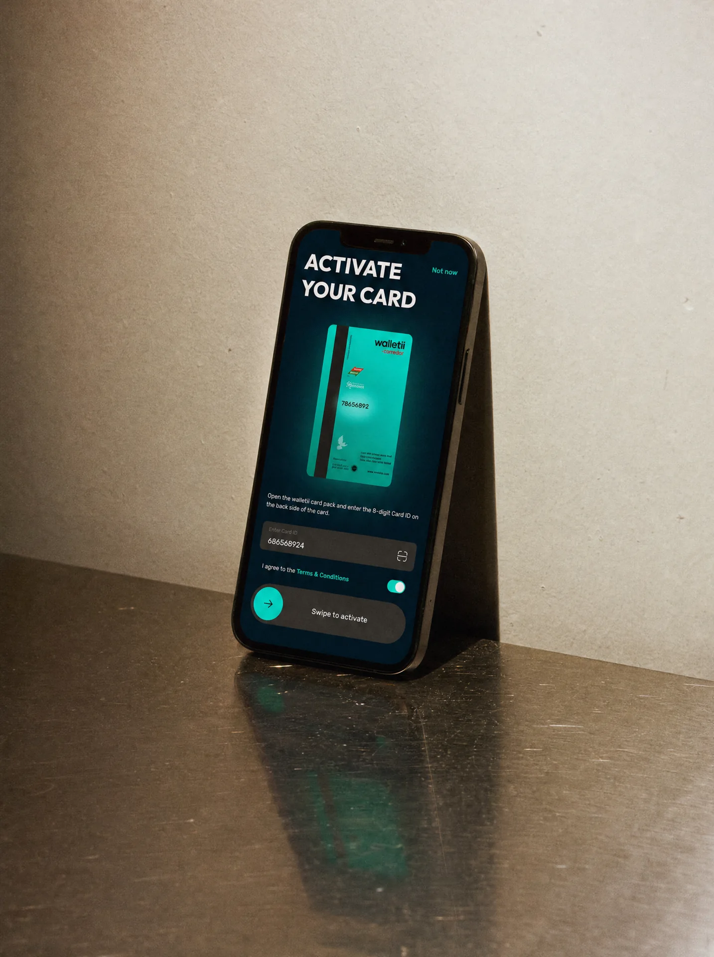
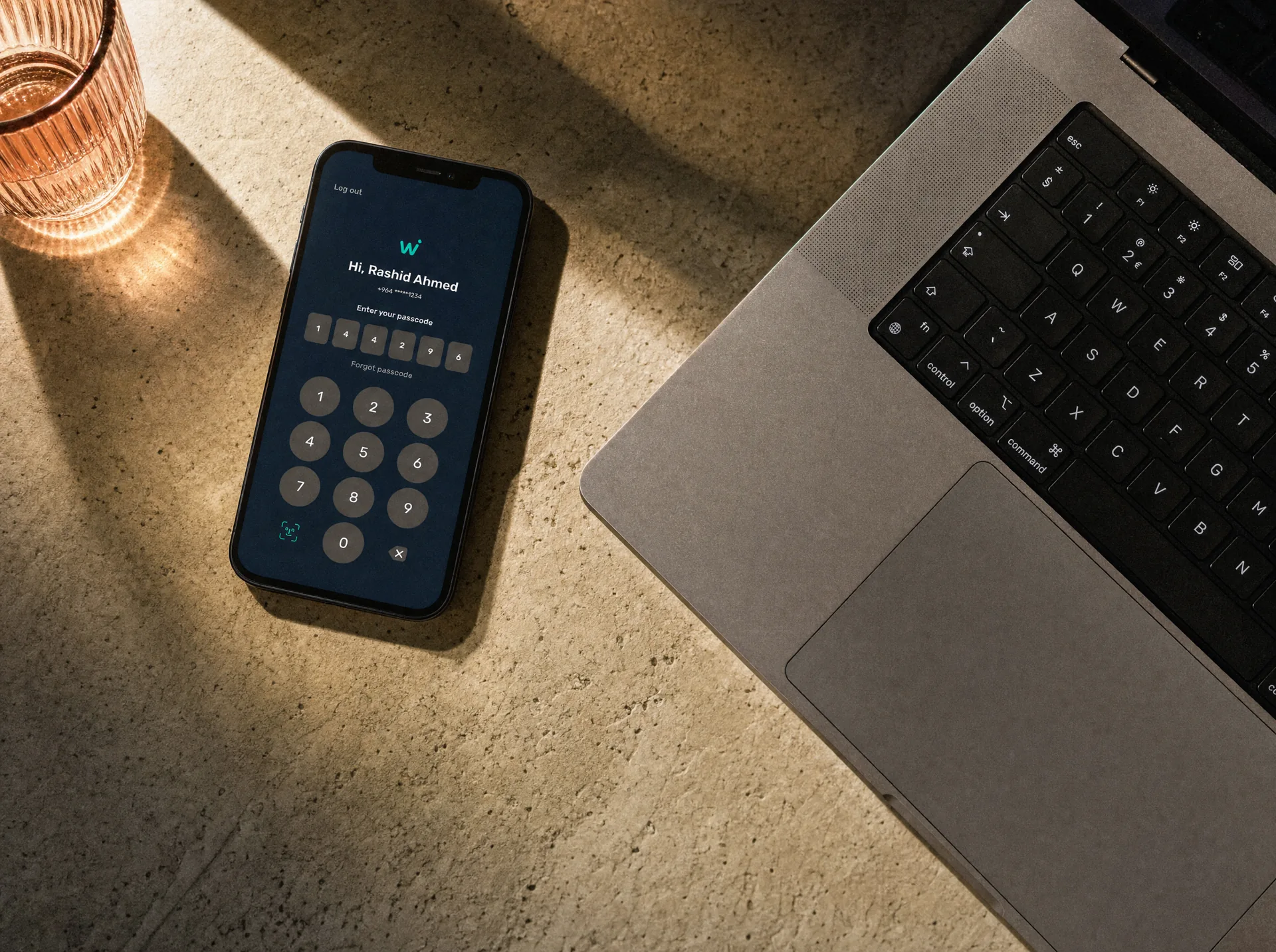
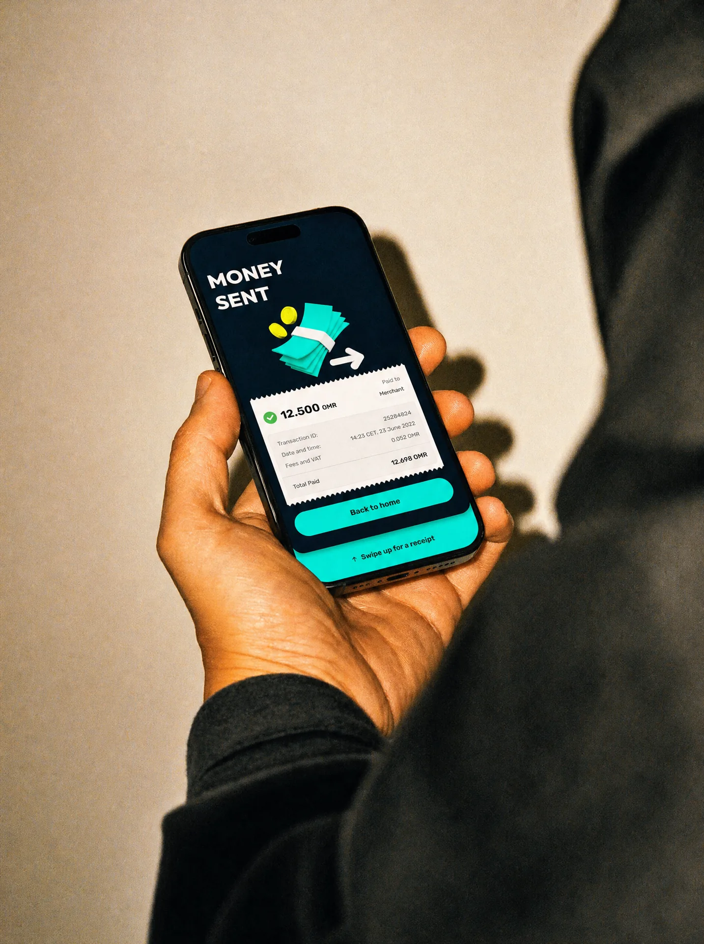
A wallet can look beautiful and still fail if people do not trust it. Trust had to be built into every part of Walletii: onboarding, balances, confirmations, transaction states, security, errors and the way financial information is presented. We worked carefully with hierarchy, interaction and feedback so users always understand what is happening to their money and what happens next. For a financial product, clarity is not decoration. It is part of the product.
Over three years, Walletii grew far beyond a few key journeys. The product expanded into hundreds of screens and extensive UI-kit libraries, covering everyday payments, international transfers, cards, transaction management, account services and new features as the ecosystem evolved. That scale required a strong design system. Components, interaction patterns, labels, states and layouts had to stay consistent even as the product grew across markets and teams.
Some parts of Walletii required much deeper product thinking than a conventional banking interface. We explored new ways of handling payments, including chat-like interactions, remittance journeys and marketplace-style experiences designed to make difficult financial tasks feel more intuitive. The work often went beyond designing screens. It meant questioning the journey itself, simplifying the underlying logic and finding a better way for people to complete the task.
Walletii was never designed for just one audience. The product had to work across different countries, languages, cultures, regulations and financial behaviours. That meant constantly balancing consistency with local requirements. Layouts had to survive translation. Journeys had to adapt to different market needs. New feedback could affect hundreds of existing screens. The design system gave the product a common foundation while still allowing each market to work the way it needed to.
The work expanded beyond the digital product as well. We applied Walletii’s existing visual identity and developed a brand digital system, advising on how the brand should live across digital communication, cards, packaging, leaflets, in-store materials and other physical touchpoints. Colour, messaging and visual rules had to feel consistent whether someone encountered Walletii inside the app, on a card or in a retail environment. The goal was one recognisable product experience, not separate digital and physical brands.
Long-term product work is very different from delivering a one-off design. Walletii evolved constantly. New markets launched. New requirements appeared. Regulations changed. Journeys expanded. Features that looked simple at first became entire systems. Our role was to keep the product coherent while continuing to challenge how it could work better. Three years meant thousands of small decisions, feedback rounds, edge cases and iterations that gradually became one product.
Joy through design since 2008


























 garcy.studio


