What it takes to design a modern luxury magazine (and why it still works today)
By Tom Garcy · 2025-07-01
Every magazine starts with a blank page — but Luxury Travel Digest started with a vision. Not just to create another travel publication, but to build something timeless. Confident. Truly luxurious. That’s where we came in.
Our task: design not just the first issue, but the entire brand identity behind it. That meant everything from typography and layout principles to image curation and art direction. A full package to set the tone — and raise the bar.
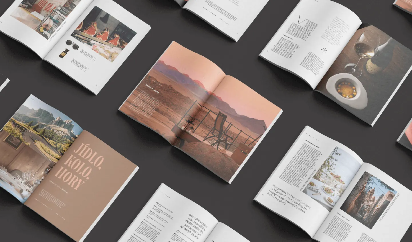
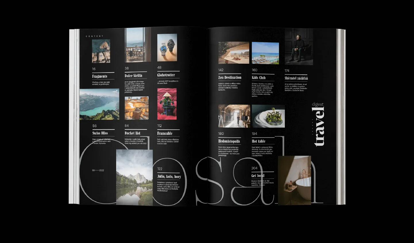
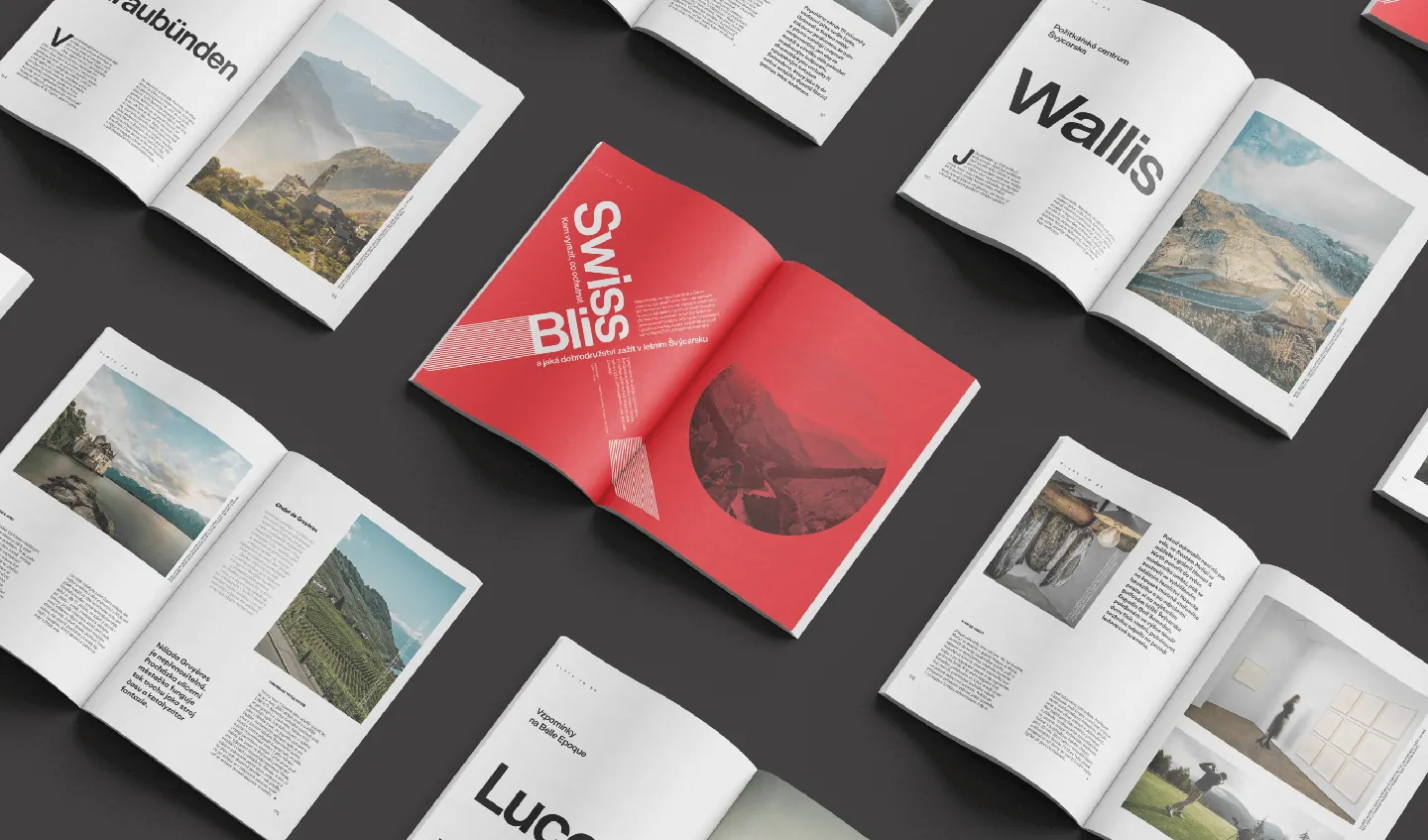
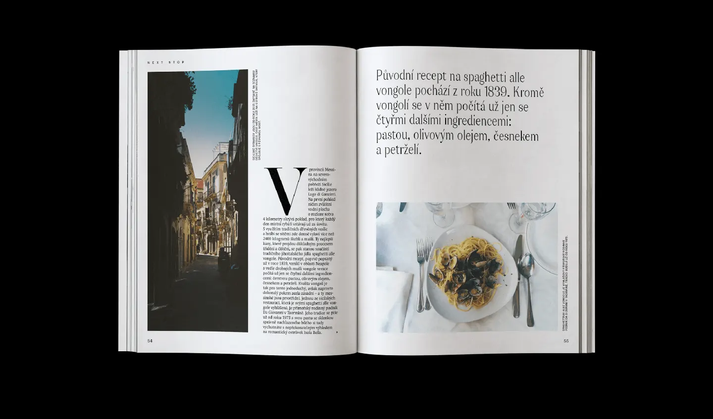
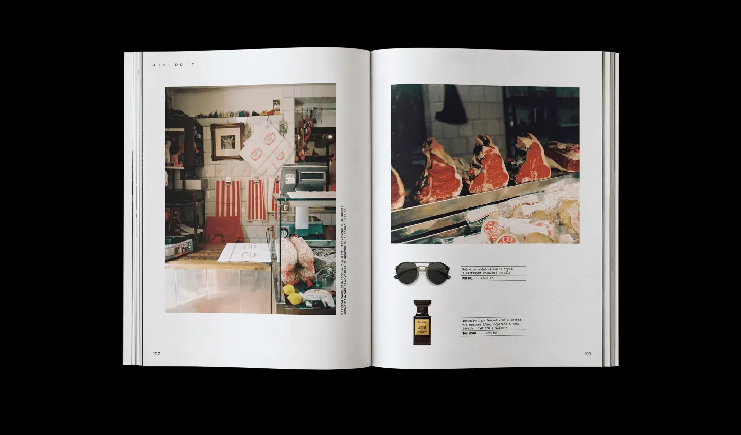
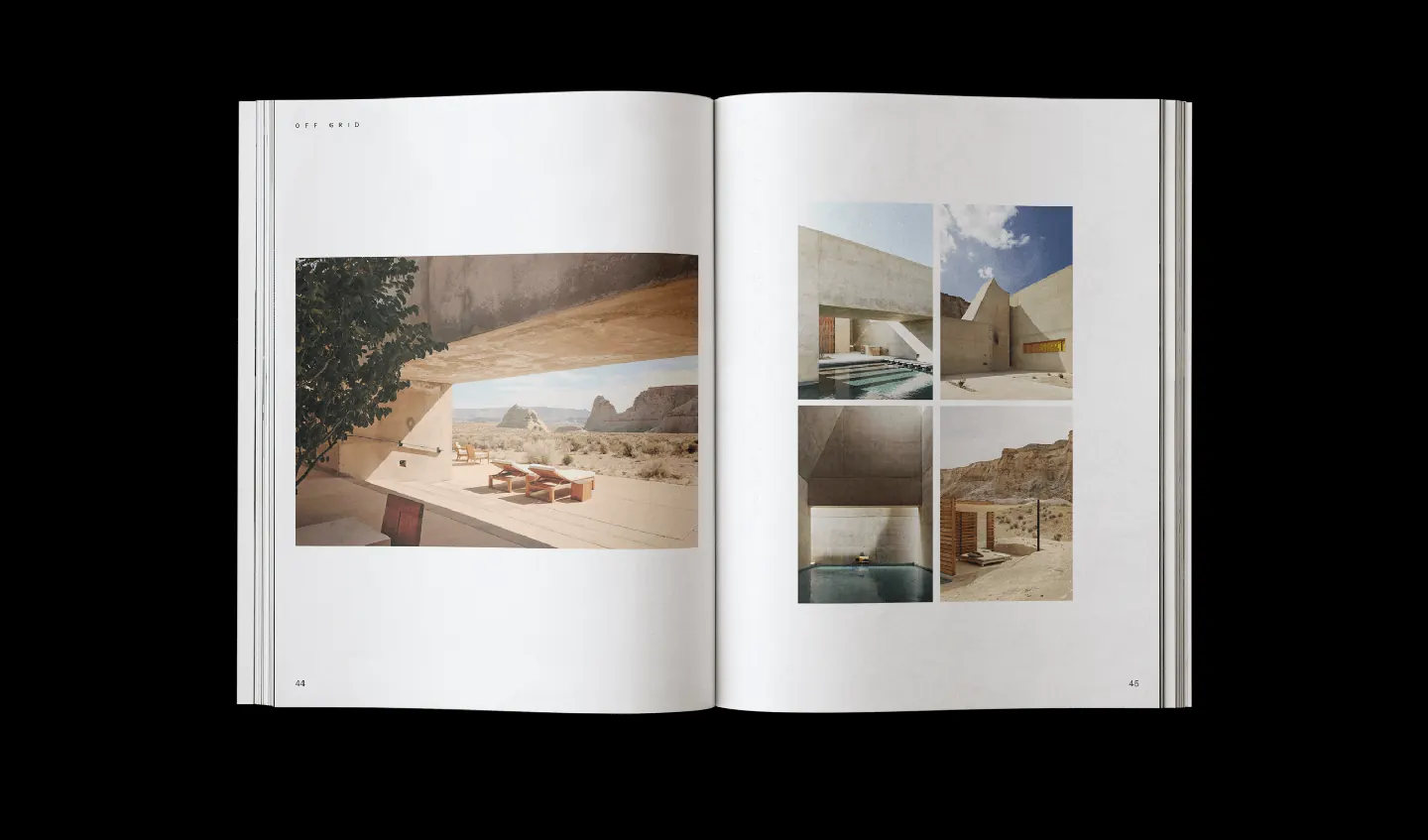
We developed a clean, modern visual language rooted in simplicity and clarity. We picked elegant, high-contrast typefaces. Set rules that balance boldness and airiness. Used space generously. Built layouts that breathe — allowing each image and headline to stand on its own, like a framed moment from a trip you’ll never forget.
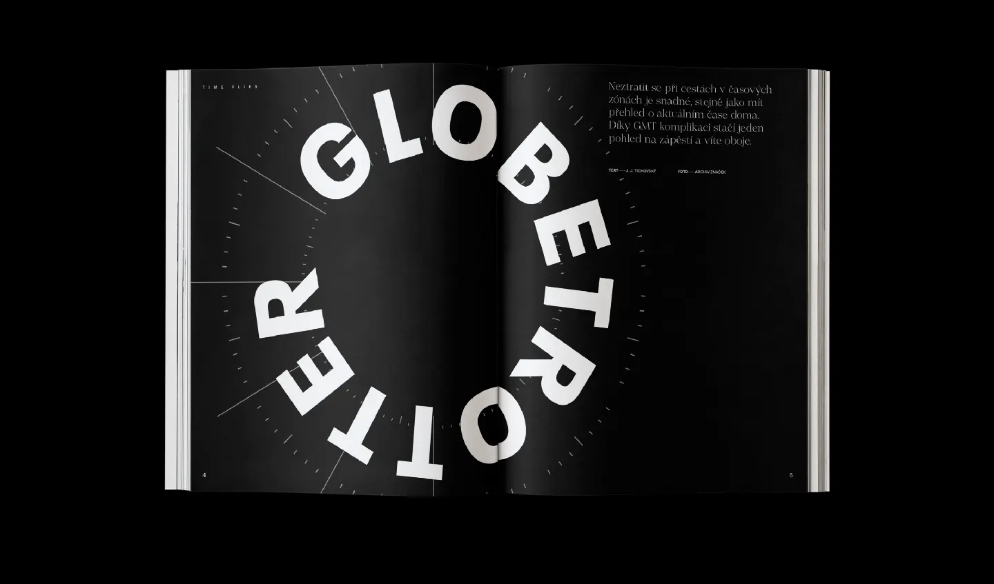
Typography was our main tool.
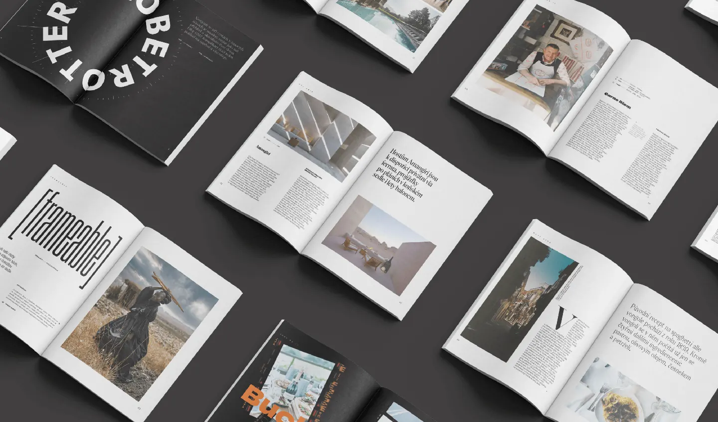
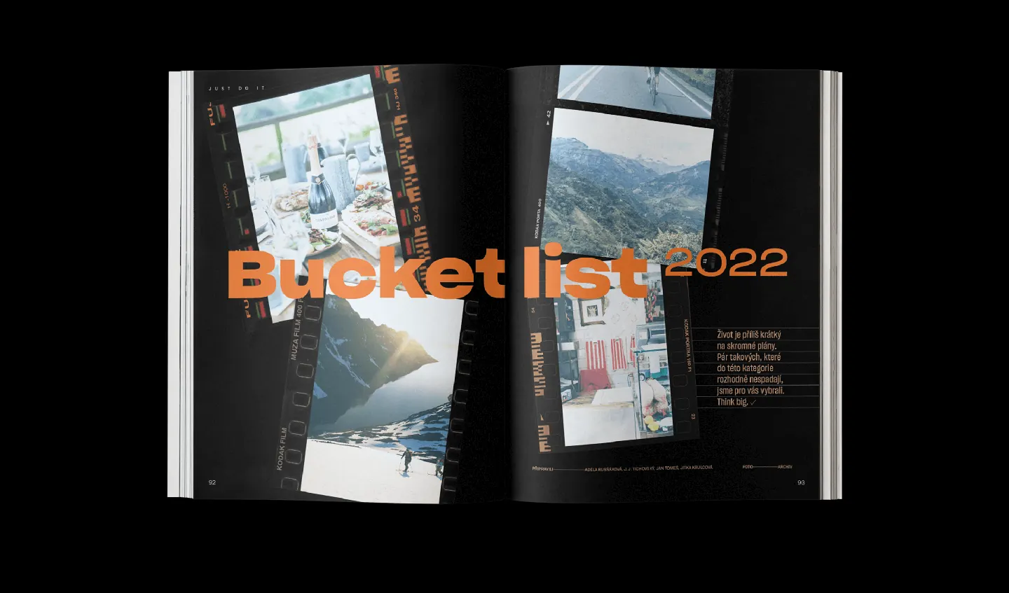
Grids were sharp, modular, and versatile. The use of white and black gave it an edge, while warm tones and oversized headlines gave the pages their rhythm. Every choice had one goal: make travel feel emotional, refined, and worth chasing.
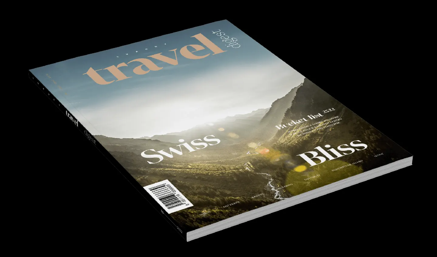
The cover of issue #1 set the tone. But it was the inside spreads — full of oversized photographs, vertical titles, and playful but precise text wraps — that proved this wasn’t just a pretty book. It was a brand with purpose.
And that very first issue? It’s still used today as the blueprint for everything that followed. We laid the foundation. The magazine took off.
To this day, the brand system we built for Luxury Travel Digest helps it stay consistent while staying fresh — an identity that scales across editions, stories, and locations.
Because good design doesn’t age — it travels well.