Oslo Tennisklubb – 125 Years of Legacy, Reimagined
By Tom Garcy · 2025-12-04
When Oslo Tennisklubb approached us at garcy.studio, they were standing on the edge of a new era. With the construction of a state-of-the-art indoor tennis hall and arena underway, they knew it was time to refresh their visual identity to match their future ambitions.
The task: how do you honor 125 years of tradition without getting stuck in the past? How do you build a brand that feels exclusive and prestigious – yet truly welcoming to all?
From the start, we knew this had to be a delicate evolution, not a revolution. The club’s existing symbol carried deep emotional value, and we chose to preserve its essence while refining every detail. At the same time, we were given the creative freedom to develop a visual identity that would be instantly recognizable and bold enough to stand out not just in tennis, but across the entire sports world.
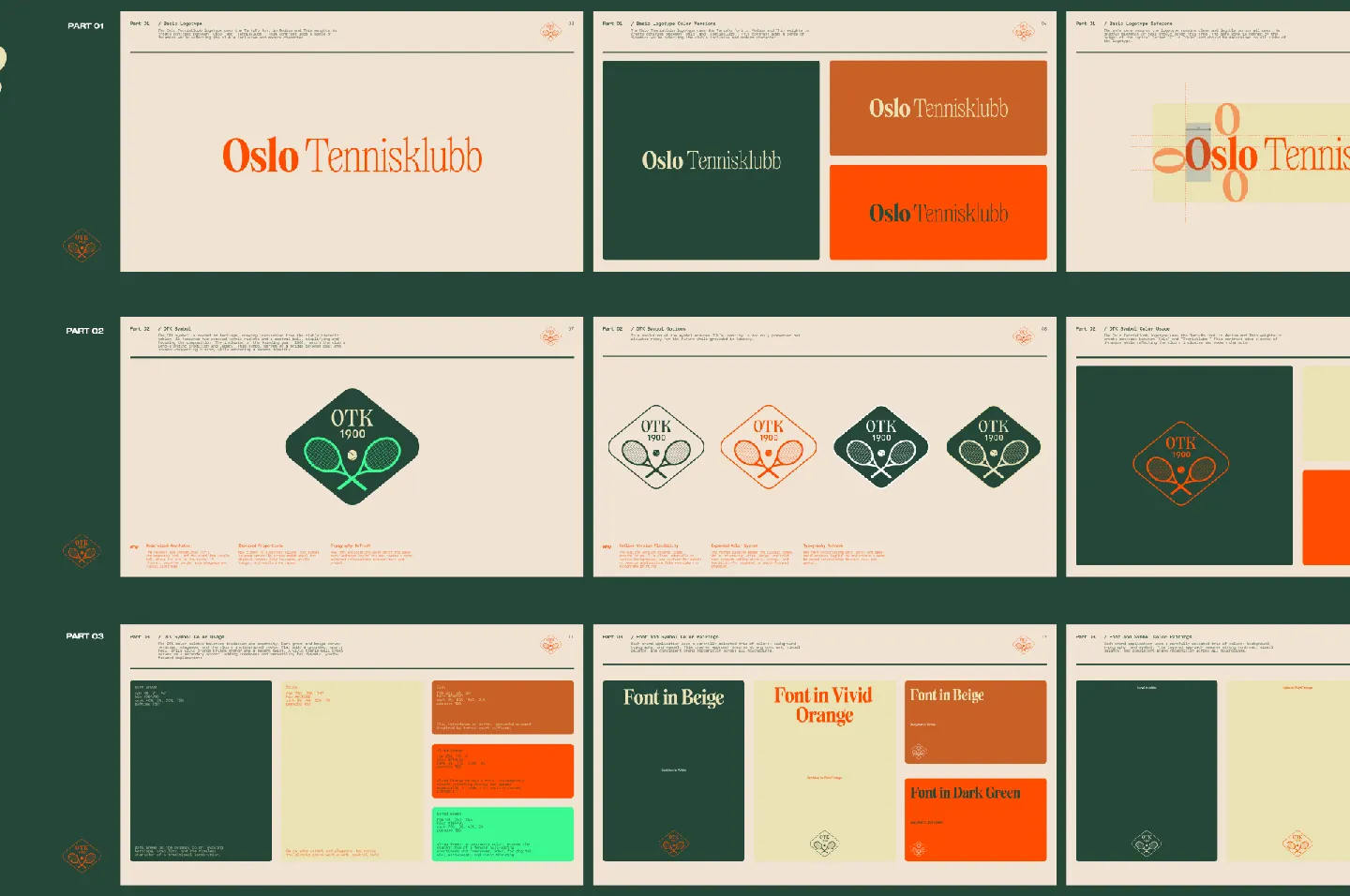
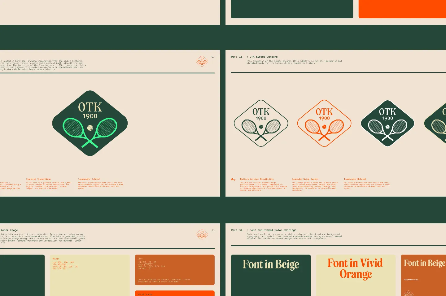
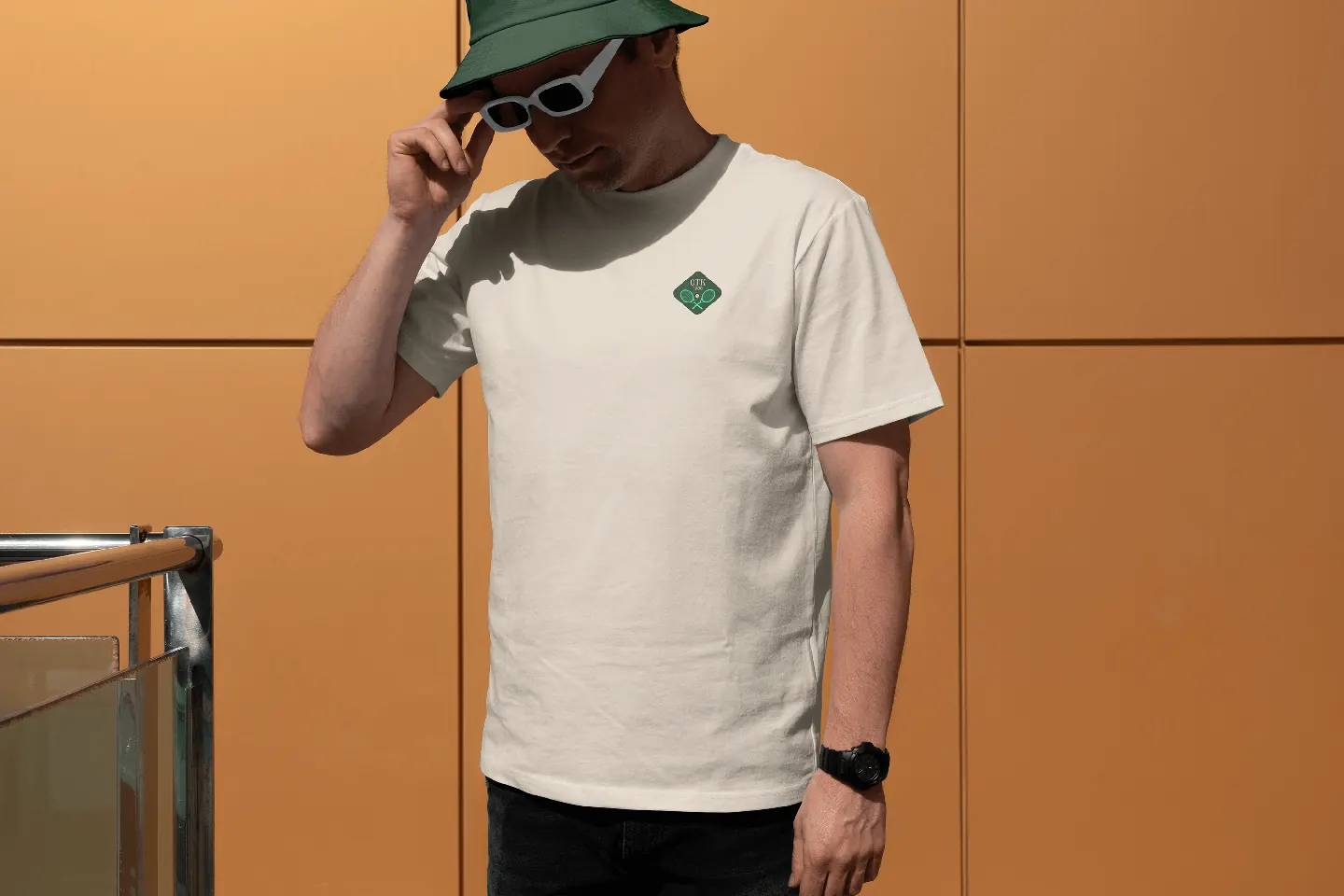
We began with the symbol: redrawing and perfecting it while testing new typography and color systems. We developed multiple new lockups and variations – including outline, full color, and single-tone versions – each with defined usage rules. This gave the club a flexible yet consistent brand system that could adapt across contexts.
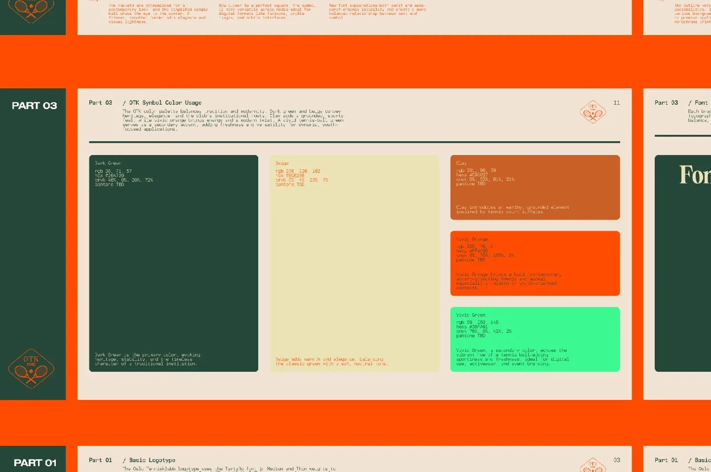
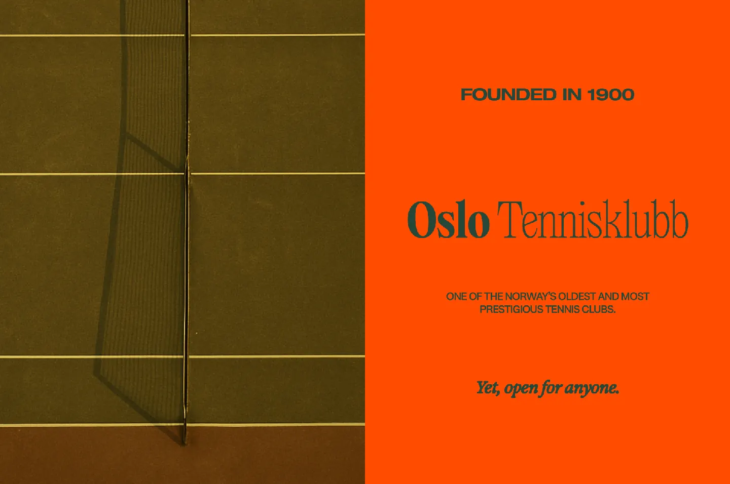
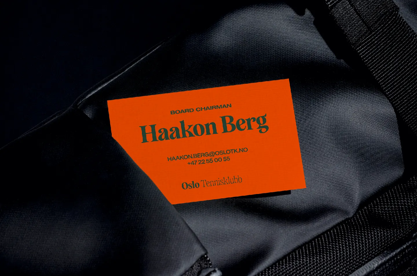
We paired Oslo’s signature dark green with a vivid clay-court orange and a sandy beige to create contrast, warmth, and personality. The palette feels both premium and playful, traditional and contemporary.
Typography became a playground for contrast. We combined the classic geometric precision of Helvetica Extended with the elegant flair of Tartuffo – used both in the logotype and headline work. Supporting this, we used Restart for body text and Exposure Italic for stylistic flair, nodding to both modern and vintage editorial aesthetics.
At the heart of the new identity lies a message: Oslo Tennisklubb may be one of the most prestigious tennis clubs in Norway, but it is open, human, and welcoming. We wanted to show that this is a place where Bentley owners and young students can share the same court. It’s exclusive – not because it shuts people out, but because of the quality, culture, and care it offers.
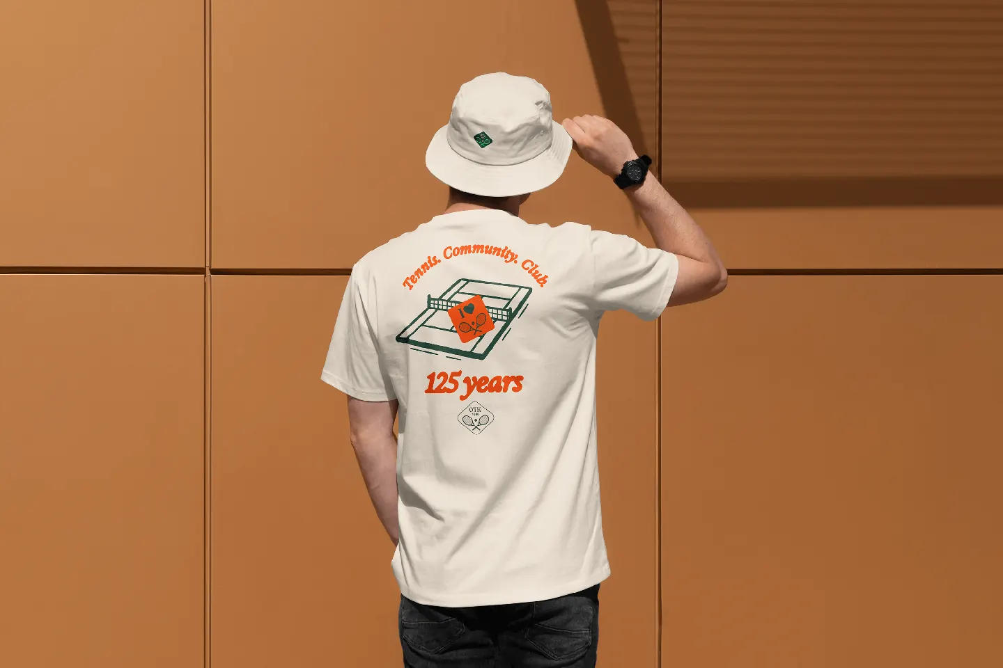
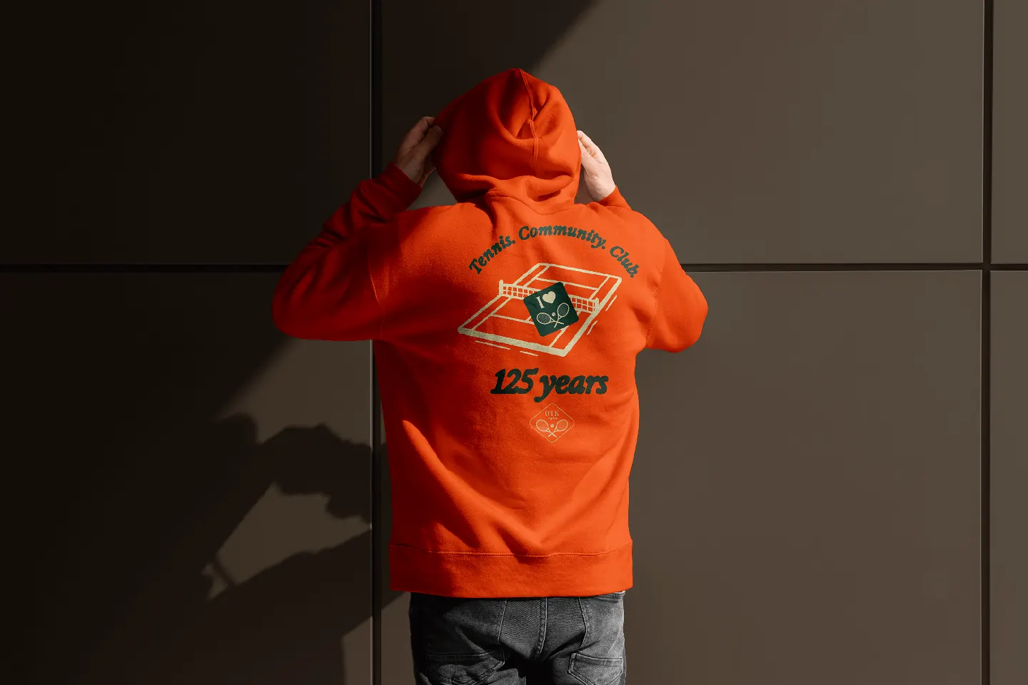
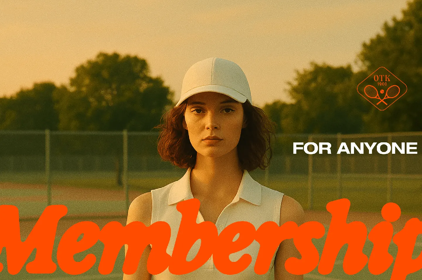
The design language reflects that. Vintage-style illustrations. Hand-drawn icons. Retro-style Polaroid imagery full of warm light, grain, and joyful moments on the court. Everything was crafted to bridge generations, to appeal equally to someone in their 50s and to someone discovering tennis at 22.
A Living, Breathing Website
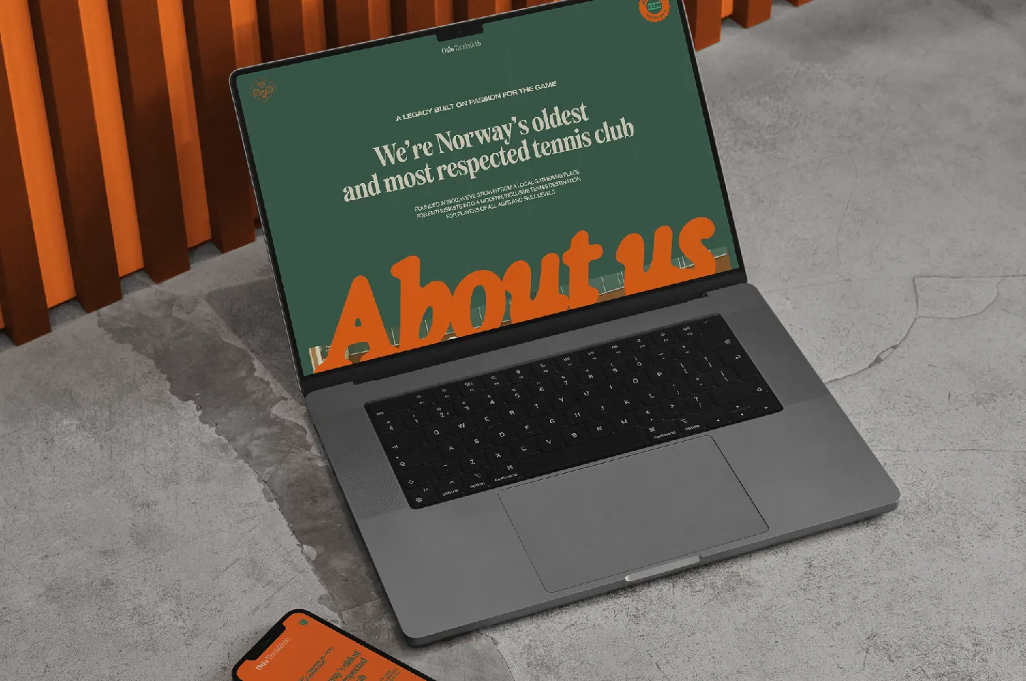
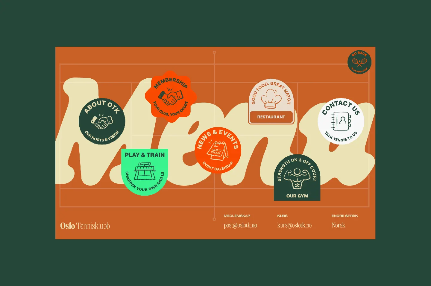
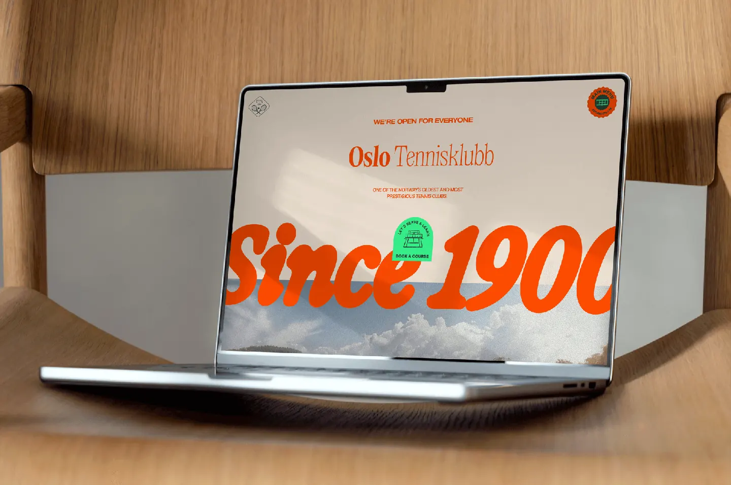
The new website became the ultimate expression of the brand. More than just a place for information, it became a stage to demonstrate the behavior and personality of the new identity. Each page was treated as a canvas – shifting color palettes, font pairings, illustrations, and photography – each tailored to its message and audience. The result is a new visual language.
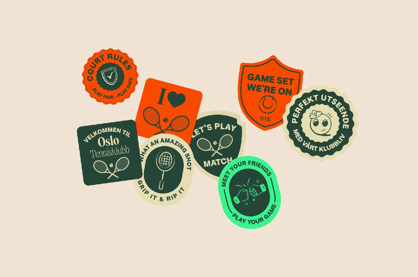
From custom stickers and hand-drawn motifs to precise typography, the website shows the identity in motion.
―
The rebrand expanded into a full system of assets:
- A tone of voice that’s clear, confident, and friendly
- Website content and layouts
- Custom illustrations and signage
- Membership stickers, courtside materials, and more
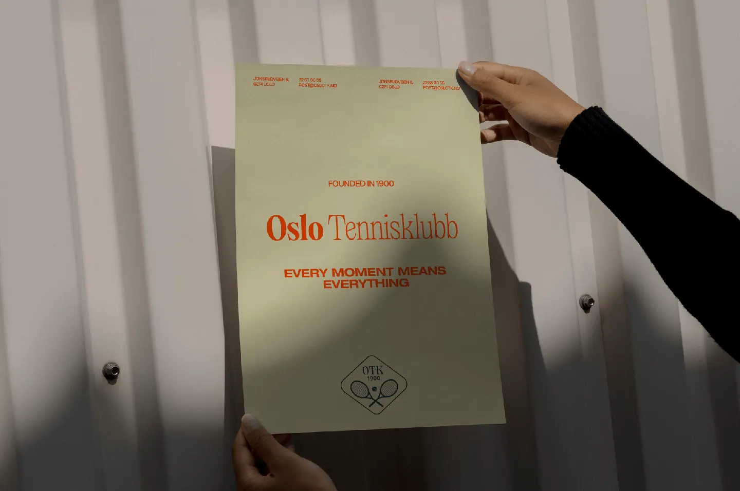
We designed imagery guidelines – a photographic style that feels like it was shot on an old Kodak film camera in golden hour. Slightly over-saturated, slightly faded, full of charm and life. Just like OTK.
What started as a logo update became one of our most beloved studio projects to date. It required deep historical respect, and let us go bold without losing touch with what matters: community, passion, and timeless quality.
We’re incredibly proud of what we created together. This identity is a milestone. A tribute to 125 years of excellence. And a launchpad for everything to come.
Here's to the next 125 years.