From fine to unforgettable: The Sunnysoft rebrand
By Tom Garcy · 2025-07-15
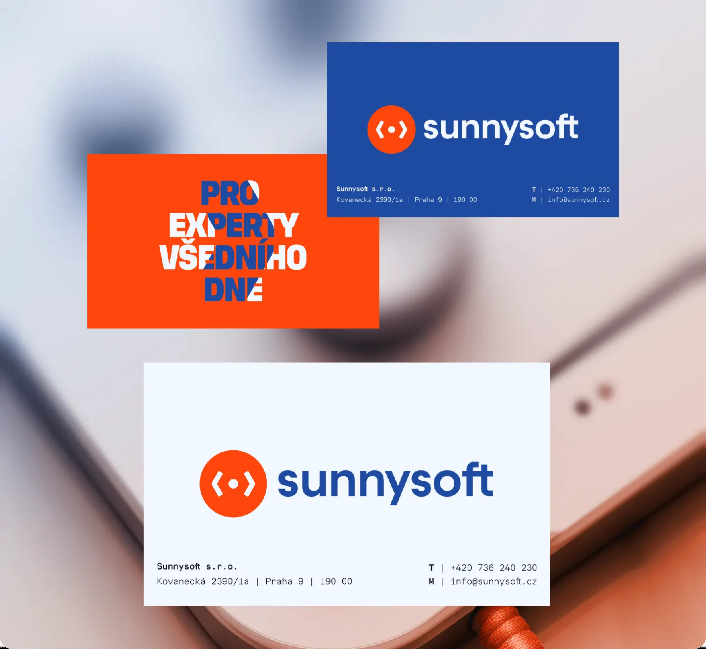
Sunnysoft has been a well-known name in the world of electronics, DIY tools, and smart gadgets for years. A trusted ecommerce brand with a strong product offering—but visually, it was safe. Familiar. Something you’d scroll past without a second look. That’s where we came in.
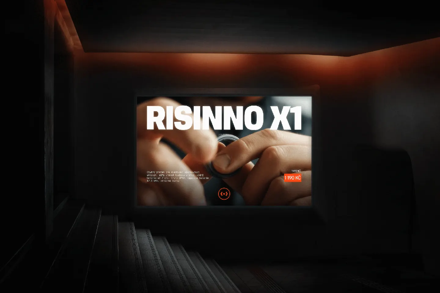
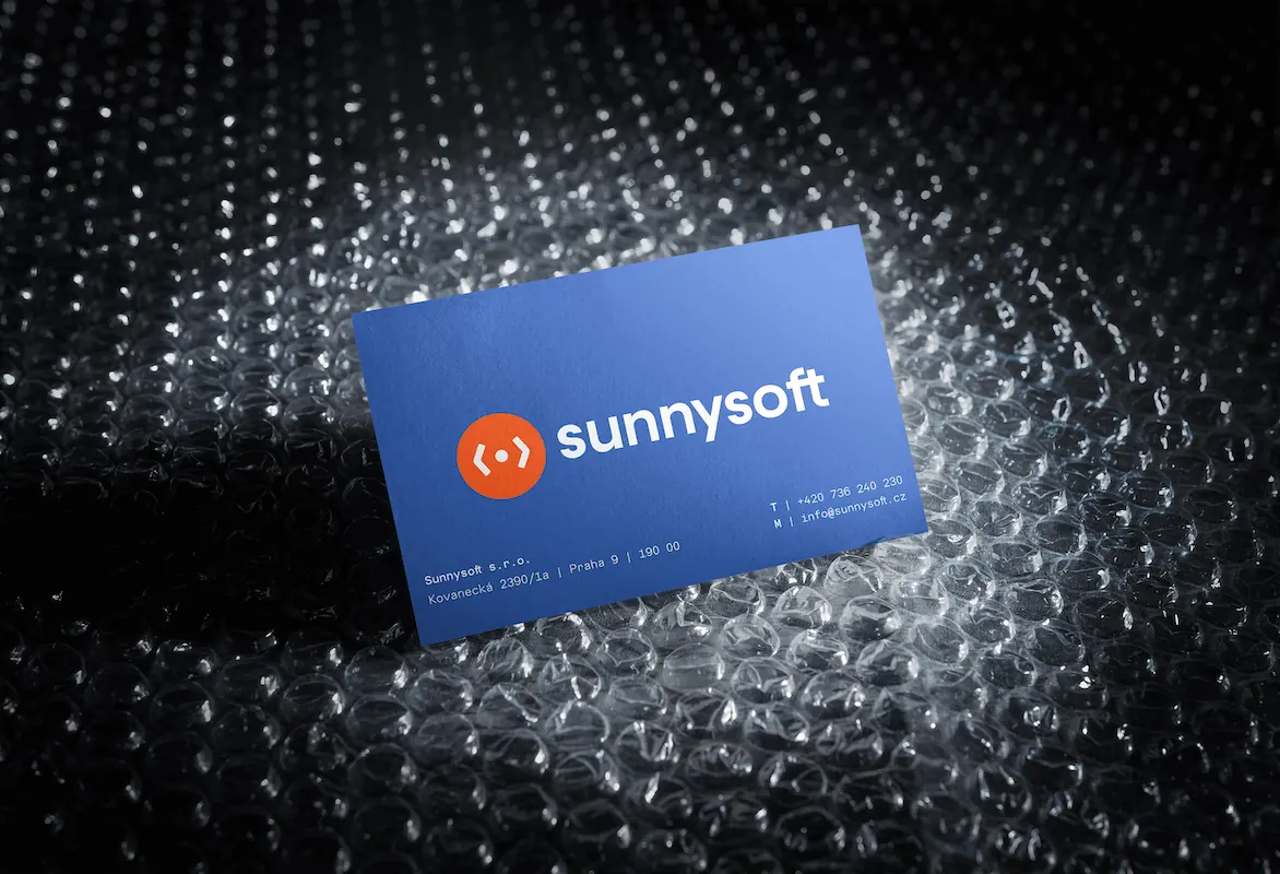
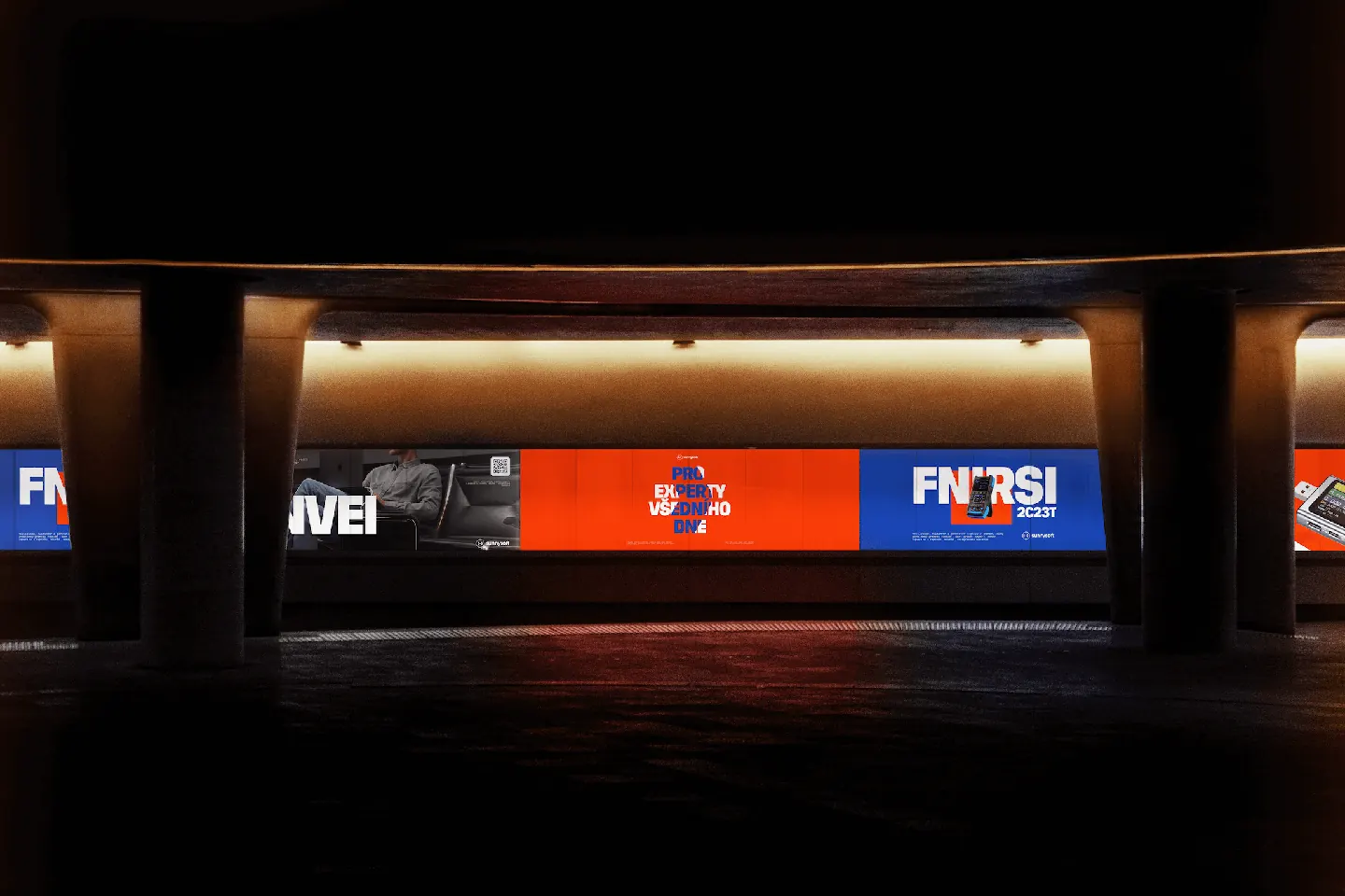
From the very beginning, we saw more. More confidence, more edge, more identity. We believed this could look and feel like a world-class brand—without losing the practicality and purpose that makes Sunnysoft what it is. With the team’s trust and willingness to explore bold ideas, we set out to design a whole new visual identity.
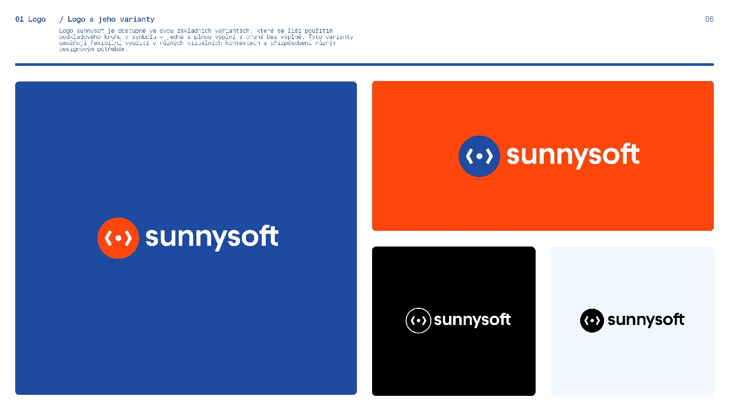
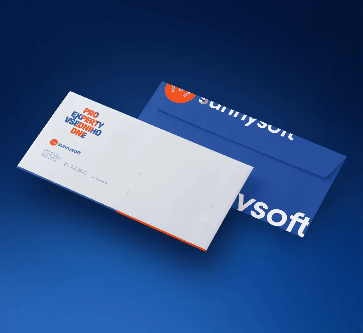
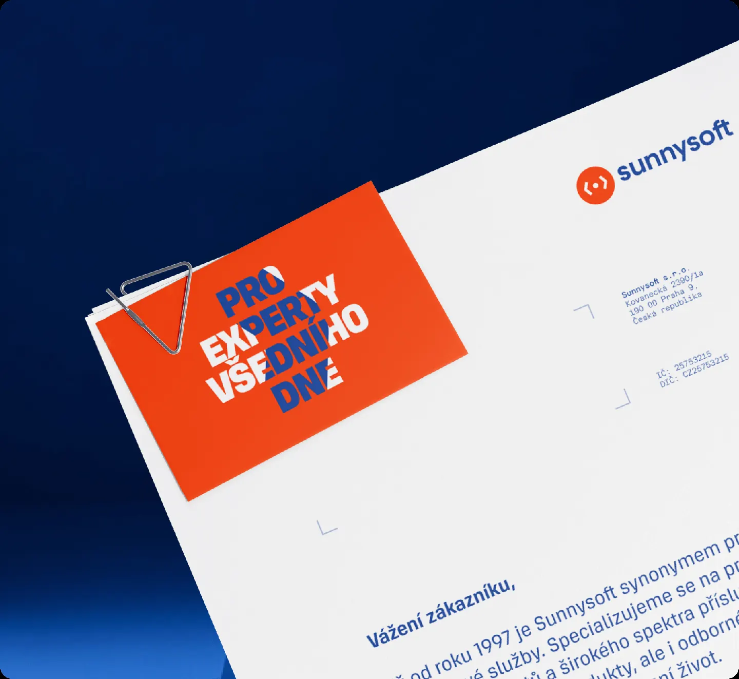
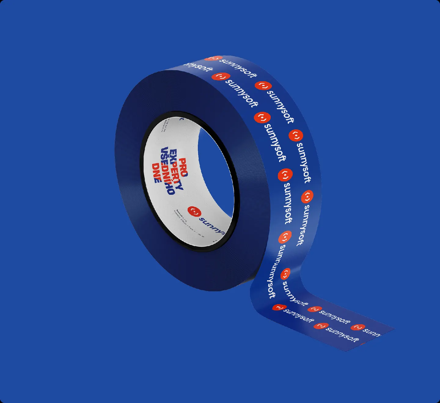
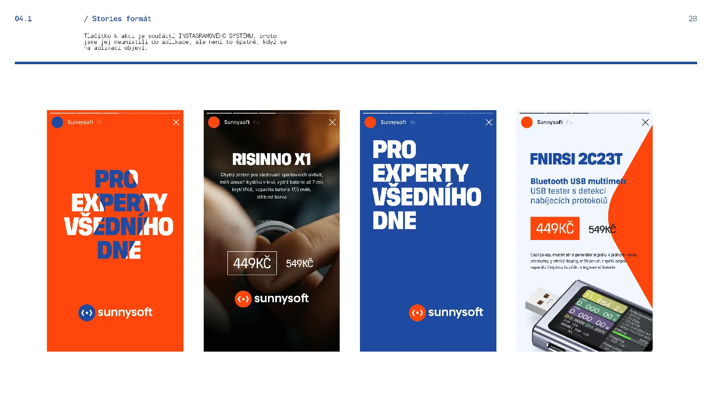
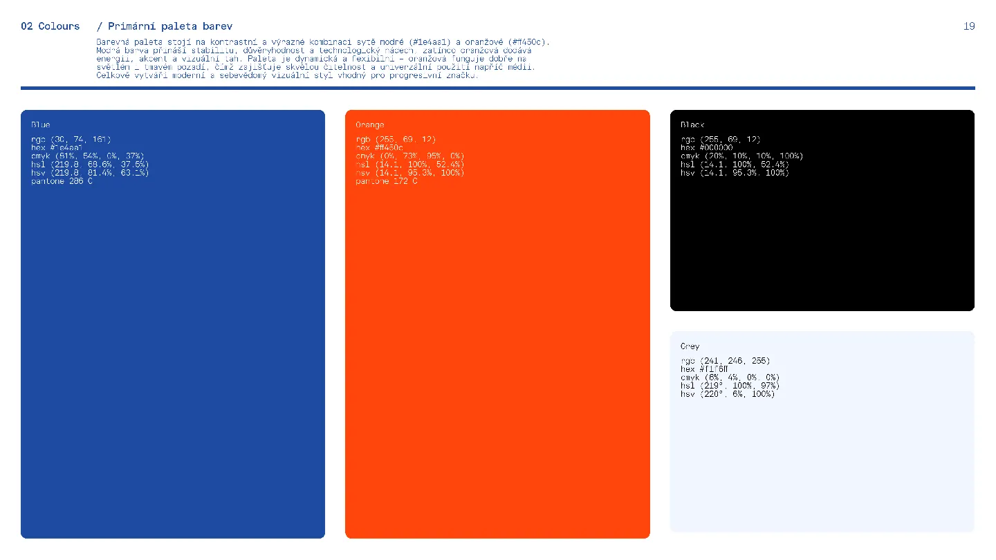
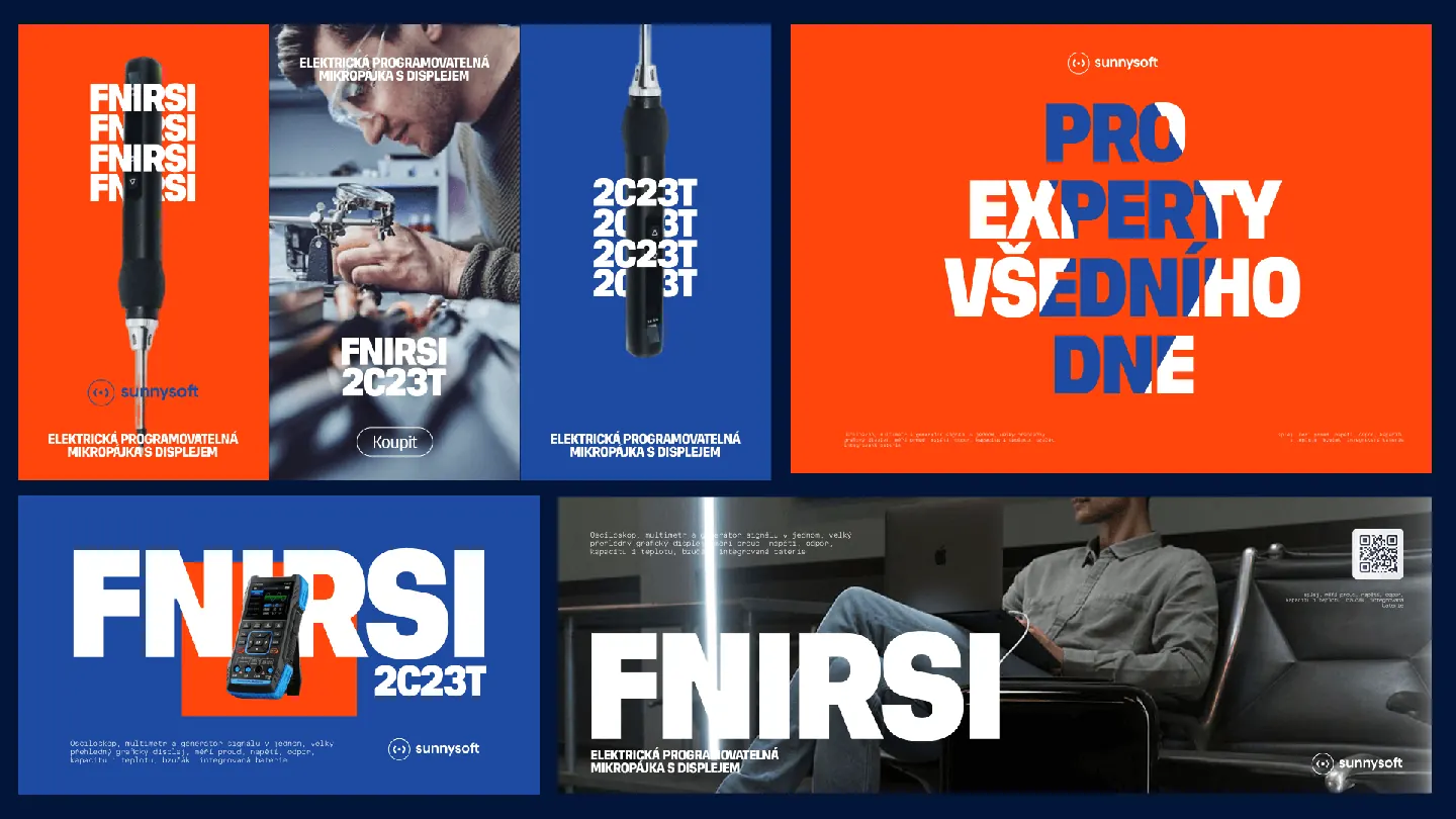
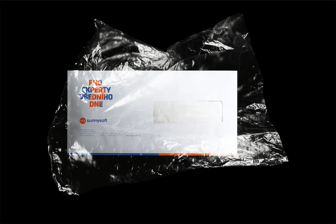
We introduced a refined type system, more expressive colors, and a visual language that feels modern, smart, and clear. But most importantly, we gave it a voice. A claim that says it all: “For everyday experts.” Because Sunnysoft isn’t trying to talk to everyone—it’s for people who know what they’re doing, who don’t need fluff or flash, but do appreciate design that makes things easier to understand and use.
This was one of those projects that starts with, “Isn’t this a bit much?” and ends with, “This is exactly it.” The kind we love. Because it means we found the edge—and then sharpened it. Big thanks to the Sunnysoft team for the trust and openness, and to our own—Loren Goodknight for leading the process, and Vašek Šrámek for shaping the visual identity with confidence and care.
This one was fun. And it’s just the beginning.