Arkády Pankrác: Bold moves for a bold brand
By Tom Garcy · 2025-07-07
We don’t believe shopping centers should look like they were designed by committee.
That’s why for Arkády Pankrác, we did the exact opposite. We simplified. We amplified. And we made it unmistakably visible.
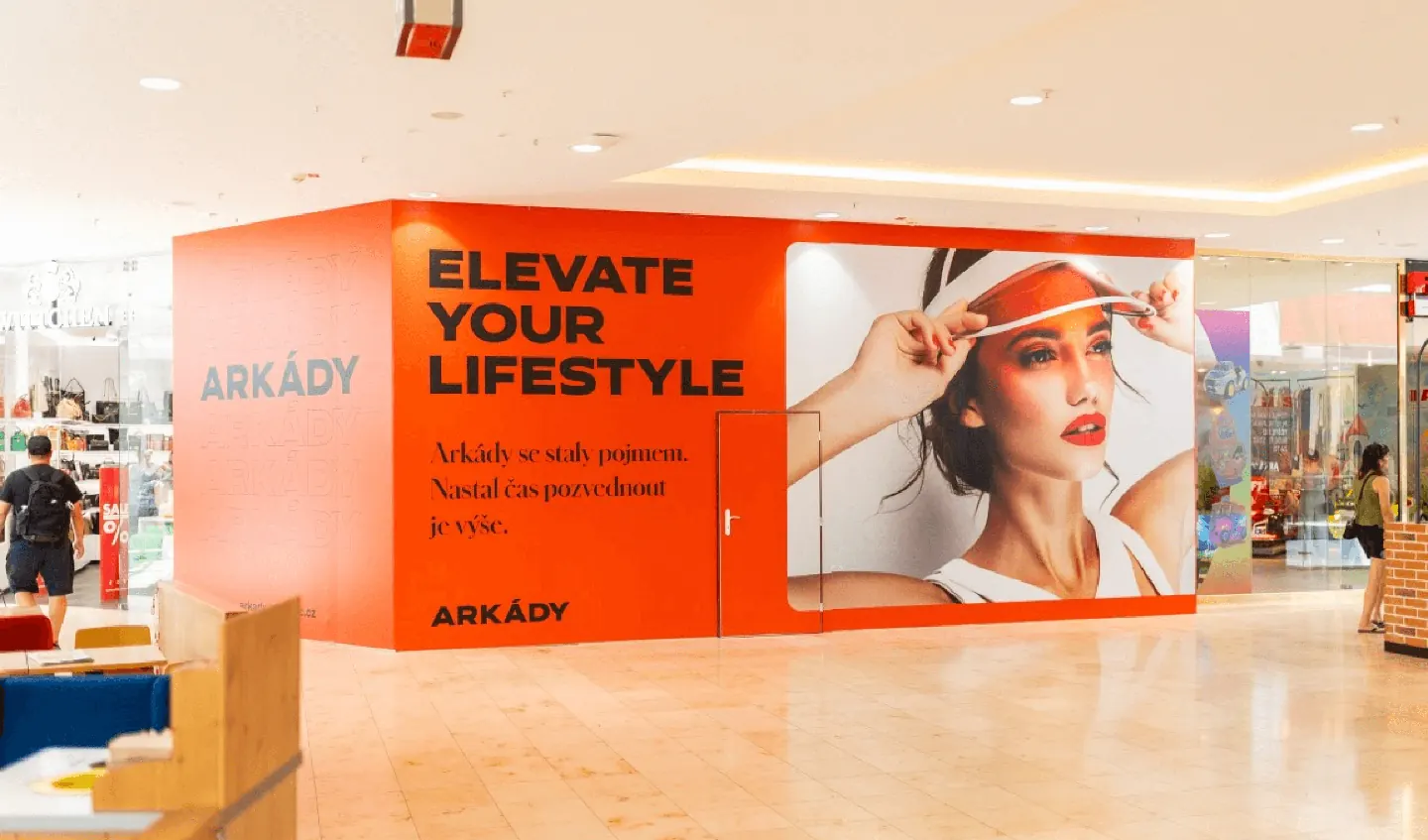
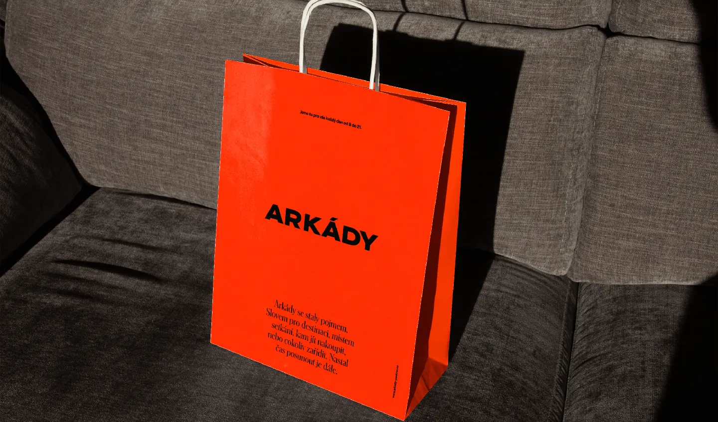
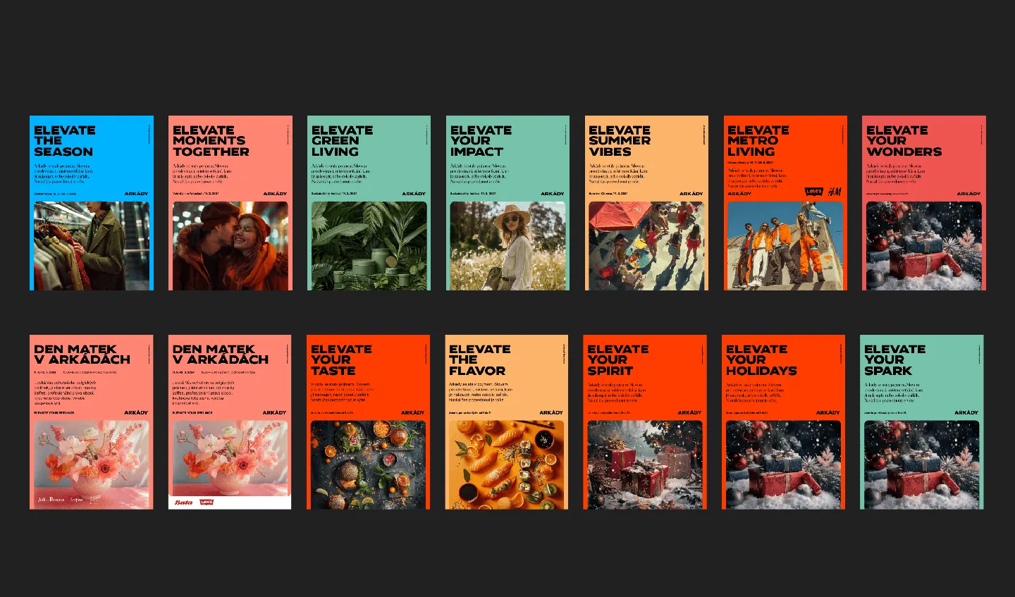
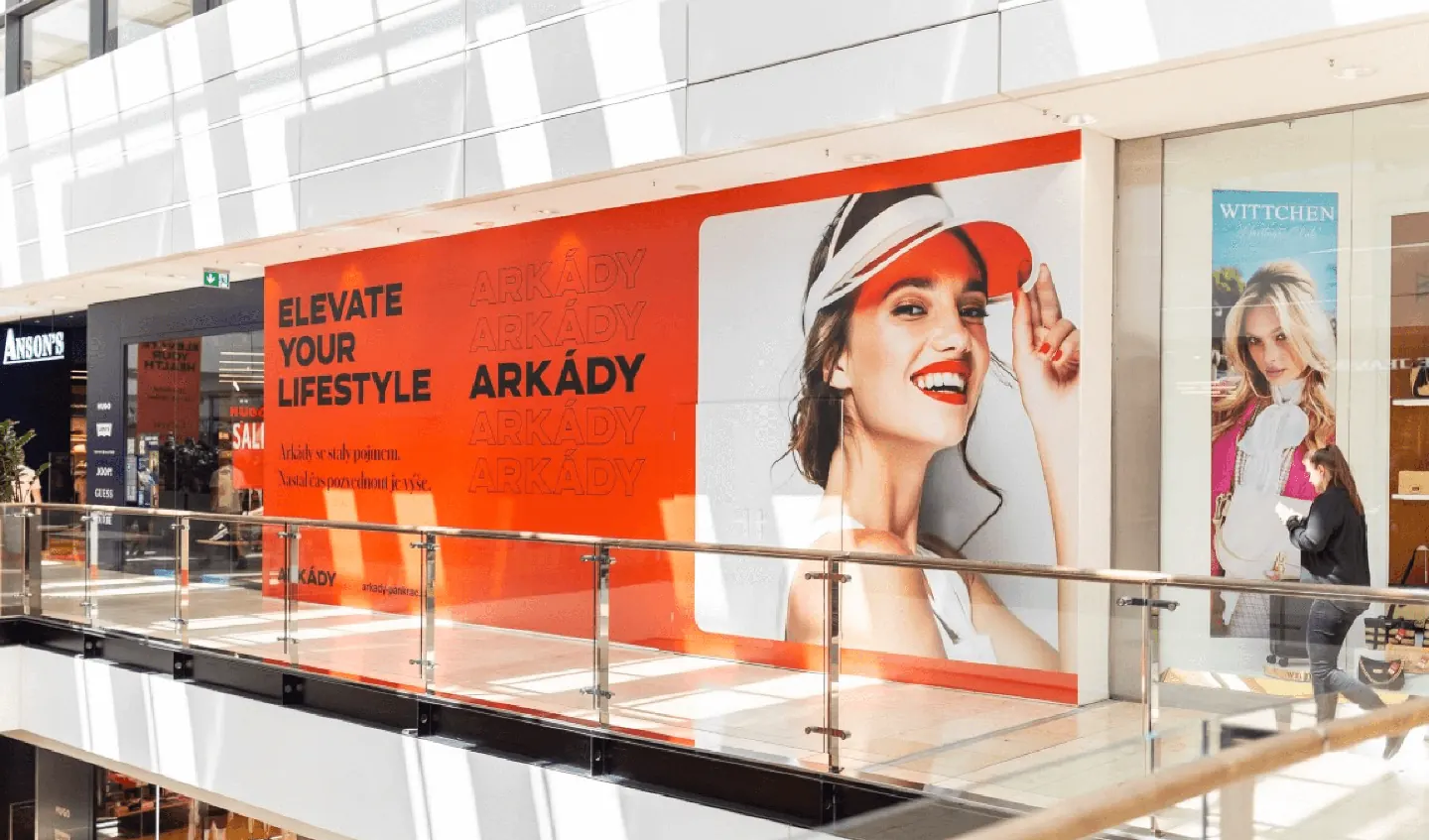
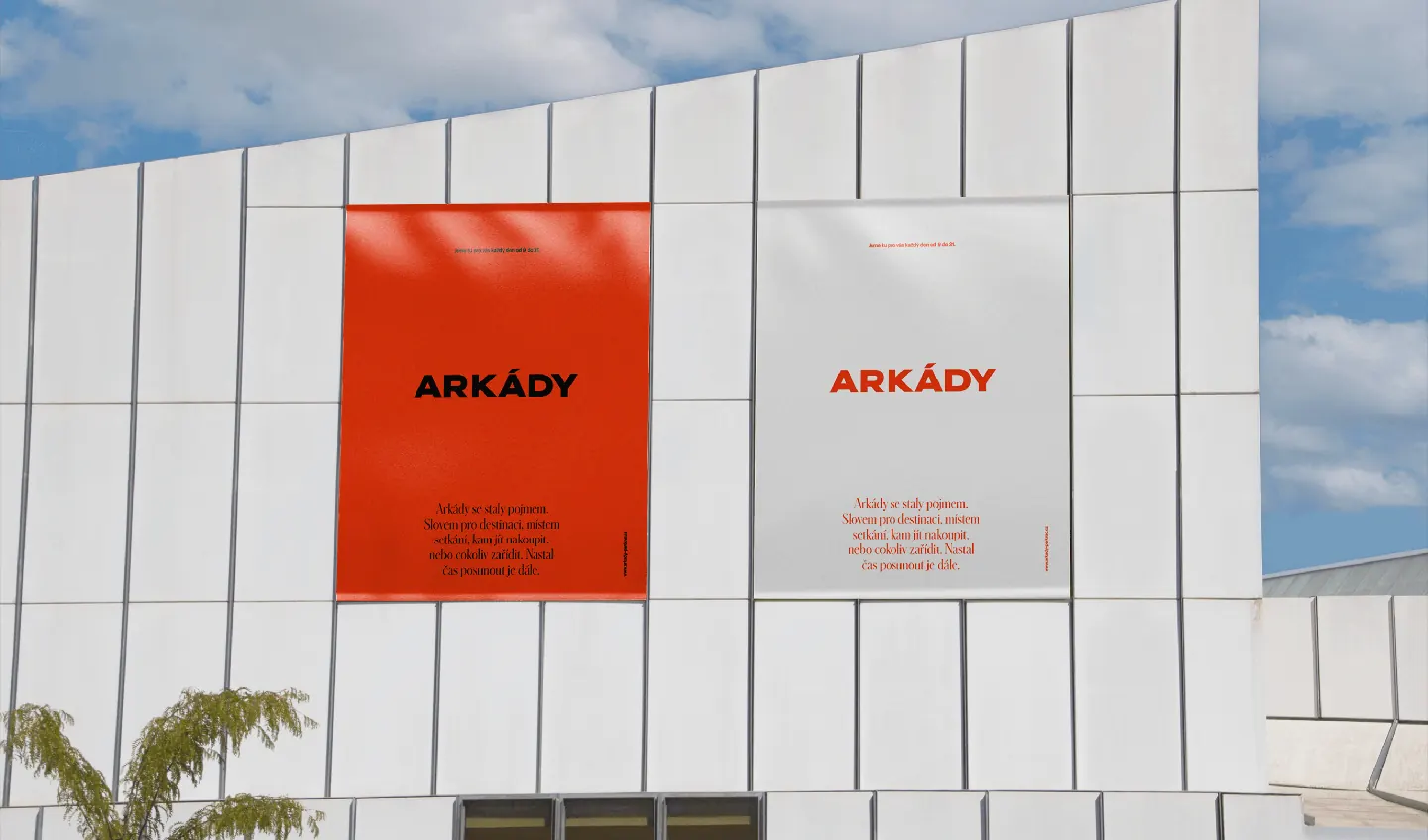
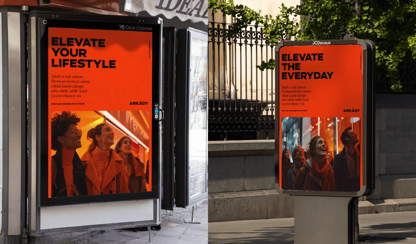
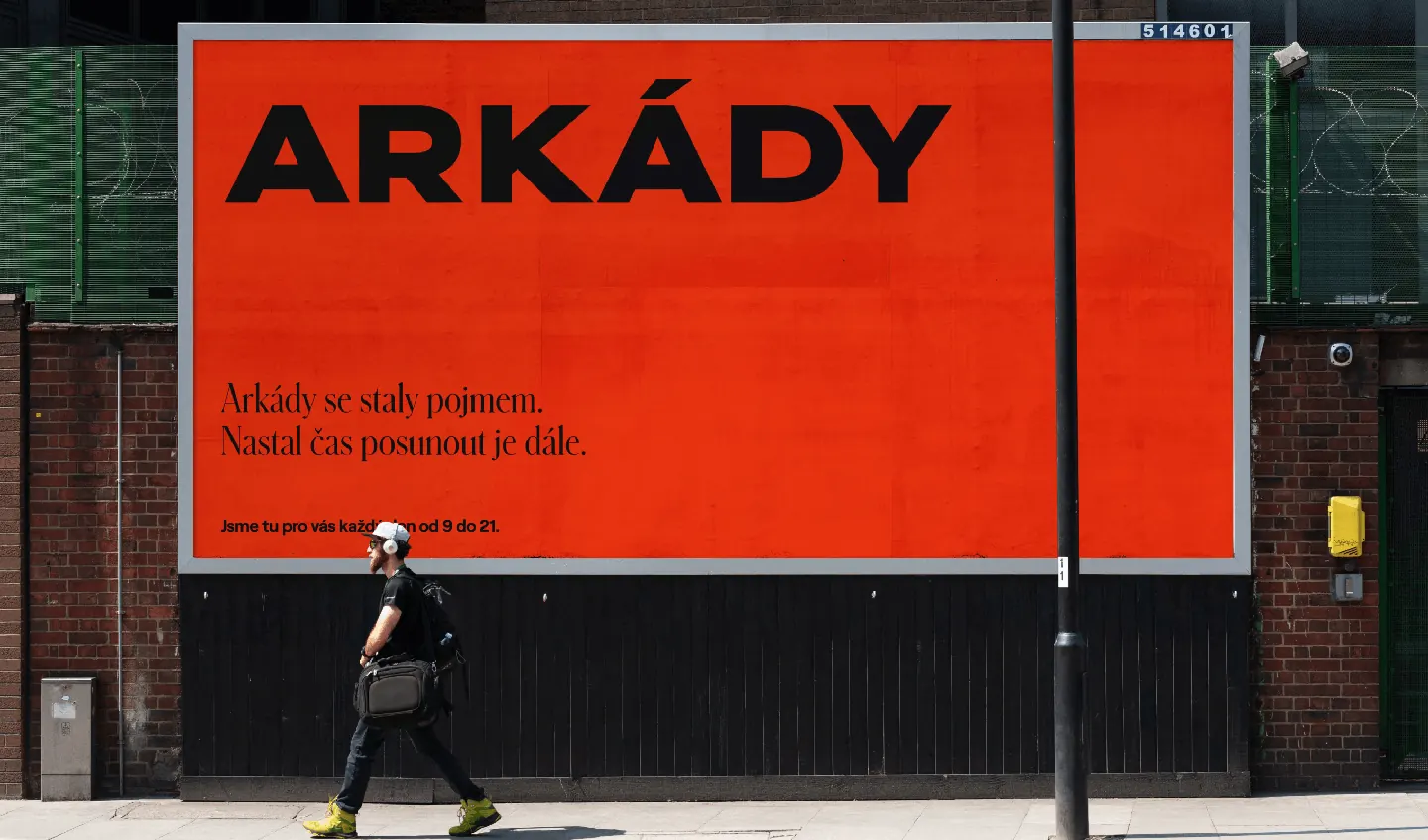
The new branding is bold, confident, and instantly recognizable. No fluff. Just strong, sharp visuals designed to stick. Anchored by a key orange that you simply can’t miss, and driven by typography that speaks loudly and clearly.
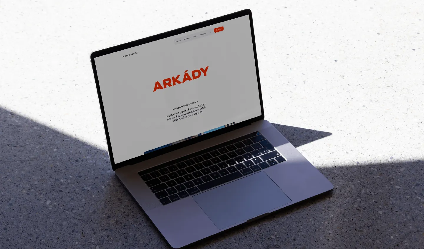
We used Hrot, a geometric typeface from the Czech foundry Superior Type, paired with the elegant Schnyder serif to bring contrast, elegance, and flexibility across formats. The tone? Modern minimalism meets commercial power.
This is branding for a shopping center that doesn’t want to blend in. It wants to be remembered. And it is.
From billboards to signage to digital to bags — every touchpoint works together to create a clear, consistent, and elevated experience. It’s not just about looks. It’s about conversion, emotion, and clarity.
Because smart branding isn’t decoration. It’s how you win attention in busy spaces. It’s how shopping malls become destinations.
It’s how design becomes success.